| |||||||||||||||||||||||
| Specialty Boards/Contest! | |||||||||||||||||||||||
|
Axil62
(Mar 6, 2004)
I figured if you're gonna use Flash the parts that make up the subject should be simple and separate. The eyes, the hands, the mouth. He travels by simply sliding around on his little plastic pen tip leaving lines in his path to keep mobility simple. Just an idea. Of course in Flash the edges would be much smoother. |
This is hidden because it is rated 18+. Edit your privacy settings to make it visible.
| ||||||||||||||||||||||
| Public Boards/Advanced | |||||||||||||||||||||||
|
Axil62
(Mar 5, 2004)
Hey guess who one of my favorite singers is? |

| ||||||||||||||||||||||
| Public Boards/Intermediate | |||||||||||||||||||||||
|
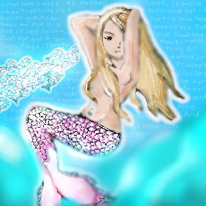
lp_phaery
(Feb 28, 2004)
Well...........
ToraNeko (Feb 28, 2004)
How you can have enough perserverance to do that, I have no idea O.O I'm in awe, lol
davincipoppalag (Feb 29, 2004)
yes phaery..you have a good start on this one.. the scales are well done (mermaid looks a bit like Shakira.. lol) boy they sure give you kids alot of homework these days... ALMOST FINISHED!
Finished, finished, finished WELL..........done >';'<
|
| ||||||||||||||||||||||
|
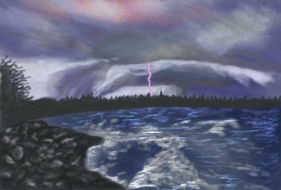
Krystiana
(Feb 28, 2004)
Grand Beach in Winnipeg, Manitoba.
ToraNeko (Feb 28, 2004)
Ooooo I like how the bolt is purple, and the waves are awsome n.n
DeadlyBlondeArcher (Feb 29, 2004)
This is very nice... it really has a stormy feeling to it, good choice of colors.
Gigandas (Mar 5, 2004)
Nice landscape here.I like the colors XD.
ProjectZeppher (Mar 6, 2004)
nice... i wish i could do landscapes... |
| ||||||||||||||||||||||
| Public Boards/Advanced | |||||||||||||||||||||||
|
Axil62
(Mar 4, 2004)
"It's a still life watercolor of a now late afternoon, as the sun shines through the curtain lace and shadows wash the room. And we sit and drink our coffee, couched in our indifference like shells upon a shore you can hear the ocean roar in the dangling conversation, and the superficial sighs, the boarders of our lives. And you read your Emily Dickinson and I my Robert Frost and we note our place with book markers that measure what weve lost...." Simon and Garfunkle
Axil62 (Mar 5, 2004)
Thanks guys. Prshade it.
Marienkind (edited Mar 5, 2004)
that's better. lovely reddish shade. kind of changes the feel of the picture.tasteless senryu: i sleep with the dead. frequently. they are nice and they do not bite me.
alwaysLearning (Mar 11, 2004)
One of my all-time favourite songs, Axil - and you did it justice. The final version really captures the feelings of "the shadows wash the room", in a way that the earlier versions didn't, leaving the image more disconnected from the song. This brings them back into a connected whole, as a picture and its description should be, IMHO. :) The only flaw is not in the image or its execution, but in the connection between it and the song - because she doesn't look "couched in indifference", but instead intently focused. No insult intended, though -- the piece is gorgeous, regardless.
shell (Mar 1, 2011)
lovely |

| ||||||||||||||||||||||
| Public Boards/Intermediate | |||||||||||||||||||||||
|
kaT
(Mar 3, 2004)
I had a sorta vision for this, meant just for Oekaki, But from what I have so far, the doodle of it i did in english might have been better.
dixielandcutie (Mar 4, 2004)
lookin good so far. i love the really thick black outlineI'm gonna call this done now, but it still doesn't live up to its realife counterpart.
Knockoff (Sep 4, 2004)
thats pretty cool. I dig the shadeing. |

| ||||||||||||||||||||||
| Public Boards/Advanced | |||||||||||||||||||||||
|
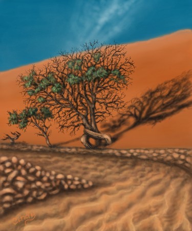
DeadlyBlondeArcher
(Mar 4, 2004)
A fair image of your description... lol
dixielandcutie (Mar 6, 2004)
dont know how i missed it, but oh man, it rocks dba. the shadow of the tree is amazing. awesome work as usual.
DeadlyBlondeArcher (Mar 6, 2004)
Thanks yall. :)
alwaysLearning (Mar 13, 2004)
Oooh, more pictures of the home of my heart! You have a real gift for rendering this kind of scene, Cindy! :) There are two points that I have to question, though, for future reference (again, not that I could do this myself, but I can tell that these two points don't look quite right -- my eye being better at this than my hands, as yet, at least).First, the ripples in the dry wash of the path seem to me to be too consistently angled, instead of following the curves of the path, the way I'd expect them to, if they were caused by water running over the mud during flood time (which is what I think of when I see that kind of image). They'd make more sense if there were a way for the water to have acted on the land outside of the path, the same way, but with the wall there, I'd expect the water to be restricted to the path more, and curve to follow it, during flash floods. Second, the tufts of greenery on the bush don't seem to have a correlary set of darker areas, within the shadow of the bush, so it looks to me like the shadow is of a bush that doesn't have as much foliage on it as this one does. These are both fairly minor points though, which I offer only in order to point out directions in which you can continue to work on advancing your work, which is already spectacular, and VERY evocative of the landscapes you've been painting. <smile> As you may be able to tell, what I've seen so far has been enough to spur me to go back through the pictures in your user board, in order to see more of these pieces! <grin> But even great artists can still grow, and I hope I've offered some useful suggestions for your consideration, here. :)
DeadlyBlondeArcher (Mar 13, 2004)
sure, always, I appreciate all the helpful suggestions. (Actually, it doesn't rain often where this was taken from and it's very windy, so I assume the ripples were caused by the wind since the sand changes rapidly - although the rain does a number on this wash when it does happen) |
| ||||||||||||||||||||||
| Public Boards/Beginner | |||||||||||||||||||||||
|
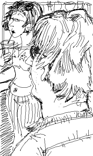
MachinaFalllal
(Mar 5, 2004)
just praticin'.
dixielandcutie (Mar 5, 2004)
oh thats pretty~ maybe smooth out the shading a bit...and sharpen up her hair. but nice work! |

| ||||||||||||||||||||||
| Specialty Boards/Contest! | |||||||||||||||||||||||
|
lilypad
(Mar 5, 2004)
ok...maybe this isn't intermediate level type stuff, but some of the other mascots aren't there, either. and you have to admit, it IS cute. ^^<this took about 40 minuets, not i minute, like the timer says. there's something messed up with it...>
dixielandcutie (Mar 5, 2004)
hehe it is that. very cute. nice work lil
marcello (Mar 5, 2004)
my eyes... the pink.
davincipoppalag (Mar 5, 2004)
hes cute lily..<see got it right that time..
lilypad (Mar 5, 2004)
davin, davin, davin...i understand the little confusion that one time. i'm not going to remember it forever(well, unless i go and read that comment over and over). thanks, though. and as for you, marcello, y0ou said it could be cool, evil, or CUTE. anything we wanted. ;P |

| ||||||||||||||||||||||
| Public Boards/Intermediate | |||||||||||||||||||||||
|
ambermac
(Feb 24, 2004)
late twenties singles
Axil62 (Mar 5, 2004)
It's always fun to see someone who can get the lines right first try seemingly effortlesly. Nice toonin lady.
ambermac (Mar 5, 2004)
thanks D. i'm sticking with sketching for now. those airbrush tools look great but take too long for my hasty style.
davincipoppalag (Mar 5, 2004)
Yea 10 minutes? you sketch well! looks like john lennon and wonderwoman on their first date!
ambermac (Mar 7, 2004)
thanks davin. eight actually. the last two minutes were an added on when i posted it twice. :) |
| ||||||||||||||||||||||
| |||||||||||||||||||||||
| 2draw.net © 2002-2026 2draw.net team/Cellosoft - copyright details - 1.62sec (sql: 38q/0.77sec) |
Emoticons are a good inspiration for that stuff