| |||||||||||||||||||||||
| Public Boards/Intermediate | |||||||||||||||||||||||
|
pandabarrie
(Jul 13, 2006)
i dont know if im going to color this or not, but whatever...im way to tired to do anything at this point...i was on the end of falling asleep while i was doing this. D= |

| ||||||||||||||||||||||
|
Meeko-the-moogle
(Jul 13, 2006)
Trying out a style for my art course, and atm, im working on patterns which is new for me since I work on potrayal and manga usually, though manga has crept into this piece but ah well.
Pseudonymous (Jul 14, 2006)
This is really good. Please finish?
Sweetcell (Jul 14, 2006)
Has a nice pencil feel to it. I did things like this when I was younger, it's a bit freeing isn't it. Finish soon.
Childlike_Vampire (Jul 14, 2006)
Ooh, I like this very much. Nice and flowy and abstract yet graspable. I really like the profile of the face. Nice picture so far!
strangeoid (Jul 15, 2006)
I think this is particularly scrumptious. Sometimes, art projects bring out just the right kind of inspiration. The eye and the hair are particularly lovely. |

| ||||||||||||||||||||||
| Public Boards/Beginner | |||||||||||||||||||||||
|
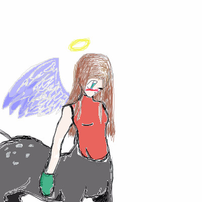
pray4love
(May 23, 2006)
it took a while, but i finally DID IT! mozl tov (<--i dont kno how to spell it) This was sorta based off.. nothing... no reference and no idea at all. i just sketched out a girl, and then a horse body too. strange how that happens... ENJOY!!!
pray4love (Jul 11, 2006)
she's tilting her head down, and i didn't want the wing to look realistic. i drew her how i draw other centaurs, and this is the actual clean one. if you saw my 'wolf', that was the first time i was on here, and it sucks big time. i am a beginner with the computer, but i am alot better by hand. i just dont have a scanner, and i haven't been on long enough to practice with bigger things... sorry. :\
wboyer (Jul 11, 2006)
You may say she's tilting her head down, but it still doesn't look proportional.And really, there's not much of a difference between drawing online and on paper. So please, quit the excuses and grow up. Was I ever this whiney? Geeze...
pray4love (Jul 13, 2006)
you lack teh creativity! you suck! i at least have an imagination! and a sense of humor!
Sweetcell (Jul 14, 2006)
Lord, P4L I'm not being a bitch, really, but if you keep insulting people like this for a few things they say your not going to make a good impression. Wboyer is right, the face does need work. Make the eyes smaller and higher on her head, and the lips smaller and just go over the hair with a solid color on low low opacity to get more of a difference of shading. Note, it's a good picture, much improved but learn to take the crtique as suggestions, not a means of putting you down. |
| ||||||||||||||||||||||
| Public Boards/Intermediate | |||||||||||||||||||||||
|
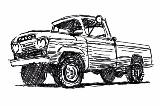
Axil62
(Jul 13, 2006)
feelin the pen tool today
DeadlyBlondeArcher (edited Dec 1, 2006)
~
Natsuna (Jul 13, 2006)
Well my dad was born on friday the 13th xDDBA: C: That's amazing to me how he kept it so long xD scince I really don't have any cars here that last awhile, They always seem to Break-down..My dad "attempts" to fix it too :D
DeadlyBlondeArcher (edited Dec 1, 2006)
~
Sweetcell (Jul 14, 2006)
dats pweedy pen werk. |
| ||||||||||||||||||||||
| Public Boards/Beginner | |||||||||||||||||||||||
|
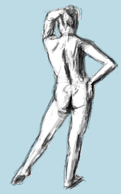
frootcake
(Jul 13, 2006)
1. As you begin to draw, concentrate on the simple lines that suggest gesture - the angle of the shoulders, the thrust of the hip, the curve of the spine, the position of the legs supporting the weight - and indicate these quickly, and decisively (about 12mins should do if you're a n00b like meh)2 Develop the solid form of the figure and indicate the shadow side with tone (15minutes) 3 Finally, strenghen the total drawing to emphasize the gesture as well as the form. you can do it toooo :)
Violette (Jul 13, 2006)
Lovely.
HunterKiller_ (Jul 13, 2006)
Nice stuff.
Sweetcell (Jul 14, 2006)
Good tute. |
| ||||||||||||||||||||||
|
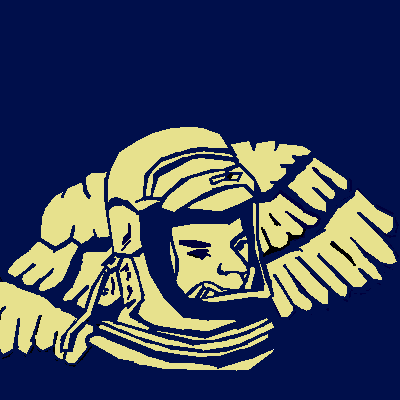
Hikaru~No~Go
(Jul 13, 2006)
Im new.Please comment my drawing,i dont care if its negitive or positive i just need to hear a comment on how i did
enamoredumbass (Jul 13, 2006)
pretty good linearti love the design i hope to see you clean it up and make everything more even.the wings look a little off take care
TaCO (Jul 13, 2006)
Looks really cool in the thumbnail.Is he a fireman???
diablo_fan (Jul 13, 2006)
im digging this alot keep it up as derrick would say draw more pictures lol
Sweetcell (Jul 14, 2006)
Looks like a poster from the 60's about the first Cosmonaut. Yes by all means keep it up. And welcome Hikaru. |
| ||||||||||||||||||||||
| Public Boards/Intermediate | |||||||||||||||||||||||
|
Axil62
(Jul 13, 2006)
It's a cow you STUPID SON OF A BITCH!!
DrsFan (Jul 14, 2006)
awww cute wittle cowy.
davincipoppalag (Jul 14, 2006)
It's udderly ridiculous
Sweetcell (Jul 14, 2006)
I wanna say the "Got Milk" thing here since no one else did... Oh I just did.
Childlike_Vampire (Jul 14, 2006)
Very bouncy, I like the swishy lines. |

| ||||||||||||||||||||||
|
Dromophobic_o.o
(Jul 12, 2006)
DETAILS X_x
nekodesu (Jul 13, 2006)
I really love this. The whole mood of it is great. What can I say, I'm a sucker for Nightmare Before Christmasish pics. :P
Natsuna (Jul 13, 2006)
:0 Holy craappp I didn't even think you drew this xD It's Freakin Amazing Amandaa, And it Reminds me of Nightmare before christmas :D So I really like it, Well I agree with Nekodesu
Dromophobic_o.o (edited Jul 14, 2006)
Hahaha honestly if i saw this out of random i wouldnt think ive drawn it either.i doubt that made any sence. D:. and i wasnt even thinking of that movie when i drew this. i guess it does cuz it has that tim burton look i suppose. lol. jeez.
Sweetcell (Jul 14, 2006)
Well this is different from you, love it absolutely, so dark and menacing, yet pleasing to the eye. |

| ||||||||||||||||||||||
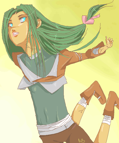
|
Garnet
(Jul 11, 2006)
Haven't drawn in a while and I plan on doing it seriously tomorrow, so I must warm-up! Jeez, feels like it's been ages...Also, if you would, I need critique badly. I've never done perspective before, and I'd really like to get better at it. Thanks for the help! :D
hideyourface (Jul 14, 2006)
well yeah, that and the flat looking body, the giant neck, and the large forearm. Where the legs are now make it seem as if the upper leg is much too short, and the lower is much too long.
Garnet (edited Jul 14, 2006)
Yes, with that I agree... both the legs are off in terms of what the human body is capable of... There's no way to bend them like that, or for them to be that high... OK, thanks a lot, Gigandas! I really appreciate it! n____nAh, the neck, I didn't even notice! T__T Thanks, though!
hideyourface (Jul 14, 2006)
well yeah, that and the flat looking body, the giant neck, and the large forearm. Where the legs are now make it seem as if the upper leg is much too short, and the lower is much too long.
Sweetcell (Jul 14, 2006)
But how do you suggest on changing it hide, that's what she's asking.For me it's the arm. I assume it's pushed behind her? Though it would be smaller to show distance it's far too small. It needs beefing up. From the shoulder to her elbow to her wrist. It would taper as it gets farther back but the way it is now it seems too... sticklike. Especially in comparison to the rest of her body. Thicken it up a bit (including her hand,) and I think it'll be alright. As for her legs both fore legs need to be lowered. As it is now the thighs would only be half as long then they normally would be. If we saw her knee it would be near the blue of the Description strip window. We'd only see a bit of her left leg. We would see the whole of her right leg. It needs to be shortened, only half the calf showing, in the perspective her right boot would look shorter than her right because of the angle. And as for her chest, even flat chested there would be a suggestion of form by way of the shoulder, curving out to where the chest is, then of course curving to the stomache. (I hope that makes sense.) Best ref's to use I think are cliff jumpers or sky divers. They come closest to bending like this. I hope you take it as suggestions. Overall it's a great composition and you'll know what to do on your next piece. In art it's an ever growing process of learning and bettering yourself. Just don't change the colors. They're like a wonderful eye candy. *<>* |
| ||||||||||||||||||||||
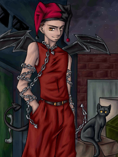
|
Juni_gatsu
(Jul 4, 2006)
Sometime i wish i had a scanner so that i could just do avi art on paper
Sweetcell (Jul 10, 2006)
This is beautiful. I love the chains and the cat and the folds... well I love everything. Don't be discouraged, it's some of the best anime art on here.
davincipoppalag (Jul 11, 2006)
Really well done!
DrsFan (Jul 14, 2006)
i have no idea why only 3 (now 4) people commented on this!
101_Torchic_101 (Jul 14, 2006)
(^u^) Wow! This is really nice! I always loved how you color your pictures. (i also love gaia, lol) |
| ||||||||||||||||||||||
| |||||||||||||||||||||||
| 2draw.net © 2002-2025 2draw.net team/Cellosoft - copyright details - 3.52sec (sql: 36q/2.75sec) |
And how much more stunning it looks now. Bravo panda. It's like the clouds are his wings.