| |||||||||||||||||||||
| Specialty Boards/Elite Bastards | |||||||||||||||||||||
|
Amityville
31 comments
– latest 4:
laurael (Oct 28, 2005)
I totally second that, Sin...wonderful idea!
sincity (Oct 28, 2005)
Move the pic into photoshop, or a different art/photo manipulation program and you can analyze its color Cindy. :} I still love it. :}
DeadlyBlondeArcher (edited Jan 1, 2006)
I have photoshop, recently, but I haven't figured out how to use it yet... I'm too lazy (and it's hunting season lol)... and I hate all that technical stuff. Thanks all for the tips, though. Maybe someday I won't be too blonde to use them. ;)
SYTHE (Dec 11, 2005)
That's one spookie house...great job. I think a faint silouette of trees with a orangish yellow tint to the sky might add a sense of dept to the otherwise outstanding picture. |

| ||||||||||||||||||||
| Public Boards/Intermediate | |||||||||||||||||||||
|
SYTHE
(Dec 8, 2005)
She has the Mark!
DeadlyBlondeArcher (Dec 8, 2005)
I love your flesh tones, they are just yummy looking. (ewww, no tatoos for me, I think they're tacky with a capital T... nasssty)
kristine (Dec 8, 2005)
lol
DinoFlorist (Dec 9, 2005)
is that the neck line leading to cleavage? Or the small of a back leading to the crack? It really could be either, it's like a Rorschach test to see what you like more!
SYTHE (Dec 9, 2005)
DinoFlorist, I noticed that also after I had already posted it. Funny how that works out. |

| ||||||||||||||||||||
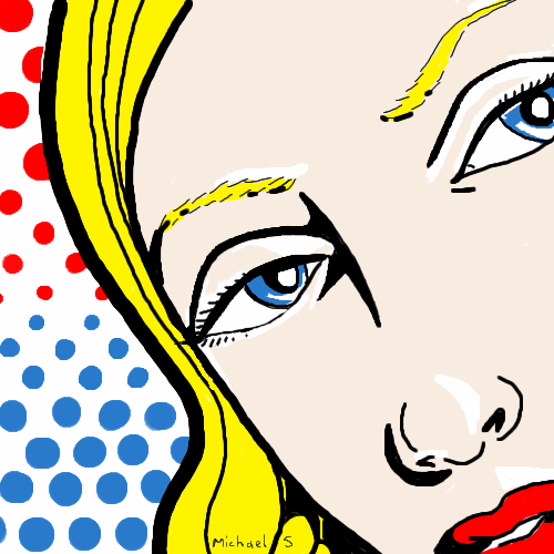
|
mx
(Dec 1, 2005)
wanted a pop art feel
Caddris (Dec 2, 2005)
Well, you certainly acheived a pop art feel. Very Warhol-esque.
woah_pockster (Dec 4, 2005)
THERE YOU GO. I was scratching my brain for that name. Warhol. :D <3
Zack (Dec 4, 2005)
not so much warhol as roy lichtenstein, I'd say.
mx (Dec 7, 2005)
thanks guys (and gals)*blush* |
| ||||||||||||||||||||
| Public Boards/Advanced | |||||||||||||||||||||
|
SYTHE
(Dec 6, 2005)
Captain America- I used my action figure to draw it. (the scales were tough)
sketcher2005 (Dec 6, 2005)
this is so nice, i love the line art.... i know having my opinion much not mean much to you but anyway.... its good!
hideyourface (Dec 6, 2005)
those muscles look more like some kind of growths.
SYTHE (edited Dec 6, 2005)
I appreciate everyones comments and suggestions. Thanks for your support.
kristine (Dec 6, 2005)
i really like the face structure! so distinct :) |

| ||||||||||||||||||||
| Public Boards/Intermediate | |||||||||||||||||||||
|
Axil62
(Dec 2, 2005)
nylon
woah_pockster (Dec 3, 2005)
rofl <:D <3 <XD
SYTHE (Dec 3, 2005)
MY GAWD, that must get pretty messy when he has to do #2.... great job.
kristine (Dec 3, 2005)
lol very creative XD
HunterKiller_ (Dec 3, 2005)
Cool selfportrait. |

| ||||||||||||||||||||
| Public Boards/Beginner | |||||||||||||||||||||
|
101_Torchic_101
(Dec 2, 2005)
(^.^) Bakura's embarassed..Or he likes it..(i just had to draw yu-gi-oh/yaoi/shonen-ai again!)..(bakura: y-you're not a dog, stop licking my face.)
SYTHE (Dec 3, 2005)
MMMMMM..(lick)...MMMM..(Slurp)...huh, oh, Sorry I was just dreaming about licking an Ice Cream Cone. Man, I'm so hungry.
101_Torchic_101 (Dec 3, 2005)
lol
Sasuke-fan-Sapphire (Dec 3, 2005)
XD hahaha! that's so cute! Bakura looks adorable blushing X3
101_Torchic_101 (Dec 3, 2005)
(^.<) Thanks |
| ||||||||||||||||||||
| Public Boards/Intermediate | |||||||||||||||||||||
|
5 comments
– latest 4:
SYTHE (Dec 3, 2005)
I like it alot. Very original. I like it alot!
lycene (Dec 3, 2005)
Very cool. I love the textures and shading.
kristine (Dec 3, 2005)
the background is really cool. i like the way you shaded everything good job :)
Punky (edited Dec 3, 2005)
I'm in love with your style. :) Can't wait to see more, the colors and style are great. :D |

| ||||||||||||||||||||
| Public Boards/Beginner | |||||||||||||||||||||
|
GundamWing
(Dec 2, 2005)
Ref. for the plane and postion from a comic book.
friend (edited Dec 2, 2005)
Jeez! Beatiful! Splendid! Gorgeous! This really gives an amazing effect! It seems like im flying right now! Merry Christmas!
davincipoppalag (Dec 2, 2005)
You do good airplanes!.. Nice sense of motion
GundamWing (Dec 2, 2005)
Thank you, It would be good, if I didn't have a Ref., but artist block infects me. The good thing is its easier to draw this type of plane without a Ref. now.
davincipoppalag (Dec 2, 2005)
Notbing wrong with using a reference. |

| ||||||||||||||||||||
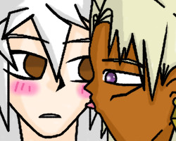
|
101_Torchic_101
(Dec 1, 2005)
(^_^) This is so pretty! Anyways, She's my Red Shoyru named after one of my favorite Legend of Zelda characters.
kristine (Dec 1, 2005)
so you like zelda, i see with the whole din thing. you should try to stray away from the line tool.
SYTHE (Dec 1, 2005)
Very sharp and clean. It looks great!
kitty25 (Dec 2, 2005)
wow like the colors! and great pic!
101_Torchic_101 (Dec 2, 2005)
Thanks. |

| ||||||||||||||||||||
|
GundamWing
(Dec 1, 2005)
3 Vf-1 Veritech fighters, trying deferent techniques for coloring and outlining
friend (Dec 2, 2005)
WOW! beatifuL! splendidspectacular!
darkshadow (Dec 2, 2005)
Really wow I really like it when you do these Think you should have done this in intermediate and drawn them a little bigger so the details stand out a little more Great clouds and this is wonderful robotech and macross I think that I will watch them this week end ;P
marcello (Dec 2, 2005)
impressive, what kind of ref?
GundamWing (Dec 2, 2005)
Thanks...V.3 I shaded the bottom of the planes more than I wanted. Ref. for the planes postion and BG. is from a page in a Robotech comic book " From the Stars " with a few changes. |

| ||||||||||||||||||||
| |||||||||||||||||||||
| 2draw.net © 2002-2024 2draw.net team/Cellosoft - copyright details - 0.77sec (sql: 34q/0.39sec) |