| |||||||||||||||||||||||
| Public Boards/Beginner | |||||||||||||||||||||||
| 8 comments – latest 4: |
| ||||||||||||||||||||||
|
4 comments
– latest 4: DONE Yup.
RabidMalikFanGirl (Nov 21, 2003)
Oooooo. Going semi-shirtless ^^ Your coloring is getting REALLY good!!!
RIKG (Nov 30, 2003)
Woaw Really nice, I agree with safescene. Very sexy. =P
STAR_WARRIOR (Dec 9, 2003)
Awsome. The shading rocks.Your really good at drawing. |

| ||||||||||||||||||||||
| Misc. Boards/Sprites | |||||||||||||||||||||||
|
haruko_ryuu
(Nov 16, 2003)
hey its mario. you cant go wrong with mario...or can you?
RIKG (Nov 16, 2003)
Mario!! And the star!! This is very nice,. I love mario.! =P
RabidMalikFanGirl (Nov 18, 2003)
Badadadadum Badadadadum BadadadadaDA da, ba-dadudadadadmu badadadaoUm... Yes... Kawaii mini! *hugglez the mushroom* |
| ||||||||||||||||||||||
|
RIKG
(Nov 16, 2003)
I havent drawn here in a long time, so I made a new icon! |

| ||||||||||||||||||||||
| Public Boards/Intermediate | |||||||||||||||||||||||
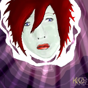
|
Knockoff
(Nov 15, 2003)
Long neck, big ears, yup I spot a dork. =)Darn watercolors *kicks them in the trash* They were not working, as you can see its almost solid, and blur didnt work either, I think by making it smaller it will look better. Nope. *sigh*
quintessence (Nov 15, 2003)
Damn scary ears. o_o;
Zinc (Nov 15, 2003)
I hope you know that you just discriminated everyone who has big ears and a long neck. ;pP.S. What're those lines under his arm for?
JesusFreak89 (Nov 16, 2003)
Cool hair though...
RIKG (Nov 16, 2003)
Lmao. X)Very funny. He is pretty cute for being a dork though. =P I think the thing under his arm is like some wrinkles or something. |

| ||||||||||||||||||||||
| Public Boards/Beginner | |||||||||||||||||||||||
|
Knockoff
(Nov 15, 2003)
Its blue, and spits out bullets, what else is there to say?
RIKG (Nov 16, 2003)
Weird. Very weird.But.. None the less cool.! The bullets(fire) Is very nice. I love how you did the KO.! Nice! |
| ||||||||||||||||||||||
|
dangerous_punk
(Nov 14, 2003)
Thats right the food will eat you some day wether you like it or not read what it says on the bottom of the pic
ky (Nov 14, 2003)
Better, my friend. That food looks ghastly.
Gothic_Otaku (Nov 16, 2003)
The arms are slightly too short, and she overall looks very stiff. The coloring could be cleaner, and some shading would be nice. Don't worry, you'll get better with practice.
RIKG (Nov 16, 2003)
This style reminds me of someone that got banned here. *hmmm.*
Harmanye (Nov 16, 2003)
*giggles* Hmm. Anger management Dangerous_punk?Yes Gothic, do "Shout up"; T'is superior to shouting down. Typos are not cool. But she (=gothic) is right, this could stand some improvement. Though the food is rather -vicious- looking, which is good. Like I said on your other picture, shading is good, it makes a picture better, and more worthwhile. Oekaki shi-painter has a wonderful tool called the Pen. Take advantage of its majestic line-art superpowers. K? ^_^ The food also has cute feet. Also I would suggest, maybe, starting out with smaller images and then working your way up through the sizes. But you know, wh'ever. Maybe I shouldn't mention this but, It doesn't seem like you are using layers, because with layers you wouldn't need that ugly white line next to the food/monster/thing. I won't explain layers because I'll mix it all up; it would be better for you to ask someone else ^_^;; Also the breasts seem a little... freaky. That's really one heck of a bra she's got on and I would ask for a refund of the purchase price if I were her. I'm also agreeing with RIKG. Deja vu. *shrugs* I've got a suspicious nature. But I do applaud you for spending over half an hour on this. ... *applause* *shuffles away with a cheery wave* |

| ||||||||||||||||||||||
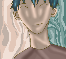
|
Knockoff
(Nov 13, 2003)
I Felt sick this morning so Im not at school right now, *snif**cough* Done now,.
Knockoff (Nov 13, 2003)
This is just a realism practice for the "Face". =/
marcello (Nov 13, 2003)
so you spent half an hour on the face, and 40 minutes on the hair. practice for realism. did you use a reference? I highly recommend looking at some real eyes and noses. (mouth seems alright although a little rough on the outline)But also for hair. Despite popular belief, hair does not grow like a rose-branch. mazi posted a nice tutorial on hair, and it doesn't hurt to look at it. you gotta get away from the notion of anime when one tries realism. traditionally you'd learn realism first, then move onto stylized forms such as anime/manga...
jord (Nov 13, 2003)
its not that bad...i like it when you do other stuff than your usual...but idd the nose needs some workabout the tutorial...hm, where is it? i've been waiting for tutorials quite a while now (okey, i should just search some on google) but i always get: The specified article cannot be found
RIKG (Nov 16, 2003)
Pretty hair! Very nice over all,. The background is a nice touch. |
| ||||||||||||||||||||||
|
Knockoff
(Nov 10, 2003)
This was very fun! I like this. As you can see here arms are in her hoodie sweatshirt thingy. |

| ||||||||||||||||||||||
| Public Boards/Intermediate | |||||||||||||||||||||||
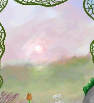
|
Knockoff
(Nov 6, 2003)
Its a little crusty ;) Well Anyways I havent drawn In A while so im a little rusty.So yea.
RIKG (Nov 16, 2003)
Very pretty, I love the sun! The vines and the purple flowers are a nice touch. ^^ Great job!
Ari (Nov 22, 2003)
'Tis pretty :) The watercolour-y effect ish awesome.Isn't "Another Day" a John Lennon song? *searches hard drive* I think so...
Knockoff (edited Nov 26, 2003)
Thank you Ari! Yes I do believe there is a song by john leenon, Im not sure though. |
| ||||||||||||||||||||||
| |||||||||||||||||||||||
| 2draw.net © 2002-2024 2draw.net team/Cellosoft - copyright details - 0.17sec (sql: 31q/0.06sec) |
Really nice.
THe shading is awsome.
Great job KO.