
|
| |||||||||||||||||||||||
| Public Boards/Intermediate | |||||||||||||||||||||||
|
Roytje
(Aug 20, 2007)
:) |
| ||||||||||||||||||||||
|
JillJJ
(Aug 28, 2007)
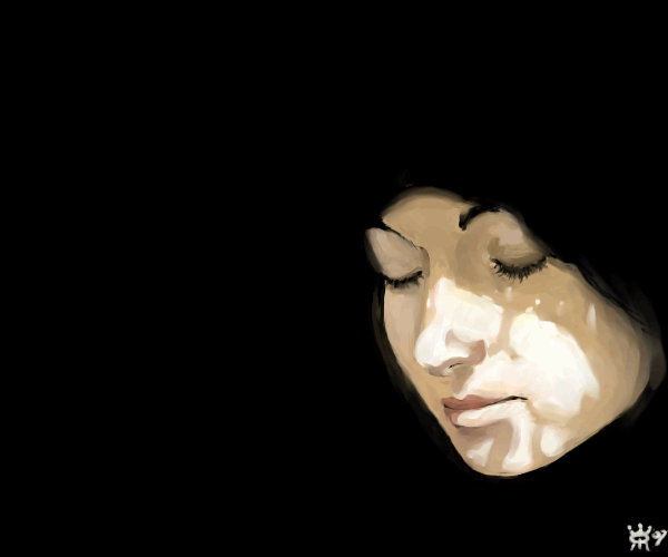
The place was tsavo, translated, the place of slaughter, where hundreds of workers fell prey to two demon lions
Pantera (Sep 1, 2007)
Very nice, I like the colours you used here, well done :)
JillJJ (Sep 1, 2007)
Thanks Helena, I appreciate your comment and love your work. Jillj
Haruki (Sep 1, 2007)
tHIS IS REALLY PRETTY.
JillJJ (Sep 1, 2007)
Thank you Haruki! It was an amazing visual in a show I was watching, the colors intrigued me. Thanks again, Jillj |
| ||||||||||||||||||||||
| Public Boards/Advanced | |||||||||||||||||||||||
|
7 comments
– latest 4:
Wraith (Aug 31, 2007)
:O Nice!
Belldandy (Aug 31, 2007)
Thanks all :D
Miss_DJ (Sep 4, 2007)
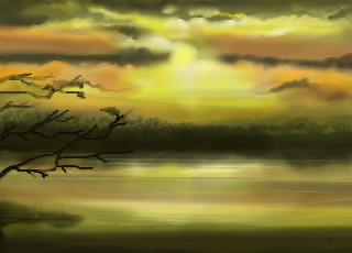
the number 4 stands for angels...444...angels, angels, angels...so that must be where this bus is headed..but I digress.. nice draw altogether!
solo_mob (Sep 9, 2007)
i like the background you've created. It's like you redesigned that spiral blur from the reference photo. |

| ||||||||||||||||||||||
| Public Boards/Intermediate | |||||||||||||||||||||||
|
7 comments
– latest 4:
schadenfreude (Mar 18, 2007)
Lollypop Girl! Was she chillin' at Red Robin in the earlier versions? I like it. A lot. Yeah... Didn't like the old picture.
senshi (Aug 30, 2007)
I liked the other hair more, but this is cool too.
PS (Aug 31, 2007)
very good lineart and coloring, nice job. |

| ||||||||||||||||||||||
| Main Forums/The Post Board | |||||||||||||||||||||||
 |
DeadlyBlondeArcher (Aug 30, 2007)
I was born. Today is my birthday. The only thing I'm proud about my birthday is that I share it with the 1964 1/2 mustang. I always wanted one. I never put it in my profile and never brought any attention to it... I didn't want any, (surprise, surprise... even with my self-centered narcissistic personality) Today, however, I feel like I need attention, so I'm asking for it. I have decided to turn 3 instead of 43. When I tell people how old I am I put up the awkward four fingers and brin...
22 comments
|
||||||||||||||||||||||
| Public Boards/Intermediate | |||||||||||||||||||||||
|
DoOp
(Aug 30, 2007)
the music...?
DoOp (Aug 30, 2007)
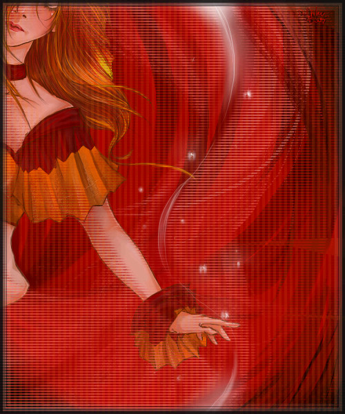
lole, the texture was there to hide some bad/cheap erasing i did XD... I couldn't erase the picture good enough for the red background i wanted @___@;;;lole thanks for the comments! :D <33
deathking (Sep 1, 2007)
How is everything you draw so lovely, I wish I knew how you got your lines so smooth.
Wraith (Sep 1, 2007)
Beautiful!
JillJJ (Sep 1, 2007)
This is really great... the colors are beautiful and your drawing is excellent! Jillj |
| ||||||||||||||||||||||
|
patienceisoverrated
(Aug 28, 2007)
The things you tried to kill, i found a way to grow
Punky (Aug 30, 2007)
My favorite part is the circles on her skin. This is just plain cool.
PS (Aug 30, 2007)
Really nice peice of art, as all you're work is.
pokey (Aug 30, 2007)
yay for stippling, the facial expression adn body language is great. niiice workk. just a little side note: it would be a little better if the skeleton was more defined (on my monitor the colours muddle up, so it's just probly my problem...) but you know, that's up to you. just a suggestion. :)
shell (Apr 7, 2010)
awesome |

| ||||||||||||||||||||||
| Public Boards/Beginner | |||||||||||||||||||||||
|
Pantera
(Aug 22, 2007)
Can not make a decent tree, now am out of space anyway:( I give up, hope you guys like it anyway.
davincipoppalag (Aug 22, 2007)
Nice looking silhouettes so far, good one Help!!!!!! How can I make this drawing look better? I can not make a decent tree or even a cactus :(
grrrrrrrrr
Arique (Aug 30, 2007)
Hehe, you totally could use my tree! |

| ||||||||||||||||||||||
|
sweet_insanity
(Aug 21, 2007)
i'll wake up tomarrow missin you. i feel empty and and torn. i need to feel you next to me but when you're here reality is all too present. i came the closest to what i thinkreal love was, but you're toxic, and i'm broken. i wish tomarrow wouldn't come, i wish today hadn't either...
davincipoppalag (Aug 21, 2007)
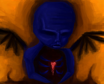
I really like this too, it does look like something zep might do
PS (Aug 22, 2007)
Interesting drawing, I like the colors.when you walk away i count the steps you take, can you see how much i need you now?
when you're gone, the pieces of my heart are missing you when you're gone the face i've came to know is missing too when your gone the words i need to hear to always get me through the day... and make it ok... i miss you.
Wraith (edited Aug 23, 2007)
Looks almost like Clive Barker's Visions of Heaven and Hell drawings. Loving that Blue character. |
| ||||||||||||||||||||||
| Public Boards/Intermediate | |||||||||||||||||||||||
|
Sweetcell
(Aug 22, 2007)
So simple even Fred Flintstone can use...... hmmm, ok, maybe not.Modified from this. Scroll down a bit to see. I just though it'd be easier for me to put the (I can only think it's the hard drive and the CD rom) into a tower. Rock tower. And hey, I think even then they'd have rock towers to protect the delicate equipment. K, I'm full of shit. It was just hella easier.
fleeting_memory (Aug 23, 2007)
Great picture! I like your computer better than the references definitely. I hate those Gieco commercials-ug.
Miss_DJ (Aug 24, 2007)
oh too funny Barb! cute!
foxfiresaint (Sep 10, 2007)
Random hello..i like the picture you did a good job. A+ yeah ...how have you been lately?
shell (Apr 7, 2010)
cool |

| ||||||||||||||||||||||
| |||||||||||||||||||||||
| 2draw.net © 2002-2026 2draw.net team/Cellosoft - copyright details - 3.45sec (sql: 41q/2.27sec) |


Heh *embarrassed*