|
| |||||||||||||||||||||||
| Public Boards/Intermediate | |||||||||||||||||||||||
|
Rudeezy
(Aug 26, 2007)
!NOTICE: The scribbly look is just a style i think is cool and I wanted to try it. The image will look best as a thumbnail.heavily inspired and referenced from this. I really enjoy this commercial, even if it does seem a little lame. But hey, this is a REALLY old commercial. The commercial was for a game called "Mother". go check it out. |

| ||||||||||||||||||||||
| Public Boards/Advanced | |||||||||||||||||||||||
|
PS
(Sep 18, 2007)
creation?
Wraith (Sep 19, 2007)
Hmmm.. The originality of it is great! Whatever this picture is about, I like it.
PS (Sep 19, 2007)
Thanks, Lori and Wraith.
davincipoppalag (Sep 19, 2007)
This one is really original and well done Paul!
Miss_DJ (Mar 29, 2008)
LOVE this ...sorry I missed it when you originally posted it! |

| ||||||||||||||||||||||
| Public Boards/Intermediate | |||||||||||||||||||||||
|
Belldandy
(Sep 19, 2007)
...
PS (Sep 19, 2007)
I like the reflection, nice work so far.
davincipoppalag (Sep 19, 2007)
Looks a good start here Katya. Nice perspective |
| ||||||||||||||||||||||
|
Roytje
(Sep 16, 2007)
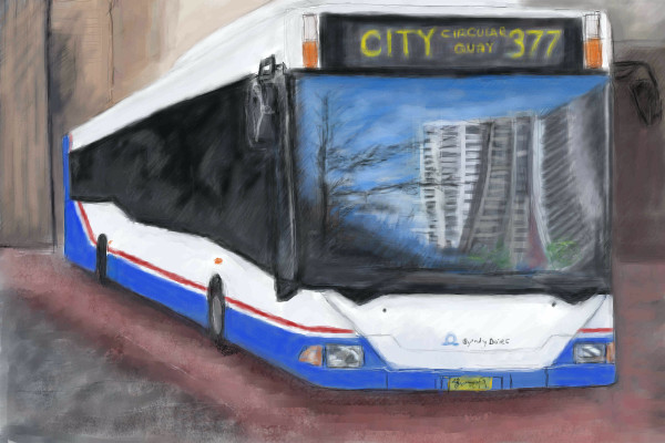
Poor ladybug didn't feel happy in the green world.
PS (Sep 18, 2007)
I liek it, nice work.
staci (Sep 18, 2007)
hrmm..i liked it before the spider..hes takes away from the mood that was there before. I think you were right, Staci :)
fleeting_memory (Sep 20, 2007)
don't jump little lady bug! I like it. |

| ||||||||||||||||||||||
|
dark_angel
(Sep 17, 2007)
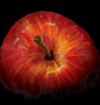
i couldve done more to this but i'm gettin tired
davincipoppalag (Sep 17, 2007)
Great textures and colors. Looks good
Rakugaki (Sep 18, 2007)
WHOAreal good, I 'specialy love the shading!
PS (Sep 18, 2007)
Looks very apple like, nice job on this.
JillJJ (Sep 19, 2007)
Beautiful colors to this, also excellent! Jillj |
| ||||||||||||||||||||||
|
Rakugaki
(Sep 17, 2007)
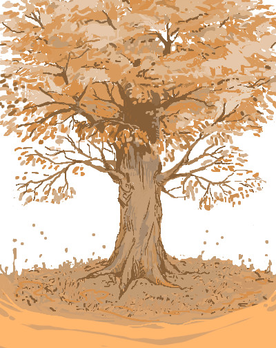
Hahaa this is SO random, I suddenly felt like trying to draw a tree.I know it's far from perfect, but it's probably one of the best trees I've drawn so far.
Anna (Sep 18, 2007)
Oh yes, I think it should be a contest entry too! :D
Buu-dai (Sep 18, 2007)
That's an excellent illustration.wowI love the colors
Rakugaki (Sep 18, 2007)
whoa thanks for all the comments o_o;!I had no idea it'd get this popular...;;
safescene (Sep 18, 2007)
this is really beautiful; I wanna sit under the branches. I'm going through a tree phase, too. |
| ||||||||||||||||||||||
|
Sufiroyce
(Sep 16, 2007)
Finish later
davincipoppalag (Sep 16, 2007)
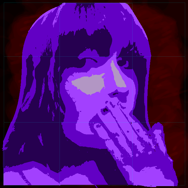
I don't know what they call this style, but I always thought it was cool looking. Lost the ref, it sucks!
Rakugaki (Sep 17, 2007)
This makes me yawn! Haha, I'm not saying it looks boring, but it looks like she's yawning and that makes me want to do so too.Nice!
PS (Sep 18, 2007)
Nice color choice, I like the style. |
| ||||||||||||||||||||||
| Specialty Boards/Contest! | |||||||||||||||||||||||
|
Arique
(Sep 9, 2007)
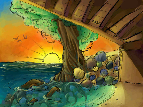
Contest Entry! Finished at 11:37!
Roytje (Sep 15, 2007)
The underwater part is beautifull done! :)
davincipoppalag (Sep 15, 2007)
Great entry!
Wraith (Sep 15, 2007)
Hey great style on this one! Some part of me wants to clean up those lines, the other part says that those lines accent the picture. I don't know. Good job though!
Pantera (Sep 15, 2007)
Very nice love those rocks :) |
| ||||||||||||||||||||||
|
Hokori
(Sep 11, 2007)
'A fair display, my dear gal.'Can you guess what this picture represents? No one's wrong, though, 'cause art is such a target for individual interpretation. after all. Update: Now that I'm done, I guess I'll tell you (though it is rather obvious). It is the paradise brought through salvation! Sleepy time!
Hokori (Sep 15, 2007)
Thank you, Kloxy. You're a sweetheart. :)
Shanghai (Sep 15, 2007)
Congratulations Hokori, "Zenker's Degeneration" is awarded first place for Contest Week 60: Paradise.I think what I like most about this is that it doesn't even need a description or a title. The picture can stand alone and tell the viewer the same story or a similar story through the symbols. There's a self contained narrative here that shows us a past, present, and future. Aesthetically it's very interesting. There's everything from pure black to pure white to various intense colors, but you avoided overpowering us by being very selective about how much of each of these colors to use and by balancing the composition with some amounts of similar colors in other places. For example, the bright red of the neck is balanced by the same red in the devil's face. The surreal perspective works well for the story-telling aspect as well.
Shanghai (Sep 15, 2007)
I dun know ¿o_o?Kloxboy said he'd handle it though, so I guess he'll memo you. |

| ||||||||||||||||||||||
| Public Boards/Intermediate | |||||||||||||||||||||||
|
shalalaheartattack
(Sep 14, 2007)
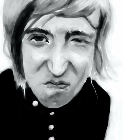
I do listen to this band.Back to Shi-Painter. I love his face. This is what it looks like when I actually try.
PS (Sep 14, 2007)
Good job on this, I like it alot, I also listen to this band once in a while, they have some good stuff.
patienceisoverrated (Sep 14, 2007)
His expression is pretty awesome.
davincipoppalag (Sep 14, 2007)
Cool looking sneer you made!
shalalaheartattack (Sep 15, 2007)
Thanks guys. (I love getting comments from talented people. They thrill me.)Sometimes I stand in front of the mirror and try to make that face, and it's not half so easy as Mr. Avary makes it seem. I'd like to send him a letter asking him to reply in detail, step by step, exactly how he does it, because I think it would come in handy from time to time. But I digress. |
| ||||||||||||||||||||||
| |||||||||||||||||||||||
| 2draw.net © 2002-2026 2draw.net team/Cellosoft - copyright details - 2.23sec (sql: 40q/1.20sec) |


drawn in 47 min
drawn in 1 min