| |||||||||||||||||||||||
| Main Forums/The Post Board | |||||||||||||||||||||||
 |
DeadlyBlondeArcher (Aug 30, 2007)
I was born. Today is my birthday. The only thing I'm proud about my birthday is that I share it with the 1964 1/2 mustang. I always wanted one. I never put it in my profile and never brought any attention to it... I didn't want any, (surprise, surprise... even with my self-centered narcissistic personality) Today, however, I feel like I need attention, so I'm asking for it. I have decided to turn 3 instead of 43. When I tell people how old I am I put up the awkward four fingers and brin...
22 comments
|
||||||||||||||||||||||
| Public Boards/Intermediate | |||||||||||||||||||||||
|
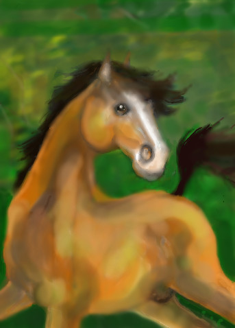
Derby hopeful
JillJJ
(Jul 13, 2007)
Thoroughbred
davincipoppalag (Jul 23, 2007)
It's pretty Jill but you might want to make thinks sharper a bit
JillJJ (Jul 24, 2007)
Thanks to both of you! I love the feedback and will work your suggestion, Dave, into my next peice. Thanks again! Jill
PS (Jul 24, 2007)
The head looks really nice, the body could use a little more work. But I like it.
foxfiresaint (Sep 10, 2007)
SOoo pretty you draw well too you know >.> |
| ||||||||||||||||||||||
|
Miss_DJ
(Aug 12, 2007)
...
Dr.Moony (Sep 7, 2007)
Yeah cool textures.
PS (Sep 8, 2007)
This is so neat, I like it alot.
Miss_DJ (Sep 9, 2007)
I appreciate your comments! thank you! :o)
UnWanted (edited Sep 9, 2007)
This does look really trippy and fun.. 2.3 MB file size makes some nice detail thereedit* I see a go-rilla screaming at me |

| ||||||||||||||||||||||
| Public Boards/Advanced | |||||||||||||||||||||||
|
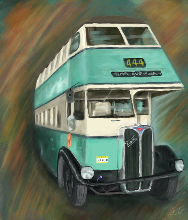
7 comments
– latest 4:
Wraith (Aug 31, 2007)
:O Nice!
Belldandy (Aug 31, 2007)
Thanks all :D
Miss_DJ (Sep 4, 2007)
the number 4 stands for angels...444...angels, angels, angels...so that must be where this bus is headed..but I digress.. nice draw altogether!
solo_mob (Sep 9, 2007)
i like the background you've created. It's like you redesigned that spiral blur from the reference photo. |
| ||||||||||||||||||||||
| Public Boards/Intermediate | |||||||||||||||||||||||
|
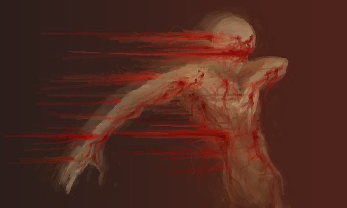
Kloxboy
(Sep 7, 2007)
right, honey?
davincipoppalag (Sep 7, 2007)
Damn.. that is such a powerful idea! She must be lettin' him have it!
PS (Sep 8, 2007)
This is very powerful, nice work.
fleeting_memory (Sep 9, 2007)
whoa. Really well executed-I like it. |
| ||||||||||||||||||||||
|
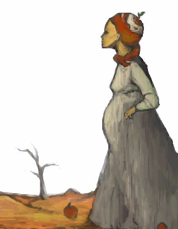
lsvr
(Sep 4, 2007)
rng
PS (Sep 4, 2007)
Nice composition, another creative piece of work. I like it.
davincipoppalag (Sep 4, 2007)
Very interesting style. Simple but sort of middle ages looking kind of picture
backmagicwoman (Sep 5, 2007)
Very lovely. I have this book called ..Mermaid tales from Around the World...and this reminds me of the illustrations in it. |
| ||||||||||||||||||||||
| Public Boards/Beginner | |||||||||||||||||||||||
|
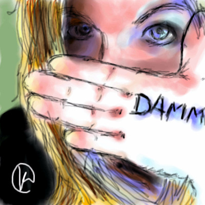
Hotaru-chan
(Sep 2, 2007)
Since all of the pictures on my user board are anime pictures, I decided to add my first oekaki'D realistic attempt. :DI wanted to google "Dammit" so I could draw a picture of some one's face going like -> U8< , but I saw this picture on the first page and decided to draw this one~ It doesn't look like the reference picture very much, though (specially the pinky ->wrist area -bleh-)... I guess it's as close as I'll get for now since this was my first try. ^^ p.s. Is this considered beginner's material or intermediate? There are somethings in this picture that I think are noobish, but there are somethings in this picture that I think came out pretty good. What do you guys think of this picture? D: I wanted to fix the coloring on the digits a little bit, but it doesn't really make a difference to the picture. :P
Arique (Sep 2, 2007)
OH cool! I like her face but her hand looks a little stiff.
sweet_insanity (Sep 2, 2007)
oh fun fun stuff, it looks like pencil and water color!
PS (Sep 2, 2007)
I think it's intermediate, you spent enough time on it and the face is nice. The hand could use a little more work, though. |
| ||||||||||||||||||||||
| Public Boards/Intermediate | |||||||||||||||||||||||
|
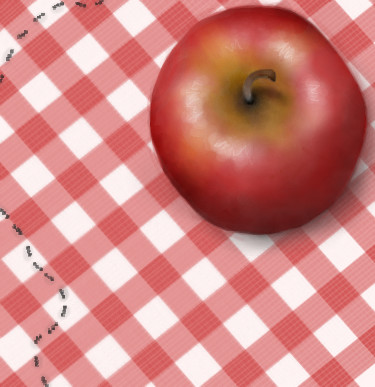
HolyCow
(Sep 1, 2007)
Mmm.
davincipoppalag (Sep 1, 2007)
Ha.. great parade of picnic ants!
JillJJ (Sep 1, 2007)
Amazing apple, love it! Jillj
HolyCow (edited Jul 4, 2009)
It almost seems too flat towards the stem, I think.Might go fix that up tomorrow, if I have time.
Arique (Sep 2, 2007)
Yup! It looks more real with that shadow added and i love the ants and the table cloth and the composition of the whole picture. it's just plain good. :) |
| ||||||||||||||||||||||
|
JillJJ
(Aug 28, 2007)
The place was tsavo, translated, the place of slaughter, where hundreds of workers fell prey to two demon lions
Pantera (Sep 1, 2007)
Very nice, I like the colours you used here, well done :)
JillJJ (Sep 1, 2007)
Thanks Helena, I appreciate your comment and love your work. Jillj
Haruki (Sep 1, 2007)
tHIS IS REALLY PRETTY.
JillJJ (Sep 1, 2007)
Thank you Haruki! It was an amazing visual in a show I was watching, the colors intrigued me. Thanks again, Jillj |
| ||||||||||||||||||||||
|
DoOp
(Aug 30, 2007)
the music...?
DoOp (Aug 30, 2007)
lole, the texture was there to hide some bad/cheap erasing i did XD... I couldn't erase the picture good enough for the red background i wanted @___@;;;lole thanks for the comments! :D <33
deathking (Sep 1, 2007)
How is everything you draw so lovely, I wish I knew how you got your lines so smooth.
Wraith (Sep 1, 2007)
Beautiful!
JillJJ (Sep 1, 2007)
This is really great... the colors are beautiful and your drawing is excellent! Jillj |
| ||||||||||||||||||||||
| |||||||||||||||||||||||
| 2draw.net © 2002-2026 2draw.net team/Cellosoft - copyright details - 1.71sec (sql: 37q/1.01sec) |