| |||||
| Public Boards/Intermediate | |||||
|
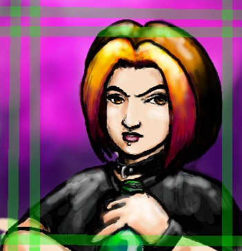
littlebunnyfu
(Oct 2, 2003)
Okiedokie! done as it's gonna get.. Damn shaking! |
| ||||
|
mazi
(Aug 14, 2003)
more lain-inspired stuff.. just a quick one before i get back to some work. hm. the sky was fun to do though.
joe_shmo (Oct 15, 2003)
i thought it looked like lain then i read the comments wowo this is amasing!
false_truths (Jan 15, 2004)
before i read your comment and other peoples comments, my first thought was, "lain! cool!" lol.. the picture is so good, i like the background.. .^__^
Look (Jan 24, 2004)
simple and nice! i like the color
davincipoppalag (Feb 12, 2004)
This is excellent...you have really captured the scene.. it looks real.. nicely done |

| ||||
|
Aunvi
(Aug 2, 2003)
I was being bugged about finishing this pic so I'll finish the background later, and there might be some minor flaws on this guy, so if you spot any tell me.edit> still not quite finished. I just need to put one more thing in there, and then I'm done. edit> okI'm done the flowers look kinda crappy tho, but it was kind of a request to be a mutant so....there ya go.
Gothic_Otaku (edited Aug 3, 2003)
He was my idea! ^^P
Aunvi (edited Aug 4, 2003)
Yes he was.
Nullzero (edited Aug 3, 2003)
Actually, heads are usually oval, almost egg shaped, and tilted backward a little bit. Unless they have a square jaw or a fuller face, then it's closer to round (but still oval, your brain only takes up the top half of the head, there's also got to be room for the jaw and stuff). Just adding to the discussion... :) I think what you're seeing is that the character is tilting their head forward, and since it's like an anime style, has an exaggeratedly receding jaw. The eyes are a little higher than they would be if it was tilted forward, so it might look a little bit offbalance, if you're trying to be super realistic. Still looks nice, though. I really like how the hair is done, and the shading looks interesting too... :)
Aunvi (edited Aug 4, 2003)
thanks for clearin that up for us...and thanks for the comment. ^^P |

| ||||
|
Genkaiart37
(Aug 3, 2003)
iv'e always admired mullets and i think it was very funny to see someone with one. THis picture is inspired off of some guy i saw in the streets.
Zappo (edited Aug 3, 2003)
Wow...The Classic hick......*pokes wit stick* ohhh awwww
Turtlebuster (edited Aug 3, 2003)
that is so wrong. i hate people who stereotype like you. now-a-days, it's all about the BEER HATS! :P
Nullzero (edited Aug 3, 2003)
It takes a lot of guts to sport a mullet in this day and age...or not too many brain cells...;P You should take this to the next level, the ubermullet. It requires one of those moustaches that drop down to the chin, but don't form a goatee...
Genkaiart37 (edited Aug 4, 2003)
iv'e seen it |

| ||||
|
Nullzero
(Aug 1, 2003)
Really, I based this off a picture of myself. At least, I did the pose, and got the haircut and build right. I messed up a little on the face, but I like how it turned out. I love white on black line sketches...and Lascaux really rocks! Great app Marcelo!
Turtlebuster (edited Aug 1, 2003)
are you skating or are you swinging around on a stop sign?not a bad pic, but a little too undefined.
Nullzero (edited Aug 1, 2003)
Just a pole, can be whatever anyone wants. :) I added it in at the last second for fun (and because I wanted to play around a little more with negative space, for the fingers and whatnot). Mostly I was just looking to catch the pose with perspective/foreshortening stuff. The point wasn't so much in what the figure is actually doing, it's more in the action of the figure and whatnot. I don't know, I didn't like it at first, but it was one of those deals where I stared at it for several minutes, and it grew on me. Wasn't looking to put too much detail in, I wanted to keep it simple, show negative space, that kind of artsy crap. ;) I might go back and put a bunch of dramatic lines in, but I don't know...I kind of like it the way it is. Simple white on black line drawing... |

| ||||
|
rosalyn
(Jul 31, 2003)
In the hands, the memories lie. They gland gleam. Burning bright as the sun...>:| Yeah it's Junk! I'll delete it in the morning.... (edit: Okay I'll keep it..>:})
purplestarfishy (edited Aug 1, 2003)
oooh hands are good swirlyness is good glowyness is very good i think its brilliant dont delete!! =^.^=
Knockoff (edited Aug 1, 2003)
Hmmm Rosalyn I Suggest you dont delte it ;) Its great. Great job!
Nullzero (edited Aug 1, 2003)
I love it. Great blending on the fire aura, the hands look very technically accurate, good lines and shading. Well done!
nyao (edited Aug 4, 2003)
coooll.... hands and shinie thing.... me like shinie thing... and i luv the colourz... ^^ |

| ||||
| Public Boards/Beginner | |||||
|
Nullzero
(Jul 22, 2003)
Testing out my posting abilities...had some trouble with oekaki last night...oekaki works much better for what I like to do, but paint can be fun too
Xodiak (edited Jul 23, 2003)
Xod likes too! Nice white snake! >:)|XOD|
quintessence (edited Jul 23, 2003)
Ooh, kickassness... ness. Love the fang things.
concannon (edited Jul 23, 2003)
Oooooh...pretty viper. *pets it*
Nullzero (edited Jul 24, 2003)
Danke...the snake was my signature drawing back when I was drawing a lot (by hand) awhile back. My buddy Littlebunnyfu (over on Overdraw and Doodledraw) got me into this bbs stuff a little while ago, so this was my first post that actually worked. I'd use doodledraw, but I'm stuck on dialup right now, and I also don't like that stileproject spyware junk. 2Draw works nicely for me, good and fast loading. :) |

| ||||
| 2draw.net © 2002-2026 2draw.net team/Cellosoft - copyright details - 0.84sec (sql: 26q/0.18sec) |
drawn in 1 hour 21 min
Meow.
P.S. Just wondering, is that a bottle or somethin in her hand? Plus very nice composition. Good job!