| |||||||||||||||
| Specialty Boards/Collaborations | |||||||||||||||
|
sticking it as finished~ yar!
4 comments
– latest 4: |
| ||||||||||||||
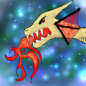
|
well everyone can add chibis I would love to see chibi furres people with cat features or just cats anyone can draw oh yeah I need a person also for bg and coloring of the clothes and boots/EARS AND TAILS and shading of skin
9 comments
– latest 4:Pleas collab lol .....if not me fin my self lol
komugimaro (Nov 19, 2005)
thanks Cg, Can I lcall you CG but any way wow super kawaii I switch to fin now hey we make a pretty good team ! You did a great job can we do another I want to make a demon princess and you can make an angel prince notify me soon lol XP
christiangirl (Nov 20, 2005)
Yeah! I love it too ^.^ yeah you can call me CG lol I know a lot of people who do (not in real life of course, but on the comp. lol) Yeah collabing was fun and I'll collab with you again on that.
kitty25 (Nov 20, 2005)
this very good.i think this is coool!
christiangirl (Nov 22, 2005)
Thanks kitty25 ^.^ wow, we spent waaay too much time on this ^.^ lol.. I can't wait until our next collab. |

| ||||||||||||||
| Public Boards/Beginner | |||||||||||||||
|
hi1022
(Oct 29, 2005)
Look how crappy.(it's my first one)YAY
Luka (Oct 29, 2005)
O.O i just had a feeling of "deja vu" when i saw this ...maybe it was StrawberryPaintbrush's pic?...anyway i like strawberries too^^
Kakashi_Hitake (Oct 29, 2005)
nice pic ^^ very good pic for ur first one ^^ it looks good to eat : P
Kuzul_the_dogrider_cless_pwns (Nov 2, 2005)
wow jennifer.. it looks like sabrina's strawberry =P wow nice .. so much beter than i am .. i feel depressed that i cant draw wit a mouse...yarr! penguin pirate! yar i shall glomp him because pp=ClessAlvein FWAHAHAHA
cookie913 (Aug 6, 2006)
great now i am craving strawberries!!!! |

| ||||||||||||||
|
xiau
(Jul 11, 2005)
My first attempt at drawing Ed on teh compy! I'm practicing cell-shading. I'm hoping that I can get a picture into showcase sooner or later... So I'm practicing using these drawing programs alot. Well, anyways, I've never watched the American FMA episodes, I keep up with the JP series ^^I hope you likes!
Kuzul_the_dogrider_cless_pwns (Sep 22, 2005)
to gigandas: yes it does look like edgar,the ponytail,blond hair,eye color,to xiau: you can do expressions so good!nice background too!but there is one thing i must say.... .CLESS IZ HAWTER! *sticks tounge out* annnnyway... its really good!
hi1022 (Oct 22, 2005)
he looks like he's about to kill somebody
xiau (Oct 22, 2005)
He looked pretty ticked in the reference, too.
Kuzul_the_dogrider_cless_pwns (edited Oct 24, 2005)
heh~ ed is only smexay when he is homocidal~ |

| ||||||||||||||
|
JK-Arts
(Oct 24, 2005)
More Graffy.
Kuzul_the_dogrider_cless_pwns (Oct 24, 2005)
it says art~ cool!
JK-Arts (edited Oct 26, 2005)
ART: B's always have a connection at the bottom(unless it is like this |3 and since lower-cased b's looks like it is, an upper-cased B does not have to have a connect at the top). Lower-cased j's have will usaully have but do not need to have either a dot(sphere shaped type objects),a crown(Joker-hat),a heart, or a diamond(any of playing cards' symbols too) an upper-cased J's will never cross like: + ,or like a lower-cased t. (Your are rite thou'.... i did make the t' back-words. and "Oh` Well." It does sort of look like an upper-cased J eccept for one thing: it crosses at the top.. thats pretty much how you would figuar out how to read it. I don't remember where: i've read something about it. It said that true graphs' are always freestyles and are never oppressed or constricted by any rules, basic fonts are.
solve (Nov 25, 2005)
you, cyclops, tol crew, and i need to do one big graff collab. i never knew you bombed. this is excellent.
Prettylilies (Nov 28, 2005)
nice JK |

| ||||||||||||||
|
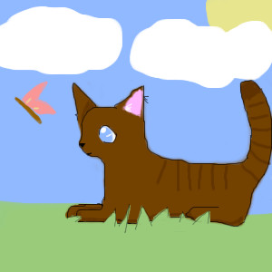
rissa
(Oct 24, 2005)
im new here. this is my first time using this.im xiau's little sister. im 7.
Kuzul_the_dogrider_cless_pwns (Oct 24, 2005)
*sigh* i guess the talent runs in the family~ hi rina-chan's sister! welcome to 2draw! the cat = teh cuteness! so much better than i draw~
narutofan (Oct 24, 2005)
so cute
Fobix (Oct 29, 2005)
Awwww -huggles Rina's little sister- that kitty is soooo cute
Neon (Oct 29, 2005)
such an adorable kitten! |
| ||||||||||||||
|
xiau
(Oct 24, 2005)
Mmmyes. Because everyone knows how ingeniously original drawing a witch on Halloween is.Just a Halloween quickie to set the mood or whatever. Disturbing? Maybe... It was going to say "Happy Halloweiners" but somehow turned into this.
Kuzul_the_dogrider_cless_pwns (Oct 24, 2005)
im gonna be a drow again or mint if i can find a outft~
xiau (Oct 24, 2005)
Yesh... Be Mint.Happy Hollow Weiners! :D
hi1022 (Nov 16, 2005)
This is so cute!!!!YAY!
kitty25 (Nov 24, 2005)
soo cutye XD XP |

| ||||||||||||||
| Specialty Boards/Collaborations | |||||||||||||||
|
Does anyone wanna make a backround for it??(I know its an ugly dog he like lives on the streets)
12 comments
– latest 4:I think its a bit better lol I blurred the colrs I think it looks a litle better
Got rid of the lines above his eye. ^^
Kuzul_the_dogrider_cless_pwns (Oct 15, 2005)
this ended up good!want to try it again sometime!
Fobix (Oct 16, 2005)
Sure ^^ |

| ||||||||||||||
| Public Boards/Beginner | |||||||||||||||
|
koo
(Oct 10, 2005)
I just like the bright colours of this frog so thought it would make fun practice.Ref: http://www.newint.org/issue378/life.htm
Gemmy619 (Oct 11, 2005)
aww its so cute, good draw :)
Rosemary (Oct 11, 2005)
wow great frog...nice shading too :)
Kuzul_the_dogrider_cless_pwns (Oct 12, 2005)
the eyes look so real .... EWWWWWWWW gett it offa me! eww frogs !! it looks like itl just hopp of the leaf and into your house .. wow... i wish i knew how you did it! and one on lascaux too! *burns lascaux* how does everyone get lascaux good but then i just sit there with my horroable pirate! ... ( my fuzzy soft penguin pirate! rawr!)
McR_SlipKnoT_LoveRs (Oct 24, 2005)
nice realism. :$ |

| ||||||||||||||
| Public Boards/Intermediate | |||||||||||||||
|
koo
(Oct 12, 2005)
I'd really like some comments that will keep me in the right direction of getting this image as close as possible to the reference. I feel I am about half way atm.REF: http://users.igl.net/toonie/gurner.jpg Hope it was worth the extra space :)
darkshadow (Oct 13, 2005)
haha great job that looks well wow and it was worth it or atlest i think so
Rosemary (Oct 14, 2005)
lol looks good now its done :)
LisaAnne (Oct 14, 2005)
Oh this made me smile, and for that I thank you. As far as constructive criticism...the head looks a little squashed (forehead area).I realize space is tight, but I think that perhaps the image going off the canvas might be better. Very nice in general though. |

| ||||||||||||||
| |||||||||||||||
| 2draw.net © 2002-2025 2draw.net team/Cellosoft - copyright details - 1.05sec (sql: 41q/0.20sec) |
drawn in 5 min