| |||||||||||||
| Public Boards/Intermediate | |||||||||||||
|
Zappo
(Mar 1, 2004)
WTF now 2draw is upside down too? |

| ||||||||||||
| Information/Site Updates | |||||||||||||
 |
marcello (Sep 7, 2003)
Hey, this is a message to all you users with a tablet and some version of windows! (You can ignore this message if you don't have both.) I've finally finished the first beta of JTablet v0.9.1, a complete rewrite of the JTablet plugin for Java. Not familiar with JTablet? It's a plugin for Java that allows applets to read tablet pressure and eraser input and whatnot. Currently Lascaux Sketch and Shi-Painter support JTablet. v0.9.1 won't add new features to Lascaux Sketch or Shi-Painter...
33 comments
|
||||||||||||
| Public Boards/Beginner | |||||||||||||
|
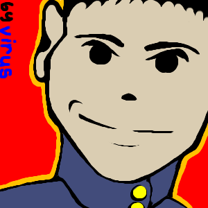
Virus
(Feb 24, 2004)
I can draw! hooray for low mouse speeds!
Krystiana (Feb 24, 2004)
Very nifty. I really like this style. Sometimes it's a nice refresh to see solid colors - it makes pictures very bright and it gives me a big smile. ^__^
dixielandcutie (Feb 24, 2004)
hehe, cute. i love the sharp color contrast!
Neko (Feb 24, 2004)
Now if he was saying something, like "Obey Mao Zedong's will!" I'd be doing it right away. This is like those old commie propaganda posters brought through 80s to the present. You shouldn't had to sign it, though. Now the blue/black text somehow disturbes the otherwise solid background.
davincipoppalag (Feb 24, 2004)
I like this too.. good lines and you did alot with a minimum of them.. I agree.. the signature takes away.. |
| ||||||||||||
| Specialty Boards/Collaborations | |||||||||||||
|
6 comments
– latest 4:
Edward (Dec 21, 2003)
i thinki am done unless you want a BG....for the life of me I cant think of one though X3Oy... long time, no see. Circumstances prevented me from getting back to this site, and when I did have a chance to visit, I never really had time to draw.
Background started (now the pose should make more sense). A few different ideas for finishing it, unless Edward feels like picking up this picture again. :) Sorry I've left it for so long. ^_~
Edward (Feb 1, 2004)
looks spiffy me think you should finish it...cause i would mess it up X3Done and done. Timer's off, probably - I'm on a dialup and was dxed halfway through. -_-
|
| ||||||||||||
| Public Boards/Intermediate | |||||||||||||
|
mazi
(Nov 11, 2003)
augh. trying out some landscape stuff.. im so horrible at rocks -_-[p.s. thats supposed to look like snow -_-]
Snoozy27 (Nov 14, 2003)
Absolutely lurvely. Esp. love the flowing water and... well, everything else. :D
Harmanye (edited Nov 15, 2003)
*peers around* You're going to kill me, I know. Just so you know I know.Let me say that I'm not saying I could do anything half as good. There, I said that. Let me also say that the foreground part is wonderfully flawless. So that said. But. However. None-the-less. In any case. That waterfall part in the background, it's a pretty rocky place, and I'm thinking the water should be splashing around a bit more. Like... | [color=white]\[/color]\ [color=white]\\[/color]/ [color=white]\[/color]| Or something to that^ extent. Don't hurt me. I'm no expert. I mean, I can't even draw on regular intermediate yet. So there you have it. Or something like it. *shuffles away quickly*
mazi (Nov 15, 2003)
no no i really appreciate criticism. i know its flawed and i was just messing around. im really astonished its in the showcase.. o_o the rocks are so crappy. rocks hate me. i hate rocks. its a lovely relationship.
Look (Jan 26, 2004)
That's really beautiful! Ilike the background and the blocked part in forground, make it as if we are looking at it thru a cave |

| ||||||||||||
|
Nanibunny
(Sep 30, 2003)
hm I think that I might get rid of the outline on the rose .. it doesnt look right O.ohm.. . i was playing around with the bg
Angeleyes (Nov 17, 2003)
hey i love more then my drawing nat
Trey (Jan 9, 2004)
This is so cool. I love your style. It's something I'd like to see on the front of a greeting card or something. That's what it reminds me of, anyhow. :) I love the way you did the lines...it's what makes your style, and it pulls it together with the way the farie looks, with the liney wings.
nyao (Jan 25, 2004)
woooo.... that's really pretty and original idea! ^^ I luv the rose and colour of the faerie! ^^ |

| ||||||||||||
|
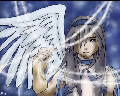
ky
(Nov 7, 2003)
eee
haruko_ryuu (Nov 13, 2003)
i like the wind effect! its awesome! the eye looks awesome 2. great job !
Krystiana (Nov 13, 2003)
I love wings... things with wings are cool all around... Great job on the expression. Why is it so sad? ;_;
candee4you (Nov 15, 2003)
i am in LOVe with this picture. i like how u did the strings..dey look like MAGIC STrinGS! WEEe!!
akakami (Jan 14, 2004)
Wow. I want to draw like that. I saw the animation. It looks so simple yet when I draw online, all I get are extremely blocky pictures. |
| ||||||||||||
|
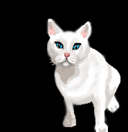
SuzieSuze
(Dec 7, 2003)
It's my evil cat, I will finish this later..
Krystiana (Dec 7, 2003)
Appearances can be deceiving. Often the cutest ones are the most evil of them all. Very nice, although the backside is nice a smooth and looks like fur, but other parts of the outline are kind of pixelated. Great so far!! ^_^
marcello (Dec 8, 2003)
hardly looks cute, definitely looks evil.ok I think I am finished
Fin_beast (Jan 10, 2004)
Na....My cat is a beast! It looks so cool! It's ginger and It's the best cat in the world! it's has a phat ass scar on its ear! |
| ||||||||||||
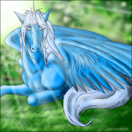
|
Tamuriil
(Dec 1, 2003)
"Ahhh,this is so peaceful.."^___^ My Uni,Xerocen,again!I LOVE the way it came out!!! :D
Krystiana (Dec 1, 2003)
I like the light flare, and the background has excellent texture. Nice job. ^_^
Emm (Dec 2, 2003)
wow i love the colouring and the texture... and stuff
Dragon_River_Spirit (Jan 7, 2004)
wad a purty pony.**gushes**^.^ |
| ||||||||||||
| Public Boards/Advanced | |||||||||||||
|
furyofroy
(Dec 1, 2003)
Is Virgil an original name?
Krystiana (Dec 6, 2003)
The style reminds me of Usagi Yojimbo. It's very nice - simple, but powerful. Cool. ^_^
elana (Dec 11, 2003)
Virgil is the name of my grandfather, you could make a female to go with this guy and name her Gertie (my grandmother) LOL!
mikhail (Dec 20, 2003)
i like the design and concpet of the sword, however the rest doesnt really appeal to me, whatsup with all this cat stuff?
angelbate (Dec 20, 2003)
very smooth, and good anatomy and design. like all the elegant weaponry and tail. |

| ||||||||||||
| |||||||||||||
| 2draw.net © 2002-2024 2draw.net team/Cellosoft - copyright details - 0.18sec (sql: 42q/0.07sec) |
-zappo fears change