| |||||||||||||||||||||||
| Public Boards/Intermediate | |||||||||||||||||||||||
|
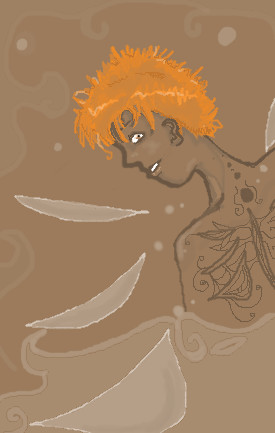
New oo;;
Moulin
(Jul 6, 2004)
Hello, I am new to these boards. Wondering if I could fit in here in the Intermediate boards...? *meep* The timer, by the way, is ridiculously off-- made pierogies and kept the applet open xD
davincipoppalag (Jul 6, 2004)
Welcome to 2draw. I would say get used to the tools before you start using the upper boards, and read the rules.
Gigge (Jul 7, 2004)
Yup, I found it very helpful to play with the tools on the beginner boards, and still do! Not a bad place to start. I like the colors on this.
Knockoff (Jul 7, 2004)
Hey! Welcome to 2draw. I like the colors, this is really nice. Good job on the lineart too! :) |
| ||||||||||||||||||||||
| Main Forums/Drawing Discussion | |||||||||||||||||||||||
 |
EverDream (Jul 6, 2004)
I've gotten recent slander from someone accusing me of "stealing work" To clear up this mess here is a DETAILED description of which images I've used referances in~ Images with Referances used and for what reason: No Strings Attached, lighting done by Noriko Meguro Persistance, characters belonging to Adele Sessler (fanart) More than a Cold Stare, (fanart) Amongst Stones, Advent Children movie still; lighting and pose, no link available Sleep Sweet Angel, pose and facial structure Aligez...
15 comments
|
||||||||||||||||||||||
| Public Boards/Beginner | |||||||||||||||||||||||
|
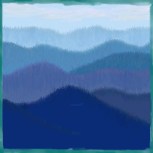
somebody
(Jul 6, 2004)
This is my third draw and a little boring. I am trying out new things.
Gigge (Jul 6, 2004)
I like it. The little scratches effectively create the illusion of a forest. The uneven edging is also a nice touch.
emmamommalag (Jul 6, 2004)
It's very nice, somebody. Nice job on the forested look of the hills and I like how it gets lighter over the farther hills.
Knockoff (Jul 7, 2004)
Woaw, isn't there a picture In ms paint like this? This is pretty nice. I like the dpeth. The color is really nice.
Cordelia_Pink (Aug 4, 2004)
hey I've see this picture before. lol I have one just like in my computer. but good job. Looks like a replica. lol Nice border, man. =) |
| ||||||||||||||||||||||
|
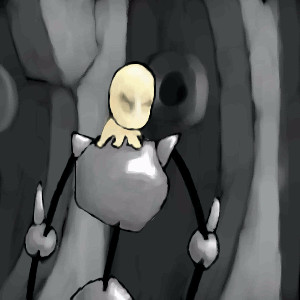
Minitsaru
(Jul 6, 2004)
i dunnno, i had this spacey feeling when drawing this.... O.o PPK-Resurection
Knockoff (Jul 6, 2004)
Run, its a rellik toboR. lol. I like the shading, and the "skin" (?) is very cool too. The background is great.The whole picture reminds Me Of TS2. :) |
| ||||||||||||||||||||||
|
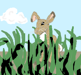
Bumble_Beez
(Jul 3, 2004)
Just a rabbit in the grass, kinda like my Fox GrassEhh...
Should I keep the grass in the back?
made it furrier, doesit look worse? I couldn't decide...
Knockoff (Jul 6, 2004)
hehe. not bad! I like the rabbit. You did a pretty good job, though the grass looks a bit weird, I think if you got rid of the black and put a darker green it would look better. Still good though ;) |
| ||||||||||||||||||||||
|
15grifficorntears
(Jul 6, 2004)
i think that i am the only person to use the minimum width.
davincipoppalag (Jul 6, 2004)
It's a cool effect for this one...now draw a professional basketball player in one of these!
Bumble_Beez (Jul 6, 2004)
Looks good!
Knockoff (Jul 6, 2004)
hehe, thouse fireworks look cool. I should buy some >:).Nice job on the picture. |
| ||||||||||||||||||||||
| Public Boards/Intermediate | |||||||||||||||||||||||
|
Nanibunny
(Jun 29, 2004)
Beh. A vision.
LovelyLori (Jul 5, 2004)
cool colors..
Gigge (Jul 6, 2004)
I like the whole effect. The colors, the geometric blocks dividing the sections, the repetition of body parts. Neat.
diver2026 (Jul 6, 2004)
its cool - its simple but unique
Knockoff (Jul 6, 2004)
Hey, this is neat. I like all the colors and stuff. Nice work :) |

| ||||||||||||||||||||||
|
Knockoff
(Jul 5, 2004)
Look at it from a side view.
Bumble_Beez (Jul 6, 2004)
This looks so cool ^_^
Minitsaru (Jul 6, 2004)
wooh, coolness! i like how u did it!!!! the clouds r the best i think!
Knockoff (Jul 7, 2004)
HJ- Wow! Thanks, thats a pretty cool way of interpreting the picture. Its not a silly comment.Thanks for the lurvly comments ;)
RIKG (Jul 8, 2004)
Wow. This is great. I like all the different layers of colors, they each have there own texture or design.This is great. |

| ||||||||||||||||||||||
|
DMV
(Jul 5, 2004)
Messed up here and there ,but overall I am happy with it:)
emmamommalag (Jul 5, 2004)
Wow, it's great, DMV!
davincipoppalag (edited Jul 6, 2004)
Beautiful...it ain't evil lookin or scary at all! Nice job on this one D ( I like your signature up in the fretboard too!)
Kloxboy (Jul 5, 2004)
Classic DMV. Great design, I dig your sig too you've been using these days.
DMV (Jul 6, 2004)
Thanks all ...everyone is too kind :) |

| ||||||||||||||||||||||
| Public Boards/Beginner | |||||||||||||||||||||||
|
Gothic_Otaku
(Jul 5, 2004)
hahaha, bet you can't guess who it is ;)
davincipoppalag (Jul 5, 2004)
Arthur Godrey?
Knockoff (Jul 5, 2004)
How did you know? hmm, Hehe. I like this. Haven't seen "much" from you in a while./
Sumomo_chan (Jul 5, 2004)
^_^' It's Hiei. |

| ||||||||||||||||||||||
| |||||||||||||||||||||||
| 2draw.net © 2002-2026 2draw.net team/Cellosoft - copyright details - 1.95sec (sql: 38q/1.41sec) |