| |||||||||||||||||||||||
| Public Boards/Beginner | |||||||||||||||||||||||
|
tattered_wing
(Jun 18, 2004)
'Missed' |
| ||||||||||||||||||||||
| Public Boards/Intermediate | |||||||||||||||||||||||
|
cmb
(Jun 18, 2004)
Line from the song "Imagine"
emmamommalag (Jun 19, 2004)
Looks like Cher after the nose job but before the rest of her restructuring. I like the colors and the shine.
Knockoff (Jun 19, 2004)
Wow, I really like the angle you put the face at.The lips are nicely done. Jah, the colors rock.
cmb (Jun 19, 2004)
I tipped my head back and looked in a small mirror on the wall to try and work out shading- anatomy etc- trouble is when you are short sighted and wearing heavy glasses its difficult to quite get it right- lol!
Axil62 (Jun 19, 2004)
I think it's good. |
| ||||||||||||||||||||||
|
squee
(Jun 19, 2004)
dont pay attention to the title...blah |

| ||||||||||||||||||||||
|
Hakkai
(Jun 17, 2004)
Wo0! A doodle.. that start out well.. then great.. then Who0sh. The Background is a little off compared to the real thing, buuuut.. I tried. n__n; Hakkai lives again.In pain right now, but still lives. XD
squee (Jun 18, 2004)
whoa..thats good
mazi (Jun 18, 2004)
zack: there was a post about that at some point. i still say the regular blue one put on negative looks best. maybe with a new title graphic.ahah wicked awesome pic 'kai. ^^ the grins so cute.
laurael (Jun 18, 2004)
I really like the way you do your lines, faces, and coloring, Hakkai...awesome style.
Knockoff (Jun 19, 2004)
Hey! This is pretty good hakkai. The background looks almost exact to the 2draw theme.I always love your coloring and lineart. |
| ||||||||||||||||||||||
| Public Boards/Beginner | |||||||||||||||||||||||
|
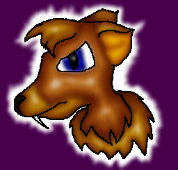
breac
(Jun 18, 2004)
another made-up animal I created, the drinkedgen, (pronounced drehn-KED-gin) is a canine-like animal used mainly for guarding houses.They do not make good pets, as they are very agressive. They are distantly related to ficklepigs (my other made up animal) but are much, much smaller, about knee high, Plus drinkgedgens are intelligent.
Knockoff (Jun 19, 2004)
This isn't bad. I like the shading, but it is an animal of some sorts, I think you could of gave it more detail in a type of furr.The background could be a bit better, but this is still good :)!! |
| ||||||||||||||||||||||
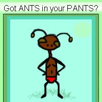
|
sal
(Jun 18, 2004)
...
DeadlyBlondeArcher (Jun 18, 2004)
hah! he has on red fruit of the looms! I hate ants.... they are everywhere around here. I love your picture, tho. :)
Gigge (Jun 18, 2004)
This is so cute. I'm glad the ants here don't have that kind of an attitude. I think I'd have to stop wearing pants.
DMV (Jun 18, 2004)
Hey this is cool :) I drew one to on the beginner board:)
Knockoff (Jun 19, 2004)
no, but I think you do sal. haha.Nice drawing. *squishes ant* |
| ||||||||||||||||||||||
|
Tuukke
(Jun 18, 2004)
hmm.. tried to do a sort of metal.. and practise shading
xwindflyer (Jun 18, 2004)
Good looking hot dog. For a more metal look, you need brighter and sharper highlights. A crisper shape would help too.
Thear (Jun 18, 2004)
mjum mjum ...*drool* ^^ great draw!
emmamommalag (Jun 18, 2004)
A metal hotdog? You'd bust your toofers.
Knockoff (Jun 19, 2004)
Hah. Yeah, this is nice. |

| ||||||||||||||||||||||
| Public Boards/Intermediate | |||||||||||||||||||||||
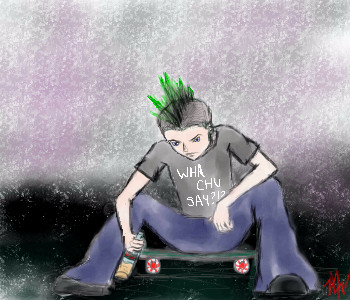
|
Nanibunny
(Jun 13, 2004)
days like these ... you wish they'd go by fasterDrinking will only make it go away for a short period of time.
not too great with bg's :/
Knockoff (Jun 18, 2004)
I like the pose. His hair is a bit different XD.I like the bg, it almost looks like hes caught in time, with those textures. |
| ||||||||||||||||||||||
|
gusiLuNg
(Jun 17, 2004)
^^ hello~
mazi (Jun 17, 2004)
wow, been a while for you huh? welcome back to 2daw.
Knockoff (Jun 17, 2004)
hey! Its you!! haha, welcome back, this is nifty.I like the silver on black thing. First one from you that has a different style, but yet still cool look.,
Zack (Jun 17, 2004)
Welcome back, I've seen your stuff in the showcase. This pic's a quickie, but it also rocks. |

| ||||||||||||||||||||||
|
Gigge
(Jun 16, 2004)
First attempt at cliffs and waterfall. When did trees become so difficult?
davincipoppalag (Jun 17, 2004)
Not bad Gigge.. the edges need some sharpening, and the cliffs could use some more horizontal elements to break up the vertical striations.. but this is nice..Thanks for the suggestions, Poppa.
Knockoff (Jun 17, 2004)
Ohh, this is really nicely done.I love the depth. And the little waterfall is nice. If you put more detail into each thing (grass, trees) becuase overall you have a lot of detail, but it looks flat in some spots. Still very nice.
emmamommalag (Jun 17, 2004)
That's better, Gigge, now that you've sharpened it up some. It's a very nice picture. |

| ||||||||||||||||||||||
| |||||||||||||||||||||||
| 2draw.net © 2002-2026 2draw.net team/Cellosoft - copyright details - 3.28sec (sql: 39q/2.76sec) |
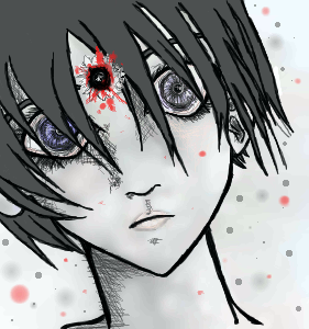
I really like this. The eyes are trippy, and very neat. I like what ever the thing in her forehead is.
I like the sketchy shading too.