| |||||||||||||||||||||||
| Public Boards/Beginner | |||||||||||||||||||||||
|
umi
(Apr 18, 2004)
... |

| ||||||||||||||||||||||
| Specialty Boards/Contest! | |||||||||||||||||||||||
|
taori
(Apr 2, 2004)
as opposed to the playboy bunny. obviously unfinished. will finish asap. any suggestions for background or other things?
Knockoff (Apr 7, 2004)
Woaw, thats really great, taori! I love the shading and clothing. The hair and pose rock.I think this is a great candidate for the contest. !!
Xodiak (Apr 9, 2004)
Now draw the turkeygirl as a mascot! >:)|XOD|
method3 (Apr 14, 2004)
OMG turkeygirl? Anyway... so yeah, I guess the question would be should 2draw's mascot simply be some kind of skimpily clad woman with some distinguishing outfit?
Erewin (Jun 16, 2004)
I like the golden highlights on the hair. |

| ||||||||||||||||||||||
| Public Boards/Beginner | |||||||||||||||||||||||
|
LovelyLori
(Jun 15, 2004)
oh happy happy
LovelyLori (Jun 15, 2004)
lol thug...
Aubrey (Jun 15, 2004)
Takin a turn at the dotty pictures eh Lori? lol Looks like you just pasted them to the screen. Nice job.
LovelyLori (Jun 15, 2004)
I never know what I'm gonna do Aubrey, lol....
davincipoppalag (Jun 16, 2004)
Lol Lori.. ya sound like Bob Ross "let's just put a happy lil meadow in there ..riggghtt about there...yea.." lol |

| ||||||||||||||||||||||
| Public Boards/Intermediate | |||||||||||||||||||||||
|
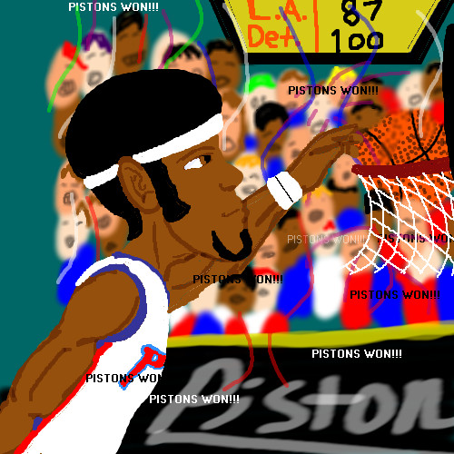
ChibiNay
(Jun 15, 2004)
AH i knwo this aint the best but hey I neede the room! idc I am to happy PISTONS WON!!!
kejoco (Jun 15, 2004)
i'm just extremely happy the lakers lost....stupid lakers....
bumpinthenight (Jun 15, 2004)
errrr..... your anatomy and lineart could use some work, and you should actually use shading... but your use of the text tool is ok.... |XP
Knockoff (Jun 15, 2004)
boooo, the pistons suck!!lol, nah. Im glad the pistons won, too!
Zack (Jun 15, 2004)
I don't really have team preferences, except in collegiate sports, (f. miami, man) so I usually just root for the underdog. I say go Pistons.As for the picture, my one main complaint is the font. That font is just... ugh. Use Eras Demi or something, and check the 'antialias' box. It makes a big difference. An easy way you could have made the background a lot easier on the eye is (assuming it's on a different layer) make its layer a little transparent and put another layer of solid (in this case, dark) color below it. It'd give the pic more depth too. I like the look on the guy's face. |
| ||||||||||||||||||||||
|
Knockoff
(Jun 13, 2004)
Haven't you parents told you not to stare?(I know the canvas size is a bit small)
Knockoff (Jun 13, 2004)
No deal davin, remember, I can eat mooseflowers and it will come back. mwahahahahahaaa.,Okayokay, im not insane, trust me o___o. hahaha, no, he won't blink, he has marble glass eyes. mwahahaha, well. not really, but he.... just won't blink.
DMV (Jun 13, 2004)
This is great ,but it looks more like a female than male to me:)
mooseflower (edited Jun 15, 2004)
Maybe he's getting laser surgery, I think they do something to hold your eyes open then so they don't accidently laser your eyelids....it was a muffin, not a cupcake...
Knockoff (Jun 15, 2004)
hmmpphh :( *cries* Thats what I ment, I don't need to eat a cup cake when I got mooseflowers muffin,hahahaha. |

| ||||||||||||||||||||||
| Public Boards/Beginner | |||||||||||||||||||||||
|
emmamommalag
(Jun 13, 2004)
self explanatory :)
Aubrey (Jun 13, 2004)
That's a different way of lookin at a shooting star lol.
emmamommalag (Jun 13, 2004)
You're right, Zack.. All I know about Pillows is how comfy they are under my head at beddy bye time.
davincipoppalag (Jun 13, 2004)
Lol cute one mommakins
laurael (Jun 14, 2004)
Hey...this was something I did a couple of years back...drew a comic strip with a star character in all sorts of funny situations, but not 'this' one...this is great! |

| ||||||||||||||||||||||
|
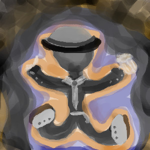
audie
(Jun 14, 2004)
weeee.
Knockoff (edited Jun 14, 2004)
Thank you, I was starting to go insane.
audie (Jun 14, 2004)
haha.
davincipoppalag (Jun 14, 2004)
KO this looks edible..like a gingerbread man.... |
| ||||||||||||||||||||||
|
Thear
(Jun 13, 2004)
ok no need to comment this xD
davincipoppalag (Jun 13, 2004)
Lol even Donald has bad days! Good one Thear..love the expression!
ladylime (Jun 13, 2004)
hahaha thats so funny :P great job on the expression
Thear (Jun 13, 2004)
heh ^^ thx all!
Knockoff (Jun 14, 2004)
lol, this is cool.You do a good job on these characters thear. I like the shading in the mouth for some reason o_o |

| ||||||||||||||||||||||
|
Tuukke
(Jun 7, 2004)
heheeee.. not concentrated.. and really this didnt take as long as the timer says.. maybe i'll clean it up.. x)
davincipoppalag (Jun 7, 2004)
Not bad.. smooth out the edges a bit.. the shading is nice..
Knockoff (Jun 7, 2004)
Mmm *eats them* thanks ;)Yeah, this isn't that bad, keep it up.
Thear (Jun 13, 2004)
pretty good! ;) eyh...i don't like cherrys =/ |

| ||||||||||||||||||||||
| Public Boards/Intermediate | |||||||||||||||||||||||
|
davincipoppalag
(May 31, 2004)
They were out of beer, so he headed home with a six pack of Snapple iced tea.....
laurael (May 31, 2004)
Very cool...everyone that's doing reflections is doing a wonderful job. I like pics of horses...this one has a hint of color that's just perfect...great!
Supergurl103 (May 31, 2004)
this is very nice, davin, very pretty, lovely horse :)
mx (edited Jun 2, 2004)
Nice painting :)I like the simplistic use of color(not too many colors, but more subtle)the contrasrt of light and dark is also quite a feature. Go well mx By the way...that girl i drew, is crazy about horses. She will probably like this pic a lot.
Pantera (Jun 13, 2004)
I love this :) you do such good paintings. |

| ||||||||||||||||||||||
| |||||||||||||||||||||||
| 2draw.net © 2002-2025 2draw.net team/Cellosoft - copyright details - 3.19sec (sql: 36q/2.78sec) |
The only differences I see: colour is lighter in yours, more watercolour used, less piercings, and no jewlery.
The original is found on Aku-Tenshi, under Bory.