| |||||||||||||||||||||||
| Public Boards/Intermediate | |||||||||||||||||||||||
|
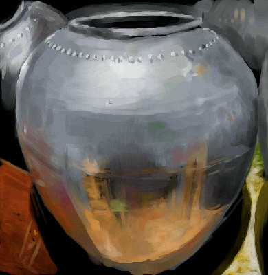
silver one
Axil62
(May 2, 2006)
doing more pot
DejasView (May 2, 2006)
I don't think you really understand what you do to me when you do stuff like this.
Axil62 (May 2, 2006)
I think it makes you wanna get your hands on some clay.
HunterKiller_ (May 2, 2006)
*drool*
Sweetcell (May 5, 2006)
Clay? It looks more like a hammered steel pot. Amazing. Those reflections on the pot... a -fucking-mazing. |
| ||||||||||||||||||||||
| Public Boards/Advanced | |||||||||||||||||||||||
|
Deino
(Apr 18, 2006)
Magic reference:http://www.deviantart.com/view/32029668/ :D EDIT! Let's play something: Identify the songs! >:)
Deino (Apr 23, 2006)
Thanks Deadly! *jumps of joy*
comd (Apr 23, 2006)
Fantastic realism - that's awesome.
tandrew971 (May 5, 2006)
i really like the reflection in the sunglasses, and the face is great
Deino (May 5, 2006)
Thanks Comd and Tandrew :) |

| ||||||||||||||||||||||
| Information/News | |||||||||||||||||||||||
 |
marcello (Mar 14, 2006)
That's right. You thought it wouldn't happen. Hell, I thought it wouldn't happen. A new version of Lascaux Sketch is finally out! Version 0.70 was released a few days ago with an all new antialias system for really smooth brushes. Version 0.71 goes on to fix some bugs such as not being able to use selections when revising, and potentially fixes the 'brush stops working' problem. Though no guarantees on the last one, that's an elusive nemesis. Will there be more? Who knows. En...
27 comments
|
||||||||||||||||||||||
| Public Boards/Intermediate | |||||||||||||||||||||||
|
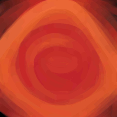
Kloxboy
(May 1, 2006)
Can you figure out how I felt when I drew this? Take a guess if you wish.
Ty854 (May 1, 2006)
calm and at peace?
mazi (May 1, 2006)
at first glance it looked like an open mouth yelling. but who knows.
TaCO (edited May 3, 2006)
I think you like red a little too much.With green coming in a close 2nd. You must love Christmas. I like this pic. It has a softer feel than most your pics.
GOODBYE (May 5, 2006)
you felt bored with yourself? |
| ||||||||||||||||||||||
| Public Boards/Beginner | |||||||||||||||||||||||
|
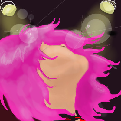
Tangible
(May 4, 2006)
Eh. I tried.
Kloxboy (May 4, 2006)
Looks more like this should be called XTC.
davincipoppalag (May 4, 2006)
Yea...Rave impresssions here... lights,movement, drugs.....I like the drawing. |
| ||||||||||||||||||||||
| Main Forums/The Post Board | |||||||||||||||||||||||
 |
method3 (May 4, 2006)
Here's a random picture, based on this, done in Alias Sketchbook. Yup, it's pretty random, although it could fit into the contest for Ailurophobia, except I didn't feel like drawing stuff completely from scratch (although I did a pretty crappy job even so) hence teh sketchbook. Props to Cloxboy for the inspiration, etc.
5 comments
|
||||||||||||||||||||||
| Public Boards/Beginner | |||||||||||||||||||||||
|
tandrew971
(Apr 26, 2006)
.
tandrew971 (edited Apr 3, 2008)
thank you davinci gerbear and cloxboy no its not from brokeback mountain.
emmamommalag (Apr 28, 2006)
You're doing some great silhouettes. This one reminds me of the Marlboro man.
tandrew971 (May 3, 2006)
thank you emmamommalag
gerbear (May 4, 2006)
Oddly eniff Tiff, the sig really does not bother me and i am a FANATIC about bad sigs in the wrong places and the wrong colors ruining the pic. If you do soften it, it will change the pic but still look good, just different. :) |

| ||||||||||||||||||||||
| Public Boards/Advanced | |||||||||||||||||||||||
|
Trying out a collaboration with Cloxboy. I don't know if I can keep up with his skill level, as he's one of my idols on this board. It's a great honor to be working with him.
15 comments
– latest 4:
comd (edited Apr 28, 2006)
Ah okay - sorry, I wasn't sure if I was supposed to fill it in with something or not. Also Marcello showed me what Zoraw was - I wasn't sure if he was supposed to have organic parts or not, but now I know what he's supposed to look like. :)
Ty854 (Apr 28, 2006)
Jeff Soto! I love his robots. Does he have a website? Anyways, cool looking collab so far. I'll be waiting for the finish. :)
Kloxboy (Apr 29, 2006)
Here ya go Ty: http://www.jeffsoto.com/
frootcake (May 4, 2006)
this is nuts |

| ||||||||||||||||||||||
|
patienceisoverrated
(Apr 23, 2006)
Entry for a logo/character design contest. I wanted to try something on a bigger canvas, so I did, and I was never really intending to post it, but I put so much time into it I can't bring myself to delete it, so.... if this offends please move it down.
concannon (Apr 28, 2006)
GREAT colors. Very impressive.
Knockoff (May 3, 2006)
This style seems so familiar.... hmmm.. >___>I absolutly love this though. The pants rock. I wish I could draw pants half as good as you :[ The coloring is great too!
patienceisoverrated (May 3, 2006)
Thanks y'all :)Knockoff: If you can remember what it reminds you of, I'd love to see.
marcello (May 3, 2006)
maybe quintessence? |

| ||||||||||||||||||||||
| Public Boards/Intermediate | |||||||||||||||||||||||
|
DeadlyBlondeArcher
(May 1, 2006)
Time to lock and load, boys.Even in Texas you can wear out your welcome.
DeadlyBlondeArcher (May 3, 2006)
I am so wishing I had spent more time making this a decent picture. lol
davincipoppalag (May 3, 2006)
it IS a decent picture. Crikey , don't be silly
marcello (May 3, 2006)
naw, she could do a lot better, we all know that. however, it's quite fine for 40 minutes.
DeadlyBlondeArcher (May 3, 2006)
*fainting*. That's the nicest thing you've ever said to me. :) |

| ||||||||||||||||||||||
| |||||||||||||||||||||||
| 2draw.net © 2002-2026 2draw.net team/Cellosoft - copyright details - 3.71sec (sql: 37q/2.98sec) |