| |||||||||||||||||||||||
| Public Boards/Intermediate | |||||||||||||||||||||||
|
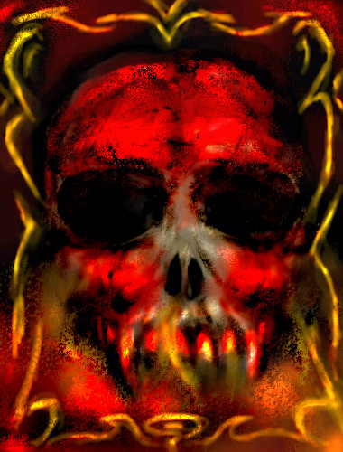
hideyourface
(Aug 12, 2005)
it's all sketchy and stuff. |
| ||||||||||||||||||||||
| Public Boards/Beginner | |||||||||||||||||||||||
|
Cooper
(Aug 12, 2005)
ZZZ....zzzzz....so sleepy -.-
sephiroth54321 (Aug 15, 2005)
You could've shaded it though....
Cooper (Aug 16, 2005)
o ya i forgot >.<
sephiroth54321 (Aug 16, 2005)
I don't believe that :(
Cooper (Aug 25, 2005)
why? |

| ||||||||||||||||||||||
| Main Forums/Drawing Discussion | |||||||||||||||||||||||
 |
Gigandas (edited Aug 7, 2005)
First of all, I'd like to state that in no way, am I intentionally dissing abstract art here if it even sounds like I am. Anyway, I just thought I'd share this with you guys, but yesterday on 20/20, they were showing these abstract paintings being sold for millions of dollars done by these so-called pros. But it got interesting when the host had these random 4 year old girls paint on a canvas and then set their work up next to the 'pro' abstract artists' pieces and see if these educated art...
76 comments
|
||||||||||||||||||||||
| Public Boards/Beginner | |||||||||||||||||||||||
|
hideyourface
(Aug 12, 2005)
I cant get enough of this song XD
KH44N (Aug 12, 2005)
Wow, was the first word that came to my mind when i saw this. I love the different colours u used! Excellent Job!
plasma_ooganator (Aug 12, 2005)
This is simply the best beginner painting I've seen so far!
Cherry (Aug 12, 2005)
This looks great! love the background ;) |

| ||||||||||||||||||||||
|
Boichi
(Aug 12, 2005)
Woooooo...is he good lookin'. *drool*
Kenshin (Aug 12, 2005)
Cute :D I like the green
anarie (Aug 12, 2005)
While I -do- like it, I have a couple of suggestions.1. I HIGHLY suggest using the "Pen" tool in Shi. If you decide to use Lascaux next time, check the "anti-alias" box. Your lines won't be so scratchy! 2. Use darker shadows and HIGHLIGHTS. It will really bring you picture to life! However, I do like the non-shading on the black shirt. Very cool. <3
oikitsumaru (Aug 12, 2005)
^___^ absolutely love it. People are so obsessed with the anti-alias-ness. I love pixelly stuff. (thats what my art looks like anyways) anyways, love it! (again)
Boichi (Aug 15, 2005)
I love it a lot when it looks like that. it gives it a certain unique quality. |

| ||||||||||||||||||||||
| Specialty Boards/Collaborations | |||||||||||||||||||||||
|
3 comments
– latest 4: :D;;; Done~sorry for the cruddy colouring ;;
Lineart: Geegee Colouring: H-llama
SanzoGirl (edited Aug 12, 2005)
Wow! Thats great for your first picture here! I can't even draw that good. D: I hope you enjoy your stay.Llamas! <3 Edit: Didn't relize that you didn't draw it, oh well. Sitll. great coloring! :D
GeeGee (Aug 12, 2005)
Yaya! :3 Awesome coloring H-chan X3
KH44N (Aug 12, 2005)
Beautiful colouring! The hair looks perfect. |

| ||||||||||||||||||||||
| Public Boards/Intermediate | |||||||||||||||||||||||
|
Tresspasses
(Aug 12, 2005)
This is taking a lot longer than I expected it to!Gotta run for now...
hideyourface (Aug 15, 2005)
it's not intermediate cause it's not good enough :)
Tresspasses (Aug 15, 2005)
Yes, but what could be improved without losing the feel of the piece. Saying it is not good enough is exactly the same as saying it is not of intermediate quality, an opinion with no helpful comments to back it up.A helpful comment would be something like "the shadows could use more depth" I know that there are some very good artists on these boards, and I would appreciate some constructive comments.
hideyourface (Aug 15, 2005)
I wrote something long, but I accidently went back a page while writing it.. Basically, the picture is small. Small pictures are good as long as they have detail. Allthe buildings/walls lack textures and detail. The fence/buildings would probably be just as dark as the person since the light is coming from behind. Maybe a street light by the person would make it look better.
Tresspasses (edited Aug 16, 2005)
Thanks for the comments hideyourface :)I was trying for a the world outside your windows type of thing, with the shadowy nature and fuzziness. The person is not supposed to be a person, but rather a shadow of the past... Obviously I was unable to portray this meaning with my drawing. I will give some though as to how to better get that point across. Too bad the long post was lost, I would have really enjoyed seeing it. Thanks again, and if anybody else has some comments I'd really like to hear them. |

| ||||||||||||||||||||||
| Public Boards/Beginner | |||||||||||||||||||||||
|
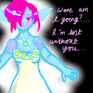
Minty_hippo
(Aug 12, 2005)
bored.....I'm not sure if I'm still going out with my boyfriend anymore......I need advice..
sephiroth54321 (Aug 13, 2005)
Hippo of Mintiness?Hahahahahaha!!!! Lmao......
voodoobunny (Aug 13, 2005)
I like her necklance. (<---- did i write it right?)
Minty_hippo (Aug 13, 2005)
almost val, its necklace ^^hahaha!! yoda and chibi usa!! lmfao!!
Xodiak (Aug 14, 2005)
She looks like an elf or fairy girl... Xod loves them! I wish they were real. <:)|XOD| |
| ||||||||||||||||||||||
| Public Boards/Intermediate | |||||||||||||||||||||||
|
6 comments
– latest 4:
hideyourface (Aug 12, 2005)
ahh you're so good with watercolour. I like how smooth your work looks.
LisaAnne (edited Aug 12, 2005)
The Shines on the hair stand out to me...Its a neat look too, with the just red and white, which I don't think I've seen you use before.Oh oh oh...check this out...."This boy has skills!" You know that's what women want too...Skills...haha good old N. Dynomite. http://www.fearsome-oekaki.com/pics/572.png
Kloxboy (Aug 13, 2005)
I like this face. Red is a great color, is it not?
solve (Aug 13, 2005)
red is one of my favorites. a grand color indeed. |

| ||||||||||||||||||||||
| Public Boards/Advanced | |||||||||||||||||||||||
|
DeadlyBlondeArcher
(Aug 10, 2005)
...far away
EyeOfSauron (Aug 14, 2005)
cant argue with that! I personally think that this would look better without the girl but that's just my opinion. It's an incredible piece of art.
Miss_DJ (Aug 14, 2005)
yep you are the Queen of Sky..there's no question! also been browsin through a bunch of yer cowboy art..excellent, excellent!
fleeting_memory (Aug 15, 2005)
nice sky-it almost rivals Icats' skies. Very nice effect
LasRever (Aug 18, 2005)
Beautiful. The bright colors of the sky contrast nicely with the dark earthtones of the hills and cross, which also makes the girls in the white dress stand out. Nicely done :D |

| ||||||||||||||||||||||
| |||||||||||||||||||||||
| 2draw.net © 2002-2025 2draw.net team/Cellosoft - copyright details - 0.94sec (sql: 39q/0.47sec) |
now that I checked, it seems to busy when it's really small. >.>