| |||||||||||
| Public Boards/Intermediate | |||||||||||
|
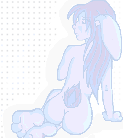
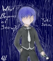
Akiko
Juna
(Feb 3, 2004)
I spent so much time on her, its not even funny.. its rated 13 cuz i well its kinda suggestive.. or not, but better safe then sorry... sorry about the lack of bg, i really couldn't get one to work for me... *sighs*
Neko (Feb 4, 2004)
Veery nice work.~ The lineart is smooth. I think it shouldn't be that dim, makes it kinda harder to see. Other than that, I can't find anything else wrong here, although her paw on the ground looks a little, err, messed up. Very good job, I'd love to see more ladies of the furred kind. ^.^
Look (Feb 4, 2004)
that's really cute. The light color makes it so sweet and girly.
Juna (Feb 6, 2004)
the colours kinda turned out that shade my friend wanted her lightblue and he picked the main colour.. trying to find colours that matched it... well look.. its pastel ah well .. thanks for the comments guys |
| ||||||||||
|
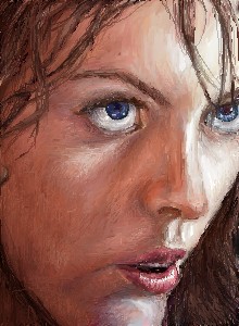
ambiguous.alkadette.amnesiac.
(Jan 30, 2004)
I had a photo obviously... I can't imagine stuff for beans yet. Working on that though... on paper ;)
Look (Feb 4, 2004)
That's so nice. I like the rough coloring, kind of like oil pastel. I think you should add a little lighting to the nose tip. and one of the eye seems a little higher than the otherI'm so glad to have "free" time again! Last week I spent too much time prepping for a dance competition... glad to be back trying to draw.
Ok. *drops it* I lost my ref so I screwed with it... this version is ultimately cos I submitted then immediately thought it needed to be darker....I really can't blend.
DeadlyBlondeArcher (Feb 10, 2004)
I think it's terrific. It's way better than some of the crap I post in the advanced section. |
| ||||||||||
|
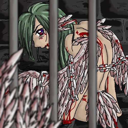
ToraNeko
(Jan 19, 2004)
I tryed for somthing I little diffrent then I usally do, Oh, and the timer is off by an Hour or so >.< Gomen-nasi
supermonkey (Jan 19, 2004)
Good one. It feels as if I can actually reach into this picture.. Nice use of the blur tool.
Peipera (Jan 19, 2004)
Oh wow, that's really cool. I like how it's blurred up close and not far away.
Juna (Jan 20, 2004)
Thats crazy at first i only noticed the bars and the man, but then i saw the wing and WHAMO! the whole picture popped out at me! I feel for the guy, love the feathers!
fleeting_memory (Sep 28, 2006)
Always liked this one but never commented. Great use of the blur tool to create depth. |
| ||||||||||
| Public Boards/Beginner | |||||||||||
|
Cookie
(Jan 20, 2004)
Meep!!! *TACKLES*Eh...reached my limit. :P Too bad. Hehe, first try anyways. :) Horrible. No more, I'll work on it later....cannot look at it anymore. X|
Juna (Jan 20, 2004)
Try cleaning up ur outter lines a bit. Try playing around with the mask tool a bit, i bet u'll find it very helpful. I hope u do finish this she's looking cute ^^ Sorry for submitting it again so early....its just that I have NO idea why the buttons just stopped working for me...i think its my computer.
Thank you so much. :) No really, not many people know that commenting on things actually make people happy, thats why I try to comment alot. ;) But yeah, thanks again.
Sami (Jan 20, 2004)
oO...all i have to say...is...i know u can do better oO |

| ||||||||||
| Public Boards/Intermediate | |||||||||||
|
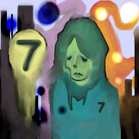
Zappo
(Jan 20, 2004)
this took way too long to think up..... |
| ||||||||||
| Public Boards/Beginner | |||||||||||
|
RabidMalikFanGirl
(Jan 19, 2004)
For Furubura fans :) His pose is crap but I'm pretty happy with it.some color...
Huzzah.
Juna (edited Jan 20, 2004)
Once again i have no idea who this is XD.. I keep scrolling by your pic, it keeps calling out to me, there's something about it that catches my eye.
Cookie (Jan 20, 2004)
Hahaha, hear hear. I think it has wonderful color, its basically the color that draws my attention, and the fact that there aren't any eyes. X| |
| ||||||||||
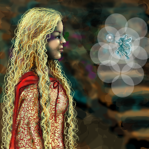
|
thecatspaw
(Jan 20, 2004)
time to put more effort in.
rayn3 (Dec 29, 2005)
Beautifull .. i jst love the hair.. and the little fairy + d details.. its amazinG!
beth92093 (Oct 15, 2006)
wow this is so kool
MelissaMissy (Dec 6, 2007)
It looks like a grown up version of Goldilocks. Very nice!
xxxshadowxxx (Jan 23, 2009)
the girl is...uhh......i like the fairy better. |
| ||||||||||
| Main Forums/Drawing Discussion | |||||||||||
 |
RabidMalikFanGirl (Jan 20, 2004)
K. I feel stupid. I know. I'm having trouble figuring out what the Mask and erm... the other mask thing do. *is very confused*
3 comments
|
||||||||||
| Public Boards/Intermediate | |||||||||||
|
ToraNeko
(Jan 20, 2004)
Yey! I try another new style. Please commwnet, I'm trying to figure out if these results are worth redoing in another Oekaki or not *goes into deep though*
Juna (Jan 20, 2004)
It looks alittle messy, sketchy.. but i love the way it looks the tiger is my fav! The problem i see with the dragon tho is that its blurry ^^ Would love to see more battles like this
Childlike_Vampire (Jan 20, 2004)
I like the tiger, and the shapes, but there isn't enough contrast, I can hardly discern which is what on the dragon. But it looks really cool otherwise. |

| ||||||||||
|
DieChan
(Jan 19, 2004)
It didn't really take that long, I was watching The Ring and helping to fill out an application. Uh... the shading technique I used didn't turn out like I wanted it to. Um... yeah. |

| ||||||||||
| |||||||||||
| 2draw.net © 2002-2026 2draw.net team/Cellosoft - copyright details - 1.18sec (sql: 40q/0.30sec) |