| ||||||||||||
| Public Boards/Intermediate | ||||||||||||
|
kejoco
(Jan 5, 2006)
Still needs a little work...me thinks |

| |||||||||||
|
kejoco
(Dec 11, 2005)
This shit is hard...**I might Go back in and edit a little more...I might leave it like it is, we'll see Just messing with some background colour...I need to fix up the "el camino"
Jessor (Jan 5, 2006)
shweet.
DeadlyBlondeArcher (edited Jan 6, 2006)
I did like the black background better? (I think the wheels on the other side might have to partially show if you leave it blue, and that's like way too much trouble for an El Camino. I'm ready to ride in it)
DeadlyBlondeArcher (Jan 7, 2006)
Back in black... much better! |

| |||||||||||
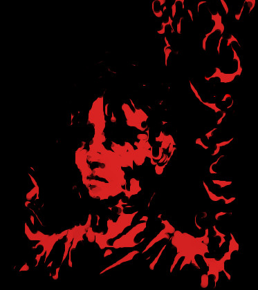
|
hideyourface
(Jan 5, 2006)
.
davincipoppalag (Jan 5, 2006)
Did you draw this with the black on a red bg or did you draw it with the red on a black bg.. its cool looking
Renuar (Jan 6, 2006)
Goood choice of colours. Simple, but very nice like that.
hideyourface (Jan 6, 2006)
red on black. thanks.
Gigandas (edited Jan 6, 2006)
Considering that black is all colors, I think that any color goes well with black. But I have to say my fav combinations are red & black and green & black. |
| |||||||||||
|
Jessor
(Jan 4, 2006)
Gackt Camui, J-Pop Star.
whitebunny1063 (Jan 6, 2006)
He used to be a lead singer for Malice Mizer,but he left the group.It still looked good.
frootcake (Jan 6, 2006)
i know most would say im not an advanced artist but willing to lay your palm with some advice. I think to make the picture a bit better you should give him/her another eye. the eyebrows looks a bit uneven, theres no ear but in general i couldn't fault your colouring. axils advice to me was to really study the picture, where one colour blends into another and dipict it as best you can. good luck, its looking grand
Jessor (Jan 6, 2006)
thanks, trying to get the light colors and the shades to blend the way i want is kind of a challenge for me, i spend alot of time doing that and mostly because my pen would stop drawing and i would have to change the size of the pen to get it to work again, it's frusterating.
Pakasutemanshikuka (Jan 6, 2006)
Wow! This really does look like him. This looks so great it kills me D: I hate when I've drawn a portrait of someone and it's quite nice and then someone other comes and I see that she/he has done better and it makes me want to kill..Anyways, keep it up! |

| |||||||||||
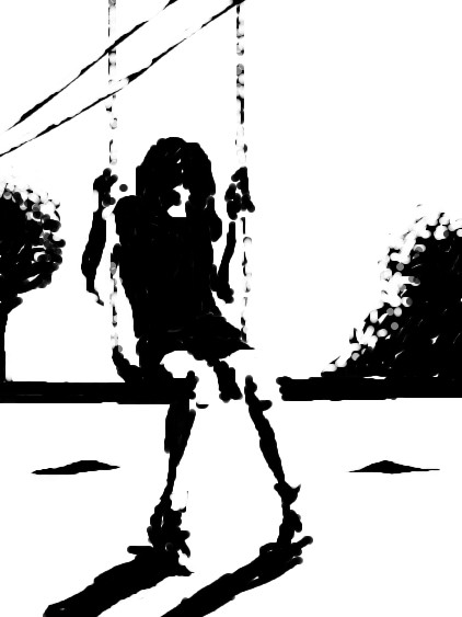
|
hideyourface
(Jan 5, 2006)
.
waffley-daffley (Jan 5, 2006)
Aw, that's pretty darn awesome. :) Love the simplicity of it and the high contrast.
Jessor (Jan 5, 2006)
I like how this looks simple with just the blotches of black as shadows.. very nice.
davincipoppalag (Jan 5, 2006)
Very nice picture here , conor.
frootcake (Jan 6, 2006)
yea this really is something special |
| |||||||||||
|
Axil62
(Jan 5, 2006)
They have taxi cabs there.
DeadlyBlondeArcher (Jan 5, 2006)
All of your friends aren't dead.
woah_pockster (Jan 5, 2006)
veryvery yummy place and picture x_x <3
Jessor (Jan 5, 2006)
I like the cityscape art although i haven't really tried it it seems like it might be challenging due to detail which im not too good at. Very nice pic indeed.
JK-Arts (Jan 5, 2006)
That looks whicked very cool . |

| |||||||||||
|
frootcake
(Nov 3, 2005)
everything will be ok. Just a bit of fun :) i enjoyed this movie, does any1 else think its better than nightmare before xmas? (excluding the songs)
Punky (Dec 25, 2005)
I just noticed his hand is disembodied. It's still nice though.
frootcake (Dec 25, 2005)
yea the move tool isn't working for me. wierd, sometimes it works and sometimes it doesn't. prob my fault, but yea, he's made of clay so i doubt he even notices his own lack of hand..
vi0lence (Dec 25, 2005)
This is a very good picture of Corpse Bride! Good picture, Good movie! : )
laurael (Jan 1, 2006)
Never did see the movie, but great pic! |

| |||||||||||
|
Opium
(Dec 25, 2005)
.
Creature201 (Dec 26, 2005)
Ah yes, the orb weaver! While I am more interested in Insects then Arachnids, I still think spiders are awesome, and this one you drew is no exception, good job, I also like the hairs on the legs.
Opium (Dec 26, 2005)
lol DBA I know....VERY sticky web! A friend of mine ran into one also, and he stripped down almost naked and was screaming like a little girlthank you guys for all your great comments :)
laurael (Dec 27, 2005)
That's very creepy looking...that means it looks very real. Great job, you. Hold one so it can crawl all over you? I don't think so....*shudders*
Deino (Dec 30, 2005)
This spider looks incredible good Opium, almost 3D!Spiders are beautiful animals, but I don't dare to touch any xD |

| |||||||||||
| Public Boards/Beginner | ||||||||||||
|
2 comments
– latest 2:
yuohoo (Dec 23, 2005)
I like the backround,I can tell you that. But I think yuo should lose the lines thats shows hair,and and a light shade of the color(blue) for shine on the hair. But you don't have to listen to me,its just advice.
Jessor (Dec 23, 2005)
sorry dude im not being mean but you should be drawing on the beginner board,not that its bad, but its not intermediate level art. |

| |||||||||||
| Public Boards/Intermediate | ||||||||||||
|
Jessor
(Nov 30, 2005)
its some mountains.
woah_pockster (Dec 1, 2005)
oo the mountains are looking more like ski slopess, try to ass a bit more rocky detail to it so I can get a sense of how big this mountain is. :PI can't wait to see it finished it looks great so far <333
Jessor (Dec 2, 2005)
yea... problem is i would but when i tried i just made it look worse... i havent exactly mastered mountains yet but im working on it... I've practiced sketching the mountains here overlooking anchorage... i think they were pretty good but never came out exactly right. <artist syndrom.> babble babble |

| |||||||||||
| ||||||||||||
| 2draw.net © 2002-2024 2draw.net team/Cellosoft - copyright details - 0.24sec (sql: 34q/0.08sec) |
drawn in 1 hour 9 min