| |||||||||||||||||||||||
| Public Boards/Intermediate | |||||||||||||||||||||||
|
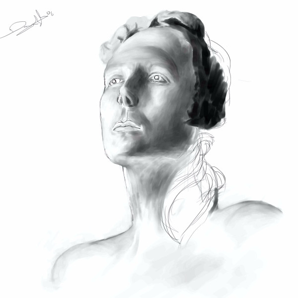
HunterKiller_
(Jun 22, 2006)
I would like help with some cast drawing practice i'm doing right now, please.I worked this one for a bit, spent most of the time on the eyes, redoing them over and over. I still feel like somethings are off but i can't see the flaws. Here's the ref. Critique would be greatly appreciated. Thanks. |
| ||||||||||||||||||||||
| Public Boards/Beginner | |||||||||||||||||||||||
|
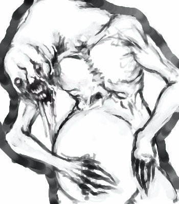
solve
(Jun 22, 2006)
Another quick sketch. Trying to work a better feel. Its name is pronounced "fladerghiest".
ayumi (Jun 23, 2006)
I like the way you made the chest. It looks awesome :]
Deino (Jun 23, 2006)
Great and terrifying!!!
Tsukiko (Jun 23, 2006)
reminds me of a Goya pictureit looks really great, really frightening
LisaAnne (Jun 24, 2006)
What has he swallowed...what pain does he hold inside... Great line quality as always. |
| ||||||||||||||||||||||
| Public Boards/Intermediate | |||||||||||||||||||||||
|
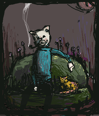
lsvr
(Jun 22, 2006)
Couch
Sweetcell (Jun 22, 2006)
Woah, this is different from you. It's always funny when animals that can speak have animals as pets.
HunterKiller_ (Jun 22, 2006)
Ah! This is brilliant! Totally caught my eye. It's strangely disturbing... wonderful. Great piece.
davincipoppalag (Jun 22, 2006)
People are animals, and in some parts of the country they can speak, many have pets! This is a cool cartoony thingy
shults (Jun 24, 2006)
i kind of hate how almost all my comments doesnt contain criticism or tips, but i just have to comment to pics like this one.anyways, i find this one delightfully designed. |
| ||||||||||||||||||||||
| Specialty Boards/Contest! | |||||||||||||||||||||||
|
davincipoppalag
(Jun 21, 2006)
No ref...I winged it..
TammyF (Jul 11, 2006)
Nice view!! I see a perfect spot to pitch a tent and stay for awhile :~)
poison_ivy (Jul 28, 2006)
gosh...that's real....good? awesome? dunno wha to say?! too good for words...god its good. lol now i can c wha u mean by sharpness and details!
thesolarwinds (Jul 28, 2006)
pretty... I like how lonely this feels.... how .... apart from everything...this is awesome!
davincipoppalag (Jul 28, 2006)
Thanks... |

| ||||||||||||||||||||||
| Public Boards/Intermediate | |||||||||||||||||||||||
|
pandabarrie
(Jun 22, 2006)
for a friend of mine. i need another nap -_-
Sweetcell (Jun 22, 2006)
I love this. I love your fantasy art Panda, worthy of posters and book covers. He's cute (to me) may I have him? Or at least give him a treat.
pandabarrie (Jun 22, 2006)
oh he would love a treat :)im thinking of making this guy an actual charater, so you may see more of him sometime
HunterKiller_ (Jun 22, 2006)
It's like a tiger crossed with a dragon. Very good.
cianteed2 (Jun 23, 2006)
nice paws! |

| ||||||||||||||||||||||
|
cianteed2
(Jun 22, 2006)
Step 1: On layer 0, use a light colour, such as light blue, to make your preliminary lineart. It's easiest just to make broad geometric shapes in the same shape as your subject. This makes it easier when you go to "ink" your lineart, and ensures it will be proportionate (that is, if you DREW it proportionate!). Skipping this stage could cause your lineart to look disfigured, unless you've practiced enough to skip it.Step 2: Next, go to layer 2. Use the pen or pencil tool (or whatever else you prefer) to make your lineart. Its good practice to experiment with different colours of lineart, but black is usually a safe bet. You can now erase the preliminary blue on layer 0. Tips: If your lineart looks too dark or intense, use the erase rectangle tool on low intensity and shave off a layer of it. It will make the lineart look finer and light, and when you go to colour the lineart wont look as separate from the colouring. Step 3: On any layer lower than your black lineart, fill it in with colour! (but PLEASE dont use the "fill" tool. Not only will not work on a lower layer, but it looks ugly when people use it and it never goes to the edge of your lineart.) Step 4: This step is just shading and detail. I'd go further into how to shade, but this isn't a shading tutorial! I just have 1 tip: Avoid shading dark areas with straight black. Shadows aren't black, they're merely darker tones of the same colour. However, if it's your "style" to shade with black, by all means go ahead.
HunterKiller_ (Jun 22, 2006)
You deserve a cookie. (.':)
pandabarrie (Jun 23, 2006)
looks familiar :)this turned out nicely, good job!
sephiroth54321 (Jul 29, 2006)
But really, the shadow would be black wouldn't it? Only it is a bit transparent which is why it appears a darker shade of the same color...i dunno
cianteed2 (Aug 4, 2006)
actually theres no such thing as a black shadow. a shadow is just a lack of light, thus the subject's colour wouldnt turn black in a shadow - it would just be a darker version of its original colour. |

| ||||||||||||||||||||||
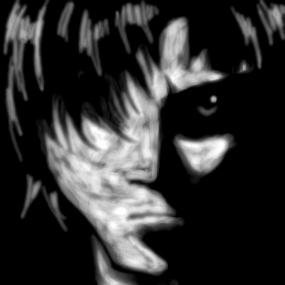
|
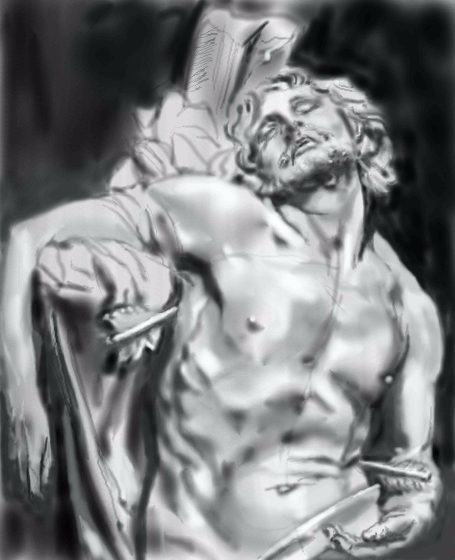
Axil62
(Jun 22, 2006)
I wish I had discovered/paid attention to the airbrush tool sooner. It really is nice to play with.
solve (Jun 22, 2006)
I only ask because I have trouble with the jaw in that position. Hoped you could help out with that vass knowledge you contain. Everything looks fine to me.
DeadlyBlondeArcher (edited Jun 22, 2006)
I have trouble with faces on a flat plane /or angled like that as well, so I understand your question... he seems to pull it off rather nicely each time, and I always wonder how he does it, myself.
HunterKiller_ (Jun 22, 2006)
It's beautiful. Maybe a little more contrast?
Pantera (Jun 30, 2006)
This is wonderful, your work is always great :) |
| ||||||||||||||||||||||
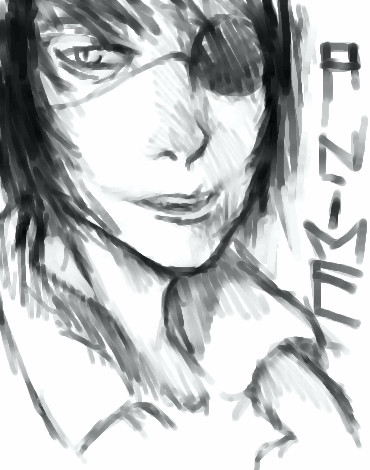
|
solve
(Jun 21, 2006)
Just a sketch of anime, seeing if I still got it (been a while since I did something of this nature). If this isnt good enough for the Intermediate board please let me know.
HunterKiller_ (Jun 21, 2006)
Funny guy.
davincipoppalag (Jun 21, 2006)
I wouldn't have called it Annie Mae either...but I get confused as to what is anime and what is manga and what is fan art and what is chibichibibangbang and all that...
Sweetcell (Jun 21, 2006)
You do such interesting things solve, I'm sure you can do anime but I find your loose draws so much more interesting.chibichibibangbangLMAO.
Purgatori1 (Jul 25, 2006)
This is great. I agree it does look like charcoal. (wet) |
| ||||||||||||||||||||||
| Public Boards/Beginner | |||||||||||||||||||||||
|
BX
(Jun 21, 2006)
My first attempt at this kind of style. I like this style, but I dont know about the pic. Anyways, hope everyone else likes it.
HunterKiller_ (Jun 21, 2006)
The shadows are excellent, really brings the features out.
solve (Jun 21, 2006)
Besides the jaw itself seeming a lil thin at the bottom, very good for 21 minutes. Nice contrast of dark to light.
paulfrank102 (Jun 22, 2006)
wow that is wonderful ! keep drawing ur good
Sweetcell (Jun 22, 2006)
What I like best is his face looks like it's reflections from water, a pool or lake. |
| ||||||||||||||||||||||
| Specialty Boards/Elite Bastards | |||||||||||||||||||||||
|
Axil62
(Jun 20, 2006)
palp is blab upsidedown almost.
davincipoppalag (Jun 21, 2006)
This woman has passion. Amazing energy now..
solve (Jun 21, 2006)
Very cool. Nice vision/creativity you have. I wish you would do more of this nature.
HunterKiller_ (Jun 26, 2006)
This is brilliant. I feel that the electricity doesn't look as intense or dynamic as it could be.
sincity (Jul 31, 2006)
this is awesome. The pose and colors are wonderful. :} |

| ||||||||||||||||||||||
| |||||||||||||||||||||||
| 2draw.net © 2002-2025 2draw.net team/Cellosoft - copyright details - 2.23sec (sql: 37q/1.51sec) |
drawn in 35 min
drawn in 59 min