| ||||||||||||||||||||
| Public Boards/Intermediate | ||||||||||||||||||||
|
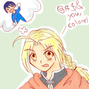
xiau
(Aug 4, 2005)
Ed hates Roy so much. Yay! That gives opportunities for funny situations!For a friend of mine. Hellooo, Misai! (trying a new style. I think it looks good!) |
| |||||||||||||||||||
|
Juni_gatsu
(Jul 19, 2005)
After listening to Iris by the Goo Goo Dolls, and some song that had something do with "when angels deserve to die", this is product...Somthing bothers me about his back though, but i'll just fix that later i guess *sigh*
darkshadow (Aug 10, 2005)
big fan of the wings i disagree with hide and i think the head is fine but it is the body that is to small for the wings and head good pic. i am drawn to the background for some reason
Xodiak (Aug 14, 2005)
This is amazing artwork... Trully exquisite. I really love the face structure and the nose, it reminds me a bit of Mr. Solve's style. Excellent. <:O|XOD|
candehfeind (Oct 8, 2005)
"When angels deserve to die. "System of a Down song... 'Chop Suey'. *luffs*
whitebunny1063 (Nov 13, 2005)
real cool.:) |

| |||||||||||||||||||
|
PS
(Aug 20, 2005)
Taken from a picture on a cd cover.
fleeting_memory (Nov 2, 2005)
Please spend at least two hours on what you post on this board. The sky looks nice but the black thing in the front could use work to clean it up and make it look more professional
JK-Arts (Nov 4, 2005)
First off i agree with fleeting memory entirely. If i may add my own say:The sky looks intermediate the wierd plane or what ever that thing is looks beginner. I think you had a good start with the sky but you got lazy and anxious to finish it so you slacked on the plane.
JESSI (edited Nov 4, 2005)
wtf! what is it ?......ok
hideyourface (Nov 5, 2005)
I think it's be better if the blane was cleaned up (even though I like those blue brush strokes on it) but other than that, it's advanced :p |

| |||||||||||||||||||
| Public Boards/Beginner | ||||||||||||||||||||
|
Kenshin
(Aug 12, 2005)
Uhmm..~ inspired by Sora but it kinda looks like Cloud @_@;;You can bump this to beginner if you think it needs to be.
Kenshin (Aug 12, 2005)
Sorry, but if I color this I'd like to do it myself.
KH44N (Aug 12, 2005)
Then please do it soon. I wanna see how beautiful its gonna turn out! :)
DieChan (Nov 3, 2005)
It looks like Sora, so therefore, I LOVE IT! x.X God.. I think my obsession with KH is slightly unhealthy. ^^; Cute pic. He looks angsty. :D |

| |||||||||||||||||||
| Public Boards/Intermediate | ||||||||||||||||||||
|
hideyourface
(Oct 17, 2005)
bah, It didn't turn out as good as I wanted. Move it to intermediate.
friend (Oct 17, 2005)
I like version one better. Version two is too...gray. Good Drawing though~!
woah_pockster (Oct 17, 2005)
I like how the light's comming through <333
darkshadow (Oct 18, 2005)
i want the light fall rains to come back but they would be bad for new orleans right now:(
Heartsdomain (Oct 25, 2005)
OMG that is absolulty amazing!!!!! They rain!! and the feeling it gives me is so wondeful!! |

| |||||||||||||||||||
|
The_Chosen
(Aug 14, 2005)
XD I`m going to try to go to the Numa-Rei-No-Con anime Convention as Integra this year so I just had to draw this
davincipoppalag (Aug 15, 2005)
Really good job on this one.. I love the shading on the coat
Heartsdomain (Aug 17, 2005)
hellsing love it nice a good on the glove you got the detales right!
sephiroth54321 (Sep 1, 2005)
cool :P
woah_pockster (Oct 16, 2005)
omg you are gellin like a fellon. :D I love thissss, it's bitchin' B] |

| |||||||||||||||||||
|
totori
(Sep 4, 2005)
Goggles. XD
Kenshin (Sep 11, 2005)
Albel is a game character and his hair is like the opposite of that. His is brown fading to blonde XD
laurael (Sep 11, 2005)
Those hands are just awesome. Great style!
totori (Sep 12, 2005)
Thanks, for all the wonderful comments!!! *huggles one and all*Which game is Albel from?
Kenshin (Oct 6, 2005)
Star Ocean 3 Till the End of Time |

| |||||||||||||||||||
| Specialty Boards/Collaborations | ||||||||||||||||||||
|
Collab withh ~unwritten_law_girl~
5 comments
– latest 4:
christiangirl (Aug 9, 2005)
uhm yeah, It is really cute and all but it isn't great. I know that because neither are my pictures. I do like it tho, specially the background. the lines just need to be cleaned up a little that's all.
Claire (Sep 19, 2005)
No offence but this belongs on the beginer boars coz its not v good no offence
SneakyWalter (Sep 26, 2005)
It can be in this board if all those other cruddy collaborations are allowed on here.Because or 'cause, not coz. I'm pretty sure there's a comma after offence. "v"? It sure isn't v good, there's not such thing. Period at the end of a sentence. Begginner has two N's. You left out the D in boards Comma after good.
RawrTeddy (Sep 29, 2005)
I think this picture is adorable..I really like the backround on it too. ^o^ You guys did a great job on it :D |

| |||||||||||||||||||
| Public Boards/Advanced | ||||||||||||||||||||
|
kejoco
(Aug 5, 2005)
....
HunterKiller_ (Aug 12, 2005)
*coughshowcase*
DeadlyBlondeArcher (Aug 20, 2005)
knowing how proportionally difficult horses are to do.... I keep wondering how you got these all three so perfect and WHYINTHEHELL is this not in the showcase?
kiketsu (Sep 27, 2005)
wow...just wow |

| |||||||||||||||||||
| Public Boards/Intermediate | ||||||||||||||||||||
|
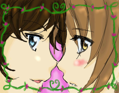
minikuineko
(Aug 10, 2005)
i'll finish this in a bit, i'm being tragically kicked off the computer...ok.. i think i'm gonna leave as is.... for some odd reason i think there's so much more i could do with ><;;;;
GeeGee (Aug 12, 2005)
aw, that's so cute ^__^
oikitsumaru (Aug 12, 2005)
love the little frame and sketchy lineart. awsome!
xlilcutie2x (Sep 15, 2005)
weee It So Cute!! |
| |||||||||||||||||||
| ||||||||||||||||||||
| 2draw.net © 2002-2024 2draw.net team/Cellosoft - copyright details - 0.21sec (sql: 40q/0.11sec) |
The whole picture is really clean, and the little bits of halftone in randomish places is neat :3
I thought the halftones gave it a different look, which I liked alot. I tried red lineart, but next time I'll make it lighter and thicker in some parts.