| |||||||||||||||||||||
| Public Boards/Intermediate | |||||||||||||||||||||
|
xiau
(Aug 4, 2005)
Ed hates Roy so much. Yay! That gives opportunities for funny situations!For a friend of mine. Hellooo, Misai! (trying a new style. I think it looks good!) |

| ||||||||||||||||||||
|
Cianteed
(Aug 8, 2005)
He gets around.
KH44N (Aug 8, 2005)
Your lineart looks amazing!
Shoebox (Aug 8, 2005)
Hey, looks like parchment.. neato... I like this (no durr, Linds <.<) Shush, you... Fairy is pretty *pokes* His waist is kinda blurry though..
Heartsdomain (Aug 9, 2005)
oh my link i love you its hot good job damn link is so dreamy i mean really the sowrd and the fairy yet he has that bravery all that stuff *yawn* no its good im just yawning cause im tired
saucy (Aug 28, 2005)
Hot. Very hot. |

| ||||||||||||||||||||
|
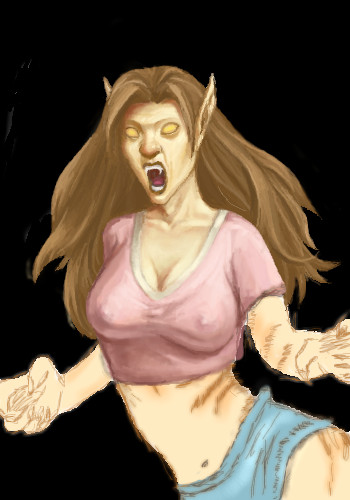
Rosemary
(Aug 6, 2005)
just a sketch...submitting this as finished to make room in my studio..will re-edit it tho...neck/shoulders need fixing..more detail adding ect..
davincipoppalag (Aug 8, 2005)
This is a lively picture Rosemary. I like what you have so far.
sincity (Aug 8, 2005)
They are both right. This looks fine the way it is. :}
lycene (Aug 8, 2005)
I really like the feeling of motion in this. It looks like it's right out of ArtGerm's Pepper series--which is definitely a good thing.
Heartsdomain (Aug 9, 2005)
it shows a lot of energy nice |

| ||||||||||||||||||||
|
two-na
(Aug 8, 2005)
bwoosh
Heartsdomain (Aug 9, 2005)
*looking close into it* hmmm *face on computer screen* i think i see something!! call everyone i see something oh my god its a meracle! |
| ||||||||||||||||||||
|
explaintome
(Aug 8, 2005)
She's one of the main characters in a manga I'm doing. She is the older, and bolder twin.And she looks quite depressed.
explaintome (Aug 10, 2005)
Thanks ^___^. For some reason, most of the art I do with the pen turns out...not good..
KH44N (Aug 10, 2005)
This looks beautiful. I like the hair. Its also very beautifully drawn. Good Job!
Knockoff (Aug 10, 2005)
hey, I like it this way. It's hard to do solids and you did it well. Awesome character, good emotion too.
sephiroth54321 (Aug 10, 2005)
Well, I guess the lines look alright solid....whatever you like.... |

| ||||||||||||||||||||
| Public Boards/Beginner | |||||||||||||||||||||
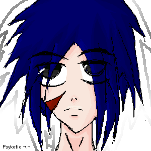
|
PsykoitcAnimeFrk
(Aug 9, 2005)
I'll add more details later,Hungry now.....Meh,i cant draw. Especially with a mouse =(
Heartsdomain (Aug 9, 2005)
thats not bad at all acualy if add some things and use a little more tools than this could actual go in intermidate |
| ||||||||||||||||||||
| Misc. Boards/Sprites | |||||||||||||||||||||
|
15 comments
– latest 4:
Kenshin (Aug 17, 2005)
This is very pretty, but pixel by pixel work is pretty pointless because it's totally unoriginal and pointless. It's just like copying a picture and pasting it.You did a good job on copying it, though
xiau (Aug 17, 2005)
"Unoriginal"? I don't think she copied a picture completely, I think she meant she used it for, you know, like, hair reference, face reference, pose reference, things like that. I s'pose it doesn't matter either way, though, I mean, it looks amazing either way! Great job, Cherry. I could never have enough patience for one o' these.
Shoebox (Aug 18, 2005)
Pixel by pixel work can be original.. it's not liek EVERY pixel-by-pixel work on here was copied from someone else...She coudl use a tad mroe shading in the hair.. and err *hands blanket* better get someone to fix them buttons on her shirt XD Nice work though, good job on keeping the pattern on the dress believable.
Starcat300 (Jan 26, 2006)
Ive seen this online and u just copy the pixel art, right? u shuld really think about trying to draw sumthing urself instead of taking other ppls stuff |

| ||||||||||||||||||||
| Specialty Boards/Elite Bastards | |||||||||||||||||||||
|
12 comments
– latest 4:
Kasha (Jun 22, 2005)
thanks you guys :D It's so great to have my fav artists comment on my work.I'm probably going to hell for this joke becuase this was based on a picture off a church pamphlet.
Zack (Jun 24, 2005)
reminds me of a joke, Kasha. some church once printed a news bulletin that read something like: "Be sure to come Wednesday to hear the Reverend's description of Hell, featuring our organist."BTW, this is hilarious and (it goes without saying) very well drawn. it also reminds me of http://www.threadbared.com/
Heartsdomain (Aug 9, 2005)
your so mean lol
plasma_ooganator (Aug 20, 2005)
i laughed out loud! |

| ||||||||||||||||||||
| Specialty Boards/Collaborations | |||||||||||||||||||||
|
Please help me out - i know i wont get it done all by myself :)
6 comments
– latest 4:send me a memo, and ill add you.. - layers are a bit messy - sorry about that..
Heartsdomain (Aug 9, 2005)
WOW *starts to back off*
sincity (Aug 9, 2005)
Real f-n cool! I like it. :}
SimplyX (Aug 12, 2005)
nice tits. lol actually i was more engrossed by the snare.
paccer (edited Aug 16, 2005)
only my pencil sketch for reference btw |
| ||||||||||||||||||||
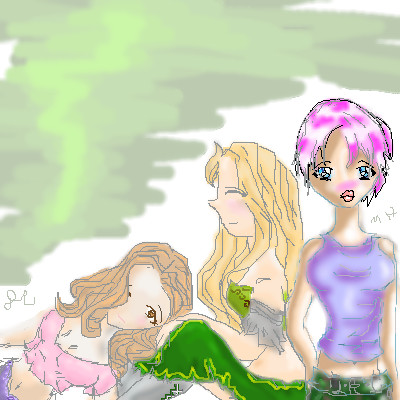
|
Color, anyone?
3 comments
– latest 4:Color... >_<
Yep... Done, I guess.
Crappy background, I know, but I did the layers weird, so... Yeah.
KH44N (Aug 28, 2005)
Holy Crap! All i can say is... this is just beautiful! Great work! ^__^Mhmm.
|
| ||||||||||||||||||||
| |||||||||||||||||||||
| 2draw.net © 2002-2026 2draw.net team/Cellosoft - copyright details - 1.05sec (sql: 45q/0.29sec) |
The whole picture is really clean, and the little bits of halftone in randomish places is neat :3
I thought the halftones gave it a different look, which I liked alot. I tried red lineart, but next time I'll make it lighter and thicker in some parts.