| |||||||||||||||||||||
| Public Boards/Intermediate | |||||||||||||||||||||
|
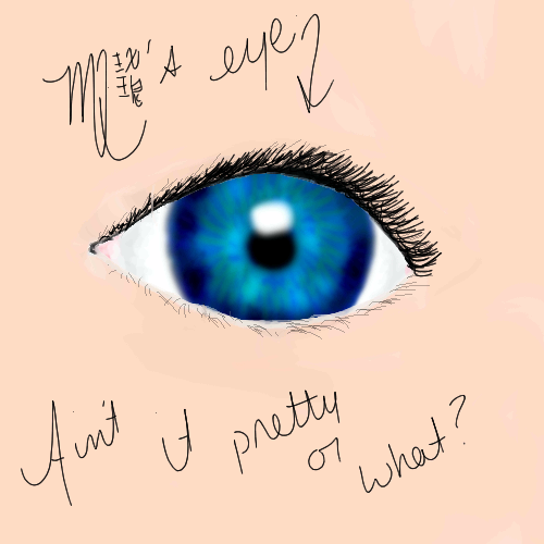
mqnania
(Aug 11, 2004)
Yeah...it be my eye. I know, I suck at doing real life stuff. Anime has almost killed all skills I had in the realism area -__-; *stabs* So yyyyeeeeeaaaahhhh... |
| ||||||||||||||||||||
| Public Boards/Beginner | |||||||||||||||||||||
|
Koneko-sama
(Aug 11, 2004)
Oi. The last one sucked. Horribly. So I redid it. There ya go.
Pence (Aug 11, 2004)
Wow, that's a deep thought. *snif* I really like the picture and the saying! good jorb.
~TaKeRu-San~ (Aug 12, 2004)
~Yo*stares at self* If only I had that sweater... *stares more* Do I actually have that long hair? *stares until my eyes pop out* How can you still remember what I said the other day...? *Koneko-sama glares* I'll stop now. The yellow color of the yang is probably better than the original white in this oekaki, and I'm glad that it's that color ^_^. I like the symbol, I love the swirls, and I adore the circles ^_^. The face is elegant, too, and although once again the lines could be more accurate, the figure seems almost perfect for some reason ^_^. I guess it really fits in this drawing. I see that you haven't put any shading in this picture, and looking at it, I think it would've been nice if the left side was light while the right side was darkened to put more emphasis on the meaning inside the drawing. Yet it isn't as if it looks as if that's missing in the picture... to be honest, it looks as fulfilled as can be... except for minor adjustments ^ ^;;. I love this oekaki: it's so meaningful *sniff*. Of course, this may be because that's ME, but still ^_^. The picture really goes well with my quote, and this whole thing inspired me to do ANOTHER poem that you have already read. It is an outlet for inspiration! ||Fantastic|| ~Takeru
Koneko-sama (Aug 19, 2004)
Heh, to tell you the truth? I copied-and-pasted it.
Urei-sama (Aug 24, 2004)
ooo, i like it alot!! very well done ^_^ |

| ||||||||||||||||||||
|
Anna
(Aug 11, 2004)
Frustrated with a current drawing....so I decided to relieve my frustration through a doodle.
Harmanye (Aug 11, 2004)
Hah, I know that feeling. I've learned something : Always, always safety save.It is frustrating in the extreme when your computer suddenly decides it doesn't like you.
friend (Aug 11, 2004)
HA NOW THATS HOW I FEEL!
davincipoppalag (Aug 11, 2004)
Lol silly Anna..
Garth (Aug 11, 2004)
lol Man I miss your pictures. I really hope I can find a computer to use in Canada. God bless dude :-) |

| ||||||||||||||||||||
| Public Boards/Intermediate | |||||||||||||||||||||
|
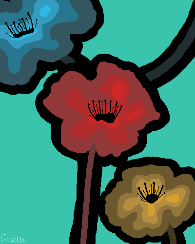
PolythenePam
(Aug 11, 2004)
Might add more. But I like it the way it is...Simple, i know...
davincipoppalag (Aug 11, 2004)
Sometimes simple can be very effective. I like the bold images. This is nice
Harmanye (Aug 11, 2004)
The solids worked really well for this. It would make a nifty user icon.I like the blue flower the best :D
Knockoff (Aug 12, 2004)
Oh. Wow, I really like the colors. Nice job@ :D |
| ||||||||||||||||||||
|
craptastic_spaztic
(Aug 2, 2004)
Another character in my Dead Toon series that are to be later used in a 3D active action adventure game I am working on. Not colored yet. Someone said that it looks too much, in the face, like Ustice from Courage the Cowardly Dog. I say don't rain on my parade, nancy-boy. Will finish laterAdded more color and some of the background. Need to finish up with highlights and more detail in the background.
The background didn't come out as good as I thought. Crap. Oh well. I will do a new one someday.
Harmanye (Aug 11, 2004)
I love the backgrounyd, though! Very ncie.The picture cracks me up altogther. :D
Pence (Aug 11, 2004)
*laughs* i love this picture. I like the bg it's good. |

| ||||||||||||||||||||
|
flamefirefox
(Aug 10, 2004)
um..mousey doodle... thing.. dunno if I should be posting on this board... This is a random character.. it's a dood with long hair.. and the title is called Reflection cuz he looks more like a guy here.. haha... yeah ok. have fun ^_^;
Harmanye (Aug 11, 2004)
Yay! Goldie eyes!Guy is majorly cool. Cleaner line-art would be nice, but perhaps it's just the style? *pets hair* Pretty hair.... most flowy,
Sutafani (Aug 12, 2004)
HE SO SEXY!!!! great pic, nice coloring..... draw more of him*huggs pic*
ami-kitsune (Aug 13, 2004)
He is much yumminess! X3 Love the flowy hair and the eyes! You draw lovely eyes! |

| ||||||||||||||||||||
| Public Boards/Beginner | |||||||||||||||||||||
|
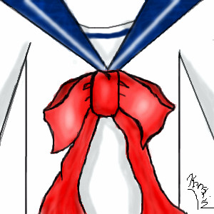
Kenshin
(Aug 10, 2004)
Wheeeeeee! ^^ Seifuku. It was going to be just a bow.. but one thing led to another. XDD I know, it's weird.Kanami-chan
davincipoppalag (Aug 10, 2004)
I kinda like this. If you smoothed out the lineart a bit.. it would be better
Kenshin (Aug 10, 2004)
Yes. If only I didn't have a stupid mouse.. I need a tablet... It took so long because I was trying to get smooth lines with this ebil mouse.
Harmanye (Aug 10, 2004)
The love hor flowy and sorta 3dish the ribbon looks.and don't diss the mouse, Hakkai uses one :D
ILoveKenshin (Nov 17, 2004)
Hmmm.. The bow looks sad. ;-; |
| ||||||||||||||||||||
| Public Boards/Intermediate | |||||||||||||||||||||
|
Gigge
(Aug 10, 2004)
You can call me flower if you want to. Reference photo used.
damnskippytakn-a-break (Aug 10, 2004)
WOW! Gigge you really know how to make someone pause and breath deeply. BRAVO
staci (Aug 10, 2004)
hehe i just caught your bambi reference too.
Aubrey (Aug 11, 2004)
lol bambi. This is very very pretty Gigge. Velvety smooth looking flower.
Xodiak (Oct 6, 2004)
Nice flower... flowers are erotic... |:)|XOD| |

| ||||||||||||||||||||
| Public Boards/Beginner | |||||||||||||||||||||
|
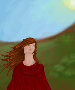
Harmanye
(Aug 10, 2004)
Someof it got eaten by the compression monster...
Harmanye (edited Aug 10, 2004)
I know (And don't worry abuot offending me' or whatever, I honestly love it when I get some crit, so I can do better next time) I tried to fix it by raising the neckline on the cape thingy, and I thought I had, but pictures always look different outside of the applet, to me. The underneath, I remember, seemed to be darker. Maybe something got to it in compression. Maybe I drew on a layer I 'dimmed' (lips, eye highlights, certain parts of hair). Maybe it just wasn't and I thought it was. Anyhow. thank you :) Hah, oops, didn't see your comment Davincipoppalag, thank you :D I'm afraid I don't know exactly what you mean with the postage stamp refereance, no doubt I should, I don't know a lot of things I should know. Obviously since I don't know them, I can't list them off teh top of my head, but I do. Or don't, as the case may ba. And is.
davincipoppalag (Aug 10, 2004)
LoL Harmanye..what I meant was that the eastern bloc nations used to put solid peasant looking people on many of their postage issues. This woman looks like a strong plain peasant type who might have appeared on one of those stamps
Harmanye (Aug 10, 2004)
Ah, gotcha, Makes sense *nods* :D
NOVEMBER93 (May 20, 2006)
the neck is very thick |
| ||||||||||||||||||||
| Public Boards/Intermediate | |||||||||||||||||||||
|
Axil62
(Aug 10, 2004)
This is a drawing of a guy.
Kasha (Aug 10, 2004)
durr! yeah from Fight Club. Brad had longer hair in Snatch. You should draw him from Snatch.. He was hawt like whoa.
Axil62 (Aug 10, 2004)
Yes ref from fight club. Yes I love that movie. Yes I love love.
Aubrey (Aug 11, 2004)
Yup, good guy drawing a good drawing of a guy.
shell (Mar 1, 2011)
I reckon this piece was worth more detail rendering. Just a personal opinion. :P |

| ||||||||||||||||||||
| |||||||||||||||||||||
| 2draw.net © 2002-2024 2draw.net team/Cellosoft - copyright details - 1.38sec (sql: 37q/0.68sec) |
Little thing that's bugging me is the blurriness of the eye in contrast to the clarity of the eyelashes.
It makes the eye look as if it is in the background. ^^;
But don't get annoyed, I couldn't do better (trust me, I've tried XD)