| ||||||||||||||||||||
| Public Boards/Advanced | ||||||||||||||||||||
|
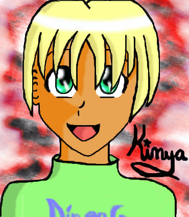
let the burn warm me
nyao
(Aug 5, 2004)
umm... it's a doodle from last year and since my friend wanted me draw something with fire in it, i just thought of this doodle... and u get to see more of my crazy obsession with hair and lineart... but mostly hair this time ^^...wow... the sketch took an hour... O_O;; edit: WOAH... after 2 years of something of inactiveness on 2draw, I find this in showcase?? *is astounded* thank you everyone ^^
enirroc (Apr 3, 2010)
I'm not so much into anime style art usually, but I do quite like the way you drew the flames in this one. Nice job.
dorothyblueeyes (Mar 25, 2012)
beautiful very effective. It looks like it was very hard to do.
mariapeterson1 (Oct 8, 2012)
Very creative, effective and beautiful I like it and I'm really impressed by it...
davincipoppalag (Dec 25, 2018)
back at front |

| |||||||||||||||||||
| Public Boards/Beginner | ||||||||||||||||||||
|
Nyuusen
(Jul 30, 2004)
Well look at thatThis can be deleted or left for me to actually do something with the canvas later. Doesn't matter.
Need to shade...but I wanted to do something with this canvas
There ya go, it's done, no more wasted canvas space
MLA-Kun: Wasn't the SA that I edited it because of, I just didn't like how the picture (pose, coloring) etc. was coming out. ^_^;;
MLA-Kun (Aug 30, 2004)
?? You've restarted the whole pic?Dont be afraid, there's a lot of SA lovers here I think ^^ And the picture is good, but I liked the previous better ^^ |
| |||||||||||||||||||
|
taori
(Aug 26, 2003)
just wanted to clear out my studio. i'm informed that my perception of myself is the equivalent of looking in a funhouse mirror. why call it a "fun" house then? they always creeped me out. ah well, i'll stop being angsty when i stop being a teenager, i'm sure.
Harmanye (Aug 26, 2003)
there are some troubles with the proportions, but since this picture is marked unfinished I assume you mean to fix those, it is turning out quite nicely :) Just a thought, but perhaps two layers for the wheat might be advisable, the extreme back would by a jagged line slightly shaded, and the fron would be finer detail with a few individual stalks (how many, of course, would be up to you, but putting them ALL on individually would turn out messy lokoing in the end.), and would also contain also the matted down wheat that would be beneath her, the color you have is perfect, also the general design (I believe) of the top part. Is it Winter Wheat? (just wondering :) Hopefully this isn't to wordy (or unintelligible) cartman! you're such a fat ass that when you walk down the street, people go, God damnit that's a big, fat ass!
no they don't, you jealous weakling! God damn, that's a big fat ass! HEY!
Xodiak (Oct 24, 2004)
I like both versions very much! Ah, I think I like pretty girls very much. >:)|XOD| |
| |||||||||||||||||||
| Specialty Boards/Collaborations | ||||||||||||||||||||
|
Based on 'Silentz' dolls.
2 comments
– latest 3:Up for colour :) I did colour this myself, but decided I didn't like it, so I deleted the colour sketches and just put it here. |

| |||||||||||||||||||
| Public Boards/Beginner | ||||||||||||||||||||
|
Haushinka
(Feb 16, 2004)
I've had this idea forever, and I'm so glad to finally have it down, and I'm so happy with the way it turned out - exactly how I had invisioned it! Hope you all like it!
Fluffysheep (Feb 16, 2004)
Great pic ! :) You did an amazing job with the textures !
Aubaine (Feb 27, 2004)
I think it looks great :)fin
Mipunai (Aug 12, 2004)
Wow, it's really pretty n_n The colors are and her expression are nice n_n |
| |||||||||||||||||||
| Public Boards/Intermediate | ||||||||||||||||||||
|
Knockoff
(Aug 11, 2004)
Done! :D
Knockoff (Aug 12, 2004)
Haha, Harmaney. That was a long time ago. Hehe. The good old days on 2draw.Thanks everyone! :)
Thear (Aug 14, 2004)
niiice! i just luv how u color!! =Pheh, you ROCK, KO!! ^^
mooseflower (Aug 24, 2004)
O my... Awesomely awesome work you have done here KO! There are so many things I like about this! Keep up the very cool work :D
cocoapuffs (Jul 3, 2005)
http://www.deviantart.com/view/7188888/Knockoff is not as good as he seems. |

| |||||||||||||||||||
| Main Forums/2draw.net | ||||||||||||||||||||
 |
squee (Aug 11, 2004)
wat i mean is like, My family is from.. yadayada. Half my family is from France, (dad's side) THe other, is from Nova Scotia. (mom's side) Spill, where is your family from??
87 comments
|
|||||||||||||||||||
| Public Boards/Advanced | ||||||||||||||||||||
|
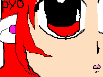
DeadlyBlondeArcher
(Aug 9, 2004)
party's over
Aubrey (Aug 13, 2004)
Yep really neat picture of the broken glass. I'd say someone's been thinkin of alkeehal a lil too much lol. Ah well, makes for interesting art.
DeadlyBlondeArcher (Aug 13, 2004)
lol aub... actually this one is water and I'm not really sure what the other one looked the most like. Really it did look more like wine or apple juice than champagne, I think.
Supergurl103 (Aug 15, 2004)
ooopsy daisy.. lovely job, DBA, u did it again as usual :) need to break more glasses to see that :P
plzdontjudgeme (Oct 19, 2004)
WOW! I LOVE YOUR WORK! its so..i dunno, GREAT! lol :P I'm always amazed by you :) |

| |||||||||||||||||||
| Public Boards/Beginner | ||||||||||||||||||||
|
multi-pass
(Aug 10, 2004)
tis still sucks.
Harmanye (Aug 11, 2004)
Well... *scratches ear... that is, my ear* Spending a larger amount of time would no doubt help.Very cute though, needs a tad bit of shading. ^^;
multi-pass (Aug 24, 2004)
how do you shade?? |
| |||||||||||||||||||
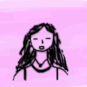
|
Kaboodles
(Aug 11, 2004)
....
Harmanye (Aug 11, 2004)
Pretty neat ^^The nec is a bit too long, but, eh, I shouldn't really be critical about that, myself. And.. well. I dunno. The blurryness is kinda nice, but it looks like you may have blurred it one time too many ^^; The hair is pretty cool, though. Has a realy inky feel, somehow. |
| |||||||||||||||||||
| ||||||||||||||||||||
| 2draw.net © 2002-2026 2draw.net team/Cellosoft - copyright details - 0.77sec (sql: 44q/0.29sec) |