| |||||||||||||||||||||
| Public Boards/Intermediate | |||||||||||||||||||||
|
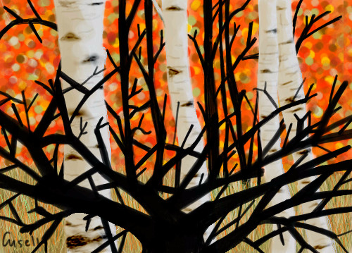
PolythenePam
(May 17, 2004)
It's a bunch of trees. |
| ||||||||||||||||||||
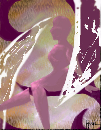
|
3 comments
– latest 3:
Gigge (Jun 14, 2004)
Ooooh. I like it. Good color choice. Such a feminine feel.
DMV (Jun 14, 2004)
This cool has a surreal feel to it :)
Bag_of_Turnips (Jun 23, 2004)
I love it. ^-^ Sooo... cooool... **stares in awe** I love that white thang ya got going on there. |
| ||||||||||||||||||||
| Public Boards/Beginner | |||||||||||||||||||||
|
Gigge
(Jun 13, 2004)
just doodlin'....
davincipoppalag (Jun 14, 2004)
Am I the only one who sees a face?
Gigge (Jun 14, 2004)
I dunno. I can't see anymore. Too busy crying over the spilled milk.....,,,,,,,..comment. :D
emmamommalag (Jun 14, 2004)
I don't know about a face.. I see a white dog with spots of different colors.
JackSprat (Jul 26, 2004)
This is awesome......I love work like this, simple use of colors making a beautiful picture. |

| ||||||||||||||||||||
|
xswirvex
(Jun 13, 2004)
it looks 'ickle' my first time on this site tryin 2 do this..heh
davincipoppalag (Jun 13, 2004)
Not ickle at all.. its a pretty good sketch! Welcome!still working on it :P
Gigge (Jun 13, 2004)
Wow...love the distance effect on the victorian lady. |
| ||||||||||||||||||||
| Public Boards/Intermediate | |||||||||||||||||||||
|
Gigge
(Jun 11, 2004)
I drew another outline for a picture that was mostly glass and then I realized I had never actually drawn glass. Not as bad as I thought it woulc be. Things I learned this draw.....keep blurring, keep blurring, keep blurring....
davincipoppalag (Jun 12, 2004)
Blur is good..but you also need sharp edges.. use the antialias setting and a small brush..and then blur the inside edge (it helps to enlarge when you do this part) with the sharp outlines the rest will look ever so much more real...the top of the clear glass vase is off a bit in perspective I believe. The front edge needs to be a bit higher, it seems to drop too low? This is a good job! I particularly like the blue one!
emmamommalag (Jun 12, 2004)
I love that blue one. Nice job on all of it. :)
WildMageDaine90 (Jun 13, 2004)
that's pretty good! i agree with davincipoppalaq on the need of more defined edges, but it's cool. i like.~WMD90 (LOL)
Gigge (Jun 13, 2004)
Yup...I agree too! The problem started after version two when I decided to add a background so you could actually see the glass. That didn't work at all. The clear glass got so over worked it wasn't worth salvaging. Better to take the comments and try to incorporate them into another picture. Thanks for the tips though. :) |

| ||||||||||||||||||||
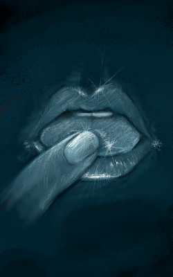
|
staci
(Jun 13, 2004)
whats the wampeter of your karass?
davincipoppalag (Jun 13, 2004)
My wampmeter says 34Kelvin in the shift range...
Gigge (Jun 13, 2004)
Hehe...I might have read the book a little sooner if that had been the cover picture. Nice use of the blue green to emphasize the temperature.
two-na (Jun 14, 2004)
icats, this creates a stream of consciousness that is very interesting to perceive.. good job
fleeting_memory (Jul 27, 2004)
hey Cats Cradle...good book but very weird but then again all of Kurt Vonnegut's books are. At the moment I'm trying to get through "Galapagos" I love this concept but her mouth is very shmall |
| ||||||||||||||||||||
| Public Boards/Advanced | |||||||||||||||||||||
|
emmamommalag
(May 31, 2004)
Another photo that I liked..
Cordelia_Pink (Jun 22, 2004)
Wow, that's really good. It seems so realistic. I really like the effects on the rocks nearby the puddle. And the reflection of the tree on the water is very well done too. Overall it's pretty good. Good job.
emmamommalag (Jun 22, 2004)
Thank you all. Yes, Super.. trees are good to draw.. and to look at. I love trees, although I've never hugged one. Well, actually.. I probably have!
Anna (Jun 24, 2004)
I really like this, momma. I love darker days.. :) So this one is right up my alley. Excellent job on it
Bumble_Beez (Jul 2, 2004)
Ohh... I love this sooo much. |

| ||||||||||||||||||||
| Public Boards/Beginner | |||||||||||||||||||||
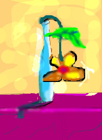
|
xwindflyer
(Jun 13, 2004)
aarrgh
emmamommalag (Jun 13, 2004)
Awww, that poor little posey.. hurry up and draw it some water.
Gigge (Jun 13, 2004)
I like how the birght cheerful colors contrast the sad, droopy flower....and that title really makes you feel compassion for that poor little thing. |
| ||||||||||||||||||||
|
poocabear
(Jun 13, 2004)
This time I didn't get any help from scarfeh.It's a bunch of people's hands.
Nightmare66641 (Jun 13, 2004)
yeah if you let the colours blur and your eyes go out of focus you can see all the hands. looks like a mosh pit. not bad.
emmamommalag (Jun 13, 2004)
Ahhh.. you're right, Nightmare. Very interesting draw.
Gigge (Jun 13, 2004)
ooh, hands.....the title enhances the picture...i like the blured effect...looks like the hands are grasping at something |

| ||||||||||||||||||||
| Public Boards/Intermediate | |||||||||||||||||||||
|
DMV
(Jun 11, 2004)
I had to do this lol! It started out as the way the poster looks then I just added.It was all in fun so....DON'T HAVE A COW MAN!
davincipoppalag (Jun 12, 2004)
Lol! D you must be a teacher! lol hee hee great one!
DMV (Jun 12, 2004)
I thought this was funny:) yeah this bart looks like the first season one lol!
thug (Jun 12, 2004)
Hey DMV, did you ever see the first Simpsons cartoons on the Tracy Ulman show? They were very primative, even more than your Bart drawing, which by the way is excellent. Your comment about the first season made me remember a burping cartoon by the Simpsons on Tracy's show years ago.
DMV (Jun 13, 2004)
yeah ,I remember them on that show they were goofy looking lol!I think homer even had a deeper voice back then too. |

| ||||||||||||||||||||
| |||||||||||||||||||||
| 2draw.net © 2002-2026 2draw.net team/Cellosoft - copyright details - 1.57sec (sql: 37q/0.88sec) |
drawn in 51 min