| ||||||||||||||||||
| Public Boards/Beginner | ||||||||||||||||||
|
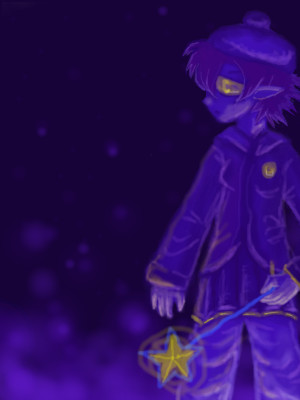
Under The Water it Glowed
George_Goat
(Jun 21, 2006)
But one would be advised not to become lost in the Sea of Tears.
paulfrank102 (Jun 22, 2006)
kinda reminds me of a harry potter book ....
Tsukiko (Jun 23, 2006)
woa! gorgeous
TammyF (Jul 28, 2006)
Wow!! Great effect!! Very captivating picture!!
VQ (Jul 28, 2006)
The colors are amazing! |
| |||||||||||||||||
|
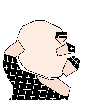
Backstabbed_and_broken
(Jun 22, 2006)
Anarchy!THE GRASS IS GREENER ON THE OTHER SIDE LMFAO
Shanghai (edited Jun 22, 2006)
even though change is often needed for healthy growth as the situations and conditions of yesterday are not always the same as they are today, change through destruction is overrated. That's not to say destruction is never the best way, or that there aren't situations in which the complete downfall of the old ways are the only way that will work out in the long run, but a lot of anarchist I've come across are more focused on rebeling against their parents who told them to do chores than actually researching society and culture. You misspelled government XP
George_Goat (Jun 22, 2006)
Something tells me they might need more than eggs thrown at them....XD Protests, people with more progressive thinking put in office, etc. Nonetheless, I like the simple style of this, and it is kinda funny! I didn't like the backround at all.
|
| |||||||||||||||||
|
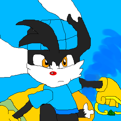
ssmario100
(Jun 22, 2006)
I thought I would try something new, and try some new characters on my page. Klonoa is a prutty cool guy. I really like his games.
George_Goat (Jun 22, 2006)
I LOVED those games. <3333I own the second one, so I still play from time to time.
Akechi456 (Jun 22, 2006)
I loved this game so much. *D*:3 I loved the 2nd game so much. <3 Good job~
Lost_Seraph (Jun 22, 2006)
Klonoa pwnz0rz! ^__^ |
| |||||||||||||||||
|
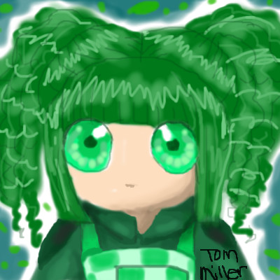
George_Goat
(Jun 21, 2006)
TOM!!
101_Torchic_101 (Jun 21, 2006)
(^D^) Gaia? Yay!! Btw, this is adorable.
George_Goat (Jun 21, 2006)
Yup, it is my old pal Tom's avatar. =OAnd thanks. X3 |
| |||||||||||||||||
|
vapor
(Jun 20, 2006)
a red face.
Sweetcell (Jun 21, 2006)
I agree with Dave, it looks like an Aztec cave painting, or a painting on a pot. Very nice.
duuncan (Jun 21, 2006)
Great work - wonderful, evocative painting!
Axil62 (Jun 21, 2006)
Definately looks brushed on.
solve (edited Jun 21, 2006)
Great texture. Almost like a a mass of bricks were painted with acrylics. Good face and coloring. |

| |||||||||||||||||
| Specialty Boards/Contest! | ||||||||||||||||||
|
Sweetcell
(Jun 18, 2006)
Because of the violent anomoly that orbits close to the colony every 4 years and briefly engulfs the neighboring moon Sitis the citizens cannot work for that one year and use that time to process the ores and metals found in abundance on Aracon. The anomoly's radiation is so harsh that should one be exposed for more than 5 minutes they have little chance of surviving. But despite this danger the citizens are willing to risk it for all the riches that can be found on the planet.
George_Goat (Jun 22, 2006)
Absolutely awesome. The atmosphere in this painting seems to have a ton of feeling in it. It's the kind of thing, that if you were really there you would be overwhelmed with the sheer mystery and danger of it. I like this lots.
TammyF (Jun 23, 2006)
Love the space magic here!! It's sooooo exciting to see your work in color!! It's even better than I imagined it would be!!
Sweetcell (Jun 27, 2006)
I'm all smiles, thank you all so much.
cianteed2 (Jun 27, 2006)
this is really gorgeous. i dont usually like space drawings, but this is just so beautiful. the detail is wonderful, truly out of this world! =P |

| |||||||||||||||||
| Public Boards/Intermediate | ||||||||||||||||||
|
George_Goat
(May 11, 2006)
but it came as a surprise, what the means of transportation would be
mikron (May 12, 2006)
This is great =)I mean.. you can almost see her panties! (kidding...) good pic ! and I like it because she holds on to the baloon itself, and its more difficult, slippy wise.
fleeting_memory (May 12, 2006)
aw this is adorable-what a cute concept
Sweetcell (May 12, 2006)
Wonderful imagination. Peter Pan must be out of shot.
cianteed2 (Jul 31, 2006)
incredibly cool |

| |||||||||||||||||
| Public Boards/Beginner | ||||||||||||||||||
|
George_Goat
(Mar 3, 2006)
Finished it up. C; I made the wings on this transparent, because I don't like making quite the same thing twice; the blue lady on a previous art of mine also had butterfly wings so I wanted them to differ.
George_Goat (edited Jul 31, 2006)
I draw with a laptop touchpad... D: I dunno, making good pictures with a computer art program is mostly trial and error, practice, and refinement. *shrug*
cianteed2 (Jul 31, 2006)
wings and hair are really good.
Sweetcell (Jul 31, 2006)
I missed this one, it must have flown by me. I LOVE those wings, I find that hardest on fairie pictures. Gorgeous, and that little friend of hers is cute. |

| |||||||||||||||||
|
George_Goat
(Feb 17, 2006)
I left it on for a long, long time again. D; Now, I really need advice. On the hand. I wanted the perspective on the hand to look like it was waaay in front of her, but does it look...funny? And does anyone know what could I do to improve it/make it more realistic? I'd really, really appreciate any advice at all. >u<
George_Goat (Feb 17, 2006)
Ah, thank you both very much! =O I definitely will take that into consideration, I did leave the hand kind of smudged/blurry, mostly because I was unsure what seemed to be the trouble. And indeed, the cuff's too high up. For now I'll just say it's....rolled up while the other one isn't. >U< Now that I looked away and see it again I'm also thinking I might add a tiny bit more shadow to the very base of the fingers and maybe make the tips even lighter, for more contrast and dimensionality. And yep, the teeth were drawn that way specifically for the customer. X3 I also think it would have been a less...disturbing picture without them, but, the customer is always...right. Dx You both were a great help. <3
suzie (Feb 20, 2006)
I think the perspective on the hand is just perfect how it is, and I am jealous as my perspective needs practice! :S Nice draw :D
xXxJamiexXx (Feb 22, 2006)
Wow this is really a pretty picture...except the teeth, why are the teeth there?
George_Goat (Mar 28, 2006)
xXxJamiexXx: Read my comment right before suzie's? >.> |

| |||||||||||||||||
| Specialty Boards/Collaborations | ||||||||||||||||||
|
Draw some "sexy" eyes!!! ;D
27 comments
– latest 4:
deleted10215 (Feb 23, 2006)
aaawwwwwwwwwwwww i want to join but its finished
Protocom-iko (Feb 23, 2006)
wow! me like the red eyes their soo DARK
DieChan (Mar 9, 2006)
This is kinda creepin' me out... that signature looks just my real name. o_O The last name, too. The signtaure under the grey eye on the bottom. Freaky. What is that name?
whitefox0 (Nov 30, 2006)
I love this one!!! |

| |||||||||||||||||
| ||||||||||||||||||
| 2draw.net © 2002-2024 2draw.net team/Cellosoft - copyright details - 0.44sec (sql: 36q/0.18sec) |