| |||||||||||||||||||||||
| Public Boards/Intermediate | |||||||||||||||||||||||
|
kohrak
(Dec 4, 2003)
the faces of the box are going to be filled with drawingswhat yyou think about the background |
| ||||||||||||||||||||||
| Public Boards/Advanced | |||||||||||||||||||||||
|
furyofroy
(Dec 1, 2003)
Is Virgil an original name?
Krystiana (Dec 6, 2003)
The style reminds me of Usagi Yojimbo. It's very nice - simple, but powerful. Cool. ^_^
elana (Dec 11, 2003)
Virgil is the name of my grandfather, you could make a female to go with this guy and name her Gertie (my grandmother) LOL!
mikhail (Dec 20, 2003)
i like the design and concpet of the sword, however the rest doesnt really appeal to me, whatsup with all this cat stuff?
angelbate (Dec 20, 2003)
very smooth, and good anatomy and design. like all the elegant weaponry and tail. |

| ||||||||||||||||||||||
| Public Boards/Beginner | |||||||||||||||||||||||
|
concannon
(Dec 1, 2003)
Obviously.Time, 'cause shi-painter ate the original image and 'cause of dinner and dishes.
Neko (Dec 2, 2003)
The "rubber fur" really does describe it well. You've done great work with making him look all shiny and smooth. Colouring works great as do shadowing and the shine.Still can't believe this can be done with a Shi-painter...~
marcello (Dec 3, 2003)
dunno what you're talking about, shi painter and lascaux are way easier to do stuff like this in than paintbbs...
T-wins49 (Dec 3, 2003)
hey thats not begginer work *lol* i want it ....Bwahahaha....*steals kitty* try and stop ME!!! *runs away with kitty*
Mafuyu (Dec 4, 2003)
0.0!! *hugs* *runs without letting go* |

| ||||||||||||||||||||||
| Public Boards/Intermediate | |||||||||||||||||||||||
|
31 comments
– latest 4:
Enishi (Jan 3, 2004)
Holy cow...that is AWESOME, let me buy your talent pleeeeeeeeeeeeeeeeeeeeease!!! Seriously...its awesome
fleeting_memory (Jan 28, 2004)
you coppied that off of Digital Blasphamy didn't you? That's my background-VERY nice
marcello (Jan 28, 2004)
read the description, a reference link was added after I commented on that
KiwiKitsune (Apr 9, 2004)
STOP. O_O It's way too awesome... I suck at drawing with a mouse... and......................... you............ x.x you rock! |

| ||||||||||||||||||||||
|
Zappo
(Nov 30, 2003)
Raw! C&C pretty please
Dirty_Cooth (Nov 30, 2003)
awesome. I love it. The face is great, especially the redness around his mouth. :D
Childlike_Vampire (Nov 30, 2003)
Wow, this is vurry wicked, I don't really like it, but it sticks out and is very well done. It almost looks like a pic from a comic or summing. Good job!
mikhail (Nov 30, 2003)
looks good... not really scary or anything tho
mazi (Dec 1, 2003)
completely awesome. uber original. |

| ||||||||||||||||||||||
|
Vinegar
(Nov 29, 2003)
Ill be done in like 4 hours gotta run out..
mazi (edited Nov 30, 2003)
nice lines, nice colors, but i think the shading/highlights really need some work.[edit: the colors look kinda flat. they could use a lot more shadow.. looks like you just used the dodge tool a bit over your coloring. try using various colors where you only have one now for instance. and various shades of the same color, depending on what effect you want.]
furyofroy (Nov 30, 2003)
I like the way you think. =3 Looks like there might be competition between us. *licks lips* I'll be looking foward to your future pics.
Fin_beast (Nov 30, 2003)
The boobs are a bit wanky...sorry wonky but everythin else is good!
Vinegar (Nov 30, 2003)
I just got here..fury, glhf.. i like ur stuff fin and mazi, thanks for critique, but could u be more descriptive, or give examples to help me not make the same mistake again :) |

| ||||||||||||||||||||||
|
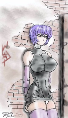
LiLMac05
(Nov 28, 2003)
Lalalalala Da** face is gonna take me a while gotta add background to it a lil moreim still not done hopefully be done 2night
tappie_chan (Nov 29, 2003)
the wall is tight! it looks like shes leaning against it cuz if she doesn't, those ginormous boobs will make her fall over! lol j/k ^____^ this is nice. she looks like she should be a character in a fighting game.well well well.....im very tired of workin on this piece so i give it quits...was goin to add graffiti too the BG and make the brick a lil more Realer, i also messed up on the face!?!?!awwww, well hope ya'll enjoy! :D
|
| ||||||||||||||||||||||
| Public Boards/Beginner | |||||||||||||||||||||||
|
Serchul
(Nov 29, 2003)
Messing around with layer effects..
tappie_chan (Nov 29, 2003)
what a beatuiful mess it is. it kinda has a shiny quality to it. i like it.
Fin_beast (Nov 29, 2003)
Yea thats cool. It's like mother of pearl! |
| ||||||||||||||||||||||
|
animekittykat
(Nov 29, 2003)
this is my first pic ive drawn online so ya i was just messing around i hopw its not that bad
Fin_beast (edited Nov 29, 2003)
keeps your mum a day? |
| ||||||||||||||||||||||
| Misc. Boards/Sprites | |||||||||||||||||||||||
|
marcello
(Nov 29, 2003)
The question is, did you fall for it?
DarkFact (May 10, 2004)
HAH! Just shows how much of you are p0rn addicts clicking on this link!! Me.. ehm, I accidentaly clicked on the link. Yeah.
HeadlessHeadbanger (May 16, 2004)
i knew someone would do this!!! and the sad thing is ... yes i did. i was just about to go into configurations....ugh. nice job.
Cordelia_Pink (Aug 19, 2004)
lol ha ha I guess there's no need for the rating to be 18+ 'cause obviously that's what it shows. and it would also trick those people who are so crazy for porn and would probably be double checking their privacy ratings to see if it was all of the above and their eyes weren't fooling them. lol looks like the exact replica.
Wraith (Feb 25, 2021)
Yes I fell for it :/ |
This is hidden because it is rated 18+. Edit your privacy settings to make it visible.
| ||||||||||||||||||||||
| |||||||||||||||||||||||
| 2draw.net © 2002-2026 2draw.net team/Cellosoft - copyright details - 3.32sec (sql: 39q/2.22sec) |
The only thing is the red and yellow layer has kinda un-natural strait lines to it.