| |||||||||||||||||||||||
| Public Boards/Beginner | |||||||||||||||||||||||
| 1 comment – latest 1: |

| ||||||||||||||||||||||
| Public Boards/Intermediate | |||||||||||||||||||||||
|
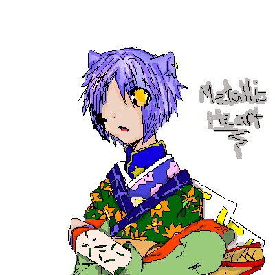
Garnet
(Jul 11, 2006)
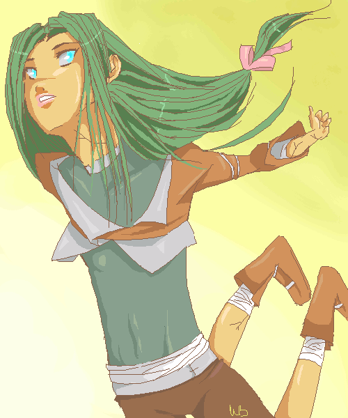
Haven't drawn in a while and I plan on doing it seriously tomorrow, so I must warm-up! Jeez, feels like it's been ages...Also, if you would, I need critique badly. I've never done perspective before, and I'd really like to get better at it. Thanks for the help! :D
hideyourface (Jul 14, 2006)
well yeah, that and the flat looking body, the giant neck, and the large forearm. Where the legs are now make it seem as if the upper leg is much too short, and the lower is much too long.
Garnet (edited Jul 14, 2006)
Yes, with that I agree... both the legs are off in terms of what the human body is capable of... There's no way to bend them like that, or for them to be that high... OK, thanks a lot, Gigandas! I really appreciate it! n____nAh, the neck, I didn't even notice! T__T Thanks, though!
hideyourface (Jul 14, 2006)
well yeah, that and the flat looking body, the giant neck, and the large forearm. Where the legs are now make it seem as if the upper leg is much too short, and the lower is much too long.
Sweetcell (Jul 14, 2006)
But how do you suggest on changing it hide, that's what she's asking.For me it's the arm. I assume it's pushed behind her? Though it would be smaller to show distance it's far too small. It needs beefing up. From the shoulder to her elbow to her wrist. It would taper as it gets farther back but the way it is now it seems too... sticklike. Especially in comparison to the rest of her body. Thicken it up a bit (including her hand,) and I think it'll be alright. As for her legs both fore legs need to be lowered. As it is now the thighs would only be half as long then they normally would be. If we saw her knee it would be near the blue of the Description strip window. We'd only see a bit of her left leg. We would see the whole of her right leg. It needs to be shortened, only half the calf showing, in the perspective her right boot would look shorter than her right because of the angle. And as for her chest, even flat chested there would be a suggestion of form by way of the shoulder, curving out to where the chest is, then of course curving to the stomache. (I hope that makes sense.) Best ref's to use I think are cliff jumpers or sky divers. They come closest to bending like this. I hope you take it as suggestions. Overall it's a great composition and you'll know what to do on your next piece. In art it's an ever growing process of learning and bettering yourself. Just don't change the colors. They're like a wonderful eye candy. *<>* |
| ||||||||||||||||||||||
| Public Boards/Beginner | |||||||||||||||||||||||
|
Hakkai
(Jun 5, 2006)
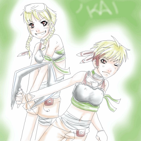
Mmm blah blah blah.Maybe I'l do some sort of sloppy coloring later.
Dromophobic_o.o (Jul 14, 2006)
I love your line art. =]Blah blah blah. It looks nicer when colored.. Although It was a crap coloring job.
Pretty rushed because it looked uglier if left alone.
pancakes_rock (Jul 14, 2006)
very cute drawing i wish i can draw like you's but i cant draw at all =( |
| ||||||||||||||||||||||
|
Dromophobic_o.o
(Jul 14, 2006)
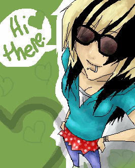
Its on beginner because i really didn't feel like putting effort into it.. at all...so if someone could move this up to intermediate that would be grand.
Akechi456 (Jul 14, 2006)
Love eet. ;3
Dromophobic_o.o (Jul 14, 2006)
Lol. "eet" made me smile XDthanks btw =]
concannon (Jul 14, 2006)
Very stylish. :] I dig.
Fairy_uni (Jul 14, 2006)
hi rockstar!!!! |
| ||||||||||||||||||||||
|
Dromophobic_o.o
(Jul 14, 2006)
omg an icon.
JasonNGT (Jul 14, 2006)
O_O;; person.... you're Oekaki skills are awesome!!! darn it... If I could fave this... I would lol
Dromophobic_o.o (Jul 14, 2006)
lol Thank you. ^_^
JasonNGT (Jul 14, 2006)
no problem. but tis true tho XD
Crazi_Insani (Jul 14, 2006)
OOoo spiffy! I love everything about this icony icon vv^ |
| ||||||||||||||||||||||
|
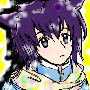
Akechi456
(Jul 13, 2006)
x___x Omfg.I was trying a picture with more detail than usual,and it's ugly.;~; ;:sob:: Ah.This is a celebration picture..because I'm getting L`Arc~en~ciel's SMILE CD on the 21st.:3
Dromophobic_o.o (Jul 14, 2006)
aw. =]cute line art. Gaia distracted me.D:
Finally.
NOVEMBER93 (Jul 17, 2006)
version 3 scares me. but the way you finished it looks nice. i like the hair |
| ||||||||||||||||||||||
|
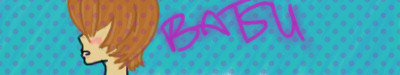
revolvere
(Jul 13, 2006)
Making this for fun for my batsu account, plztiksmile; although I already have a sig I photoshopped of "Detective Miyv" on there. ;DThoughts welcome~!
Dromophobic_o.o (Jul 14, 2006)
I like it. =D |
| ||||||||||||||||||||||
|
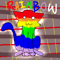
Natsuna
(Jul 13, 2006)
:DI have no idea D:
Natsuna (Jul 14, 2006)
Don't make Fun of my Gay Kitty D:<
Dromophobic_o.o (Jul 14, 2006)
Im not D':
Akechi456 (Jul 18, 2006)
Because Natsuna capitalized the begging letters of 'Fun','Gay' and 'Kitty',it looks like his name could be 'Fun Gay Kitty'.xDAnd I like this.::licks:: Taste the rainbow.:B
Wild_Mustang_Girl312 (Jul 18, 2006)
I'm scared..... should I be scared? |
| ||||||||||||||||||||||
|
zerocat
(Jul 13, 2006)
Ritsuka.......
Dromophobic_o.o (Jul 13, 2006)
=GASP= Aww.. Little rituskaa~ He's so adorable =]i love this. he came out so cute. |
| ||||||||||||||||||||||
|
pray4love
(Jul 13, 2006)
A picture tribute to my dovotion and love to my dearest partner and friend, K.Ezra. For all the time we have together. These are also two Gaia avatars left to right: GAY~THING, Rena_Kun(me[Corey]) enjoy. this is YAOI, too.
Zack (edited Jul 14, 2006)
it was just an observation, not aimed at anyone in particular.
pray4love (Jul 14, 2006)
:p. like i care. it isn't porn. yaoi isn't porn. get over it.
pray4love (Jul 20, 2006)
we use the word 'Yaoi' as code when in school. there is no sexual interaction between me and a friend. that's dishonesty to my lover. |

| ||||||||||||||||||||||
| |||||||||||||||||||||||
| 2draw.net © 2002-2024 2draw.net team/Cellosoft - copyright details - 0.44sec (sql: 38q/0.17sec) |
He eye looks awesome and i like your use of tones. =D