| |||||||||||||||
| Public Boards/Intermediate | |||||||||||||||
|
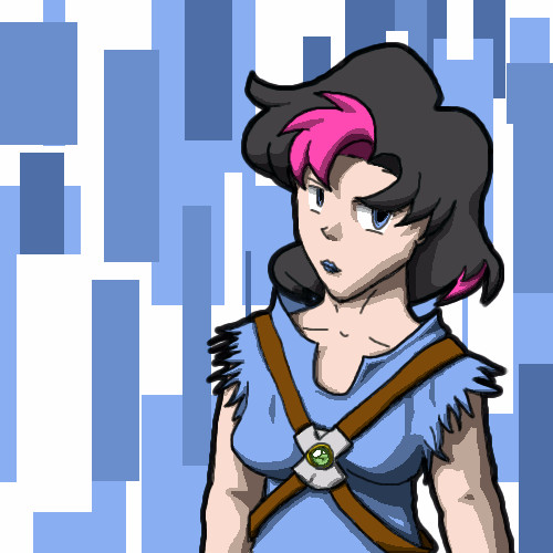
kaT
(Jul 25, 2004)
An old character...I decided to redo her a little bit...hope I don't get sued... |
| ||||||||||||||
|
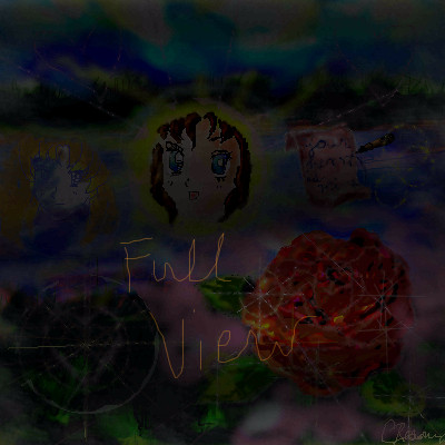
Cordelia_Pink
(Jul 9, 2004)
I'm not sure why I did this. I first drew the background and thought about a river and all that. Then I had an idea of adding a bright round-ish object or something really bright in the center. The face of a girl didn't come into mind until I finished doing the background. blah. Then there's a rose. I really don't know why I put that in there. I know the picture doesn't make sense, a rose, a face of a girl and another girl (from a distance, fading away), a little note saying 'Your heart is mine' and some bright and dark areas... I don't know. Just my obscure thought process. lolOh thanks! lol I don't know if I really have a style. I mean, I try to make my pictures a little more different from other peoples. I usually draw things out of my memory, and my thought process is a bit weird. lol but that's cool. Thanks. I'll try and do some more. =)
DireOnion (Jul 10, 2004)
Ooh, just saw your other drawings and I'm really liking your style. I'd really like to see more of them!
emmamommalag (Jul 19, 2004)
Doesn't have to make sense, Cordelia. I love the rose! :) |
| ||||||||||||||
|
LovelyLori
(Jul 10, 2004)
:O
davincipoppalag (Jul 10, 2004)
Well it doesn't look like garb to me either, but I do like the design and the colors
Aubrey (Jul 10, 2004)
Looks like a cool design for a shirt or somethin-some-such
emmamommalag (Jul 10, 2004)
I can't imagine how you'd wear this as garb either but it IS cool looking. I like the metallic look it has.
Knockoff (Jul 14, 2004)
Though I don't know what this is, I really like this. The colors work well. Nice one Lori. |

| ||||||||||||||
|
DireOnion
(Jul 5, 2004)
what
Zack (edited Jul 9, 2004)
excellent job on the texture on the statue. i don't know if you meant for the red to look like flame, but right now it's wispy and sketchy and thus looks more like motion-blurred photography of some red neon thing. the sword is pretty creative but looks unwieldy (perhaps a longer handle would help?) and the texture seems lumpy instead of shiny. i'm interested in seeing how this turns out.
DireOnion (Jul 10, 2004)
Thanks for you comments and suggestions, Zack. I'm definitely going to change the sword, but the fire...well, I'm not going for any sort of realistic look...or any look in particular. I usually let my stuff "draw itself", heh.
mazi (Jul 11, 2004)
yeah i think this one should be brought up a notch to stay on the advanced board. of course, it is still unfinished.I became tired of this old thing so it's now my little study of how light looks to the eye or something. Not like I'm trying to teach myself how to draw properly! (Oh my god her tit looks huge, but don't tell anyone, okay?)
|

| ||||||||||||||
| Public Boards/Beginner | |||||||||||||||
|
Chi_Motosuwa
(Jul 6, 2004)
.
DireOnion (Jul 6, 2004)
This is very interesting. I'd really like to see more of your drawings.
Anna (Jul 7, 2004)
Neato! I love the eyes. This reminds me of the Shel Silverstein (correct spelling?) books :D
cherikit-chan (edited Jul 9, 2004)
I like the sketchy effects and the eyes! |
| ||||||||||||||
| Public Boards/Intermediate | |||||||||||||||
|
Verde_Pirate
(Jul 6, 2004)
Nothing special, so I don't need any comments (unless you wanna leave them. ^_^)
DireOnion (Jul 7, 2004)
There's just something about this drawing that makes it work.Nice. |

| ||||||||||||||
|
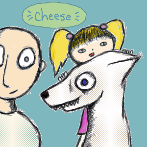
101_Torchic_101
(Jul 5, 2004)
Eh..It Doesn't Look That Good -_-
Kenshin (edited Jul 5, 2004)
Cute, but you need to fix it up a bit and give it a background or it can get deleted or bumped... You could make fingers, you could smooth out the lineart, make the coloring a little better, make it better proportioned and maybe add some more details.Yooko-chan It Looks Way Cooler Now^^!
Okay, I Added Some Sorta Army Background Wave-Ish Thing ^^ Cool
ILoveKenshin (Jul 5, 2004)
I think this should be in beginner... It's cute and all, and I like the outfit, and the background's cool, but I just don't think it matches up to intermediate standards, even though it's cute in its own way...-Hana-chan |
| ||||||||||||||
| Specialty Boards/Contest! | |||||||||||||||
|
DireOnion
(Jul 1, 2004)
You don't want to know.
Gigandas (Jul 3, 2004)
Hehe, this has a cool warped feel to it.It doesn't make sense to me but.....I like it :).
friend (Jul 3, 2004)
not to be rude or anything but wat the ruddy heck is that??????????????? its awesome tho! :)
Gigandas (Jul 3, 2004)
It's a fish cannon.....just a guess :)....
DireOnion (Jul 3, 2004)
A fish cannon, indeed. For some reason I felt like drawing a man with a fish cannon, so when I saw the new theme, I just had to do it. |

| ||||||||||||||
| Public Boards/Intermediate | |||||||||||||||
|
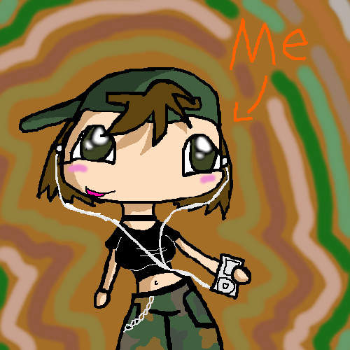
DinoFlorist
(Jun 11, 2004)
Hes got short legs and short arms, but he runs so fast! He's like, awesome.
Kloxboy (Jun 12, 2004)
Yes, over all I like the smell of this piece. Nice sketch, creative stuff.
DireOnion (Jun 12, 2004)
Hah! I knew it. Tennis IS the sport of the elite!
davincipoppalag (Jun 12, 2004)
Lol..the King worked very hard.. and he knew how to get a Head... ... (great pic dino! very creative!)
mangaflip (Jun 14, 2004)
art school effect ^^ i think...very good |

| ||||||||||||||
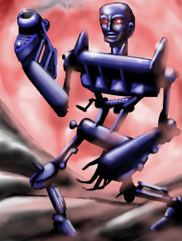
|
20ark
(Jun 12, 2004)
Robots are so awesome. I Wish I could be more like them.
DireOnion (Jun 12, 2004)
That's just creepy. Your description, I mean.
DMV (Jun 12, 2004)
Overall this is a good piece, good job!
davincipoppalag (Jun 12, 2004)
Your blends are good and so is the composition. This is good.. you need to do a collab with DMV..whattaya think D?
emmamommalag (Jun 13, 2004)
This is really cool and you did a good job on it. But why would you want to be like a robot? |
| ||||||||||||||
| |||||||||||||||
| 2draw.net © 2002-2025 2draw.net team/Cellosoft - copyright details - 0.64sec (sql: 42q/0.20sec) |
drawn in 28 min
drawn in 53 min
drawn in 9 min