| |||||||||||||||||||||||
| Specialty Boards/Contest! | |||||||||||||||||||||||
|
Me
staci
(Feb 22, 2004)
the likeness is there.
DeadlyBlondeArcher (Feb 22, 2004)
You done good, yep. I like these colors, and the half-tone effect.
-simulacra- (Feb 23, 2004)
:P Looking from our pov, the right side of the face has a good shape to it, but the left side, that thick gray line makes the face look far too rounded. And you look so proud...muah. Wtf are halftones >.<
thug (Feb 26, 2004)
I can't believe I missed and just now found this. gotta say WOW! I think this is by far your most creative and overall best piece. beautiful, wonderful, more explatives
Cobra (Feb 27, 2004)
Now I love this, it's bold with energy and it's because it's what you THINK ,that makes this good art....excellent! |
| ||||||||||||||||||||||
| Public Boards/Intermediate | |||||||||||||||||||||||
|
dixielandcutie
(Feb 22, 2004)
sometimes ya feel torn apart
DeadlyBlondeArcher (Feb 22, 2004)
I really like these abstract, 3 dimensional pieces when you do them, Dixie. I think you've found your niche. (I don't ever feel torn, though, I usually feel like I slept on the interstate and was run over by a bunch of 18 wheelers)
davincipoppalag (Feb 22, 2004)
lol good album cover for that old Patsy Cline song... I Fall to Pieces... lol (or maybe ZZTop..She's Got Legs) lol very creative.. and interesting
dixielandcutie (Feb 22, 2004)
ah ha. my niche...i hope not. i wish i could do realism better...*sigh* haha, ooh well, practice practice... thanks tho : )
Gigandas (Feb 22, 2004)
Once again, nice and creative^^.And whoa, that eye you drew looks cool XDDD.Love the iris a LOT^^.Good job XD.The color choices are awesome too in my opinion.Usually, I have a lot of trouble with colors and feel like certain colors are missing^^;.But in your case, it seems like you have it right on^^. |
| ||||||||||||||||||||||
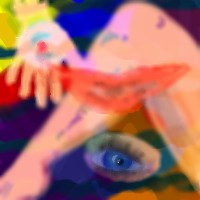
|
6 comments
– latest 4:
davincipoppalag (Feb 22, 2004)
Lol you should sell this as a wallpaper pattern
DeadlyBlondeArcher (Feb 22, 2004)
A Mr. Potato Head board game! This is interesting. I like it.
lilypad (Feb 23, 2004)
that's DEFFINITLY modern. or maybe Picasso reborn. or a new art style. or an old lost one. or i don't know one. or one i've seen but don't remember. but it's modern. ^^me likey this
method3 (Feb 23, 2004)
Ok, I think I'm going to be the first one to say this, here goes. Firstly the colors suck. I mean, I get how they are matched together and all, but you look at it overall and it's like someone puked up bubble gum and spaghetti all over a green and blue floor or something.Secondly I hate most modern art. |

| ||||||||||||||||||||||
| Public Boards/Advanced | |||||||||||||||||||||||
|
DeadlyBlondeArcher
(Feb 19, 2004)
1955 Chevrolet BelAir
marcello (Feb 28, 2004)
people, use email, people.
DeadlyBlondeArcher (edited Feb 28, 2004)
lol @ Marcello. You kiddos don't want me to come over there with a switch, do ya? (And I'm only 23 yrs older than him - don't push it.) Yes, Sim, she is an angel and I'm sure your Mom is proud of you, too.
dixielandcutie (Mar 4, 2004)
lol, at all of you. sim...washed and and flat? omg. put on your glasses man. its a style, and i happen to like it a lot. and yea, her daughters pretty darn cool too ;p
Cordelia_Pink (Jul 11, 2004)
Ohhh, very nice. lol Although I'm not very fond of cars (well, I'd like to have one but don't really care about the brands) this is a pretty well drawn out car lol even though it looks old lol j/k Anyhow I like some of your work. They're really getting better. =) GJ |

| ||||||||||||||||||||||
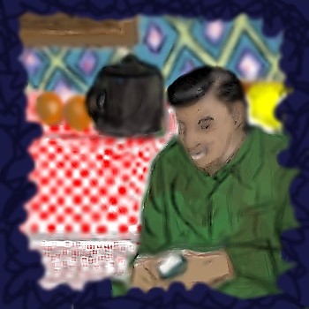
| Public Boards/Intermediate | |||||||||||||||||||||||
|
dixielandcutie
(Feb 19, 2004)
ok, i wanted to try and imitate the style of Norman Rockwell...this is based on a childhood memory ok, not sure if this is exactly what i was going for...but i definitely learned a lot...thanks furyofroy for your patience...and i think im gonna callit a day unless anyone has any suggestions. :)
DeadlyBlondeArcher (Feb 21, 2004)
I really like the way you did the tablecloth - he is just a tad bit blurry, maybe if you sharpened the edges on him he would come to the foreground a little more.
davincipoppalag (Feb 24, 2004)
its nice dixie..but I would like it sharper..
DeadlyBlondeArcher (edited Feb 25, 2004)
This is mucho bettero, senorita. :) Has more depth now. (I noticed in v.2 that you had it down right, you prolly just lost the definition when you were blending the colors in the shirt) |
| ||||||||||||||||||||||
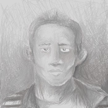
| Specialty Boards/Contest! | |||||||||||||||||||||||
|
DinoFlorist
(Feb 21, 2004)
This was based off of the picture on my profile on MSN messanger; I don't know if that's an actual page. But my member name is benfolkner@hotmail.com People from inklink might have seen it on the inklink group site.
DinoFlorist (edited Feb 22, 2004)
well actually I didn't really look at it. It's just casue I can remember what it was like. But her's the link, it's a LONG one!link I tried it. You have to copy and paste that whole thing in to your browser.
evil_cloud (Feb 21, 2004)
hm...its good, but I think it needs more dark in some parts.... But in fact like it
davincipoppalag (Feb 22, 2004)
I like the sketchy look too but I think more contrast would be good too
EverDream (Feb 24, 2004)
I like this and the light tones make it stand out more I think. The only thing that really bugs me is your right ear looks pointed and smaller than your other one and your left eye looks a tiny bit bigger than your right. Heh...try saying that ten times fast! -tries- -right-left-left-right-right-wrong...(erm..yah..) |
| ||||||||||||||||||||||
| Public Boards/Beginner | |||||||||||||||||||||||
|
Kloxboy
(Feb 20, 2004)
cookies
DeadlyBlondeArcher (Feb 20, 2004)
OMG! You crack me up! :D I am laughing so hard. Actually, I like this one, too. Looks kind of like petroglyphy or something.
davincipoppalag (Feb 20, 2004)
this is obviously an ancient Sumerian map showing the location of the sacred oatmeal /raisin cookies... they were worshipped as God's before the advent of the ubiquitous chocolate chip..... |
| ||||||||||||||||||||||
|
Kloxboy
(Feb 20, 2004)
fine, I colored it, happy?
DeadlyBlondeArcher (edited Feb 20, 2004)
Oh yes, my whole world is rocked now. :) Geez I just realized I gotta get off this site and get out of here more lately. All of the most recent comments on the front page are mine.
davincipoppalag (Feb 20, 2004)
um...I'll drive... I have alot too... lol
Childlike_Vampire (Feb 21, 2004)
Mmm that's a tasty picture. Love the soft bold lines, like a comic. Rawr.
davincipoppalag (Feb 23, 2004)
I like this..the heavy lines give it a strong image.. it looks like a poster of Bob Marley nice. |

| ||||||||||||||||||||||
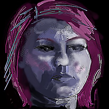
| Specialty Boards/Contest! | |||||||||||||||||||||||
|
DeadlyBlondeArcher
(Feb 20, 2004)
If this doesn't kill the theme board, nothing will. I have this pic scanned to my files, but don't know how to make a link to here... There is a black and white version of this picture @ www.dba.schauk.com . Have to scroll through the first two pics- it's the third.
EverDream (Feb 24, 2004)
Oh...don't say that! For an attempt at portraitry...(especially if you're not used to such work) this is really good! You got the proportions of your face down right, it just looks so soft and pastel like. I like it DBA and with a little more practice (that is if you're up to it) You can get really good at faces! Greak job!!! XD
sal (Feb 27, 2004)
wired lookin scenery on those other pics.... is that deer thing dead?
Cobra (Feb 27, 2004)
Wow! DBA what a beautifully talented artist you are, your work is always a joy
DeadlyBlondeArcher (Feb 28, 2004)
No, sal, I asked the deer really nicely to lie down and be still for the picture. Yeah, they usually get dead when I put an arrow through their heart. Thanks for the nice comments, ya'll. |

| ||||||||||||||||||||||
| Public Boards/Intermediate | |||||||||||||||||||||||
|
laurael
(Feb 18, 2004)
Just trying shading, sheer stuff and hair...reached ma limit...
laurael (Feb 19, 2004)
Damn...you're right about the messy...I always miss 'something'...ah well, I'm still an apprentice yet...
Childlike_Vampire (Feb 19, 2004)
No worries, I think this pic is damn spiffy. I want her lipstick. lol
Gigandas (Feb 19, 2004)
I like the skin tones a lot on this one^^.Dba's comment about the hair would be nice to see.Looks as though this will be another good pic added to the boards here^^.Good job.
davincipoppalag (Feb 19, 2004)
Yeah..great job on the skin ! |

| ||||||||||||||||||||||
| |||||||||||||||||||||||
| 2draw.net © 2002-2025 2draw.net team/Cellosoft - copyright details - 2.01sec (sql: 36q/1.79sec) |