| |||||||||||||||||||||||
| Public Boards/Beginner | |||||||||||||||||||||||
|
ak.to.v.his.di
(Dec 28, 2004)
think about it.... let me know what you figure out.... |
| ||||||||||||||||||||||
|
momiji
(Feb 5, 2005)
Ok one its not done,and two i know the shoulders are pointy and not square,the head looks deformed,the skin is a weird color,and the hair is really jacked up!
Kenshin (edited Feb 5, 2005)
Gasp! :D I am Kenshin, not ILK! XD Yay! Momiji :3 -glomp-
Nyuusen (Feb 5, 2005)
Lay off the straight line tool.
ak.to.v.his.di (Feb 5, 2005)
yea.. you don't need a tablet, i don't have one and i'm not that bad. try drawing freehand with the mouse instead of using the line tool.by the way..... Welcome to 2 Draw! ^_^ I redid a completly difernet drawing.Its not done yet i need to at flippers and eyes
|

| ||||||||||||||||||||||
| Specialty Boards/Collaborations | |||||||||||||||||||||||
|
this is for you kilala! i apologize in advance for the choppy lineart. i did this twice >_<, stupid computer is nearly on it's death bed. rest in peace little buddy....
15 comments
– latest 4:here ya go, have fun colouring it! |

| ||||||||||||||||||||||
| Public Boards/Beginner | |||||||||||||||||||||||
|
bakuraiscool
(Jan 18, 2005)
ARRGGHH!!! |

| ||||||||||||||||||||||
|
blackmamba
(Feb 4, 2005)
finish later. do you think i should continiu?maybe betterr
Cacau (Feb 5, 2005)
Very pretty. I lvoe her face. Continue!
blackmamba (Feb 5, 2005)
thanks . i will continiu then..........i cant find anything to do better
|
| ||||||||||||||||||||||
|
Broken_Chaos
(Feb 4, 2005)
o.o my comps been a bit weird lately so just doing a safety save thingy.
Cacau (Feb 4, 2005)
LOLOLOL!!! You rock >< the feather's a bit blurry though... But me likes =D
Broken_Chaos (Feb 4, 2005)
Tis the way i wanted it ^^; i was testing it out last night so i wanted to put it in somewhere.
Knockoff (Feb 4, 2005)
Not bad, but shes a bit too skinny.
Austin400 (Feb 4, 2005)
wow the feather looks wonderfull!!!!!!!!!!!!!!!!!!!! |

| ||||||||||||||||||||||
|
Cacau
(Jan 26, 2005)
Random-realistic-sketchy-girl? I hope it fits here.
pandabarrie (Jan 26, 2005)
i really like the sketchy look of it! *nods*the simplicity of it is very nice indeed^__^
Cacau (Jan 26, 2005)
That´s because it´s my first attempt at realsim using sketch-techniques, so simple =P Thankies!
StrawberryYamichan (Jan 27, 2005)
its so simple and nice and sketchy and cool and lots of nice words.
Maiko (Feb 4, 2005)
I agree with Nyuusen o_o I thought It was gonna be Miyavi at first >_>;pretty nice :3 you're getting better |

| ||||||||||||||||||||||
|
onecaloriecoke
(Dec 11, 2004)
<.< Kay...
Cacau (Dec 11, 2004)
Cute! I love the BG! 1 circle 2 circles...
StrawberryYamichan (Dec 16, 2004)
aaaw how cute ^^!
clowangel (Feb 4, 2005)
Awwww.. That's adorable! ^_^ |

| ||||||||||||||||||||||
|
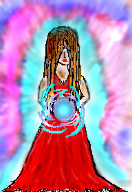
Cordelia_Pink
(Dec 25, 2004)
Basing on the mood I'm in. :) You've probably seen it before. Same old thing... combination of cliffs, rocks, and other sparkly things. Inspired by music as well. At the same time I was listening to the ... Sound of Music. Hey, it was on TV, ok? lol I like that movie tho.
nozomii (Dec 28, 2004)
It's funny, cause i don't really like it. You do use color very well, but it doesn't catch my eye. Maybe i find it a bit too abstract. And too red. And i usually like all your pics.
ak.to.v.his.di (Dec 28, 2004)
omg... that is absolutely amazing! it looks so freaking cool!lol yea i love the coloration and the details are good too. excellent work my friend ^_^
pulmonq2 (Dec 28, 2004)
Well while everyone else seems to gush over this piece, it's no better or worse really, than several of your others you've done in the past... obviously, the emphasis here is on color and not really composition or coherency, and that tends to turn off some people. Yes, you know how to combine lots of bright and varying colors to make these interesting effects...you've established this long ago, but now it seems to me that you are stuck in a bit of a rut. The vast majority of your works which are not anime, look exactly like this piece, color-wise and style-wise. I suppose this is just because it's what you know and are comfortable with, and I like it, but it's starting to reek of repetitiveness. Why don't you try something different for a change? Just a thought. I agree, in a sense, with Vera, in that I've seen this many many times before. You also recycle many of the same elements that you use in other works (the stepping cloud outlines, circles, sparkles, filling the image with a color and erasing out parts of it). Stop copying yourself, silly. You've already nailed this style to death. :P
Gigandas (Feb 3, 2005)
I'm just kinda wondering why this hasn't made the showcase :P.... |

| ||||||||||||||||||||||
| Public Boards/Intermediate | |||||||||||||||||||||||
|
Callypso
(Jan 23, 2005)
a request for StrawberryYamichan.i hope you like! i hope she looks right. i know her feet look kind of off, but nonetheless it came out good.
HunterKiller_ (Jan 23, 2005)
Oh excellent Sonic stuff! w00t w00t!
davincipoppalag (Jan 23, 2005)
Very cute Callypso
Cacau (Jan 24, 2005)
Callypso... Your draws are so perfect... I love her smile and boots....
mukumuku (Feb 2, 2005)
amy! *sings her theme song* this looks great. not that i have a poster of her at the end of my bed or anything >.>;; |

| ||||||||||||||||||||||
| |||||||||||||||||||||||
| 2draw.net © 2002-2025 2draw.net team/Cellosoft - copyright details - 1.66sec (sql: 43q/0.47sec) |
keep those guesses coming ^_^ :P
drawn in 4 min