| |||||||||||||||||||||||
| 2 comments – latest 2: |
| ||||||||||||||||||||||
|
HJ
(Dec 5, 2003)
It is funny how you come in with one idea, and leave with the complete opposite. |
| ||||||||||||||||||||||
|
Subliminal.Song
(Dec 5, 2003)
*Sighs* That compression really does a number on your work...
Hotaru-chan (Dec 6, 2003)
I like the backround and the character's hair!! nice work!! >__O |
| ||||||||||||||||||||||
|
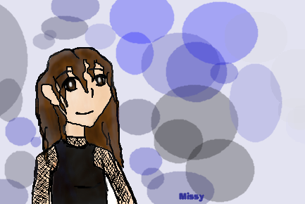
taori
(Dec 5, 2003)
bwah, cheap-ass background. shading looks halfway decent though, i think. c&c pleeeze!
Nyuusen (Dec 5, 2003)
oooh, pretty, smoking and pointing, lol. nice job
Gothic_Otaku (Dec 6, 2003)
And then she spent 5 years in jail and was phsicologically scarred for the rest of her life. Oh yeah and she died of lung cancer. :)
Childlike_Vampire (Dec 6, 2003)
"What? I'm just holding a stick of inscence...." hehe I like her hair, and bust, but where's the hips? lol. ^^ |

| ||||||||||||||||||||||
|
PurpleLlamasRcoming
(Dec 5, 2003)
This is my ~new~ icon. That is a purple llama thinking and just in case u cant read what he's thinking he's thinking "all in a days work" i think purple llamas will take over the world.~man it took me 4ever to get this right!
PurpleLlamasRcoming (edited Dec 7, 2003)
well....forwever was an exaggeration. ok! fine! this is history then! have it ur way......DELETE IT PLEASE!!!!!!!! I DONT CARE!!!!!!!!!!
marcello (Dec 7, 2003)
obviously you do care. maybe we should leave it so we can laugh. :)
PurpleLlamasRcoming (Dec 22, 2003)
you really kill me. ha. ha. ha. *sticks tounge out at marcellos sarcasticness* if you want something to laugh about go yell "hey boyz and girlz i'm santa claus and i'm a little early this year" in july. then again, you may think i'm crazy, so you can disregard that last statement.
Typo_Maan (Aug 1, 2004)
im noot goingg to assk.......nic.....purplle llama |

| ||||||||||||||||||||||
|
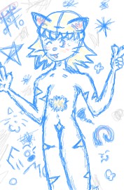
Aoi
(Dec 1, 2003)
i like pirates!!! LOL +__+
tappie_chan (Dec 5, 2003)
this is cool, yo! i thought it was Rei when i saw it on the home page. ^___^ if you added to color to the eye, it would make it even better!
RabidMalikFanGirl (Dec 6, 2003)
Tappie, we think alike. If she had darker blue hair and red/brown eyes then it might as well be Rei ^^
Clueless3 (Dec 6, 2003)
OMG, can someone tell me what this is doing in the beginner board?This is amazing!!
Knockoff (Dec 6, 2003)
lol um, I can tell you.Lots more shading, Way way way better lineart, and a backgorund. Hey Im just answering your question. |

| ||||||||||||||||||||||
|
Eyeless
(Dec 4, 2003)
Its been a long time since I've oekakied. x_o; Holy crap, yeah. This is to Shiek cos I love her.
Shiek (Dec 4, 2003)
Awww~! I love the halftones ;_; And you too!1
Childlike_Vampire (Dec 4, 2003)
I very much like the shading, and the rounded shap of the nose! :D |

| ||||||||||||||||||||||
|
Nyuusen
(Dec 4, 2003)
I'm just so tired...so...tired...ugh. But I also can't sleep, so...yeah...*hugs the random pj boy with the crappy background*I'm happy with this pic though...better than my other...attempts...*yawns* c and c please
taori (Dec 5, 2003)
Whee, definitely improving. I suggest working on lineart. The great thing about the pen tool is that it's instant perfect lineart, so you shouldn't have to go over the lines too many times. You're using a tablet now, right? Makes it even sexier. *glomps pj dude* |

| ||||||||||||||||||||||
|
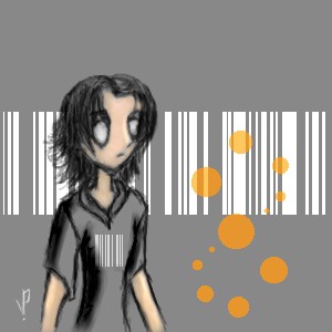
Loogie
(Dec 4, 2003)
It's an eye. I actually think I like it- *GASP!*
Arisuki_Artemis (Dec 4, 2003)
That is a nice eye...*stares* I want blue eyes...one thing, why in beginner!? This is amazing!
Loogie (Dec 4, 2003)
I don't really spend more than 15 minutes on my drawings, so I put it in the beginner board.
Childlike_Vampire (Dec 4, 2003)
wow this is very awesome. it looks like a watercolor painting, i LOVE the shines in the eye, and the way you did the lashes. very spiffy.
Amberflame333 (Dec 8, 2003)
hehehehe, its very pritty, not like my crap, c u in school, R.A. |

| ||||||||||||||||||||||
|
Childlike_Vampire
(Dec 4, 2003)
lol, just messing around, trying to decide if I want a new user icon that's actually meant to be an icon...I think the font turned out pretty cool, the animation might be kinna funneh. I like how I shaded the background....I just couldn't think of what to put on it. lol. Enjoy.
lilypad (Feb 17, 2004)
me really like this pic. it looks like it's on metal. red metal, of course and the font's really cool, too. |

| ||||||||||||||||||||||
| |||||||||||||||||||||||
| 2draw.net © 2002-2025 2draw.net team/Cellosoft - copyright details - 5.43sec (sql: 34q/5.38sec) |
Yea the ear looks like it got crinled.
Needs more shading. It has to much blank space, Mabby try I different background next time.
But good job anyways!