| |||||||||||||||||||||||
|
blah
TaCO
(Mar 21, 2006)
I'm lost. but i think i'm starting to get my footing. |
| ||||||||||||||||||||||
|
TaCO
(Mar 21, 2006)
....
Axil62 (Mar 21, 2006)
Nice one. The colors convey. |
| ||||||||||||||||||||||
|
~unwritten_law_girl~
(Mar 21, 2006)
Blah.
Sasuke-fan-Sapphire (Mar 21, 2006)
that's adorable! ^^
Ferret_Boy (Mar 23, 2006)
very cute |

| ||||||||||||||||||||||
|
Chilliwack
(Mar 21, 2006)
well i would have finished this and put it in the intermediate board, which is where i WOULD be if i had a stylus... but yeah, i just decided to not finish it, not worth my time to salvage what little there is to be salvaged |
| ||||||||||||||||||||||
|
Uzumaki_Kari
(Mar 21, 2006)
It's Hatake Kakashi from Naruto!!! Hmm... I don't thinks it's all too bad for my first time using this program, what do you all think? I'm amazed at how well the blur tool works for shading... Anyways, I hope to improve on my skills on this program! I won't be in the beginners section for too long! ^^
DoOp (Mar 21, 2006)
kakashi is the sexiest man alive in anime *dun dun doom*
yuohoo (edited Mar 21, 2006)
lol yep, and uh shouldn't there be is scar or something??Just saying..
blahaha (Mar 21, 2006)
blahahaha...kakashi is teh sex. XD
Zeal (Mar 22, 2006)
From Naruto : ItachiIn all of anime : Rei :0 |

| ||||||||||||||||||||||
|
Hotaru
(Mar 20, 2006)
took reference (i.e. position or the face and hair.) from a picture that i have which is amazing (if i new the artist i would tell you, but i don't sooo sorry!!!) and well the boobies and top are what i added (or well i hade room, so i put them in there :P). so yeah thats it. (please don't kill me for not being totaly original!!!) |

| ||||||||||||||||||||||
|
purpleee
(Mar 21, 2006)
chaos....
Natsuna (Mar 21, 2006)
Look's like a bunch of skittle's :D
purpleee (Mar 21, 2006)
mmmmmmm i loooove the green ones :D
dreamyyy (Mar 21, 2006)
pretty ... i love all the colors you chose ...what tool did you use it's cool...:D it's pertyful :D
purpleee (Mar 21, 2006)
all i did was use the normal draw thing with the blendie thing lol "tee hee" |

| ||||||||||||||||||||||
|
Kallasilya
(Mar 21, 2006)
arg. i ran out of room. oh well. gifty for my friend, who's been feeling bad.i hate this picture oh so very much... trying to write a history essay and draw are not recommended to do at the same time...
saucy (Mar 21, 2006)
Ooh, I love how you did the water!
Kallasilya (Mar 21, 2006)
thanks! i can't draw water, but that makes me feel haaappyyy. XP
DoOp (Mar 21, 2006)
i can't draw to start with :\cute picture :) would've been nice with hands, but hey it's still cute >^_^< the fish nets are nice and the shading's cool :) |
| ||||||||||||||||||||||
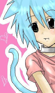
|
~unwritten_law_girl~
(Mar 21, 2006)
after all these pictures.. i havnt named him yet. .. I might have but don't remember so from now His name isss... Tai :3
xiau (Mar 21, 2006)
Aw, Tai is so cute <3He reminds me of my stupid cat boy Ame o_o Except yours is cuter X3 (gets thwacked by Ame-chan)
~unwritten_law_girl~ (Mar 21, 2006)
Gasp. THEY COULD BEE..Brothers :3Heehee.
xiau (Mar 21, 2006)
Yes! :D |
| ||||||||||||||||||||||
|
Natsuna
(Mar 20, 2006)
Gah...You peoples are PROBLY gonna look at it @_@ So forget what i said.................:(
YouLovePoop (Mar 20, 2006)
Is she trying to eat the cat?O.o
Natsuna (Mar 20, 2006)
Maybe.............
~unwritten_law_girl~ (Mar 21, 2006)
Hahaha that's cute. CAT ATTACK EIII!!! XD
YouLovePoop (Jun 13, 2006)
I can't breathe:] "It's not even about my pictures!! Uhuhuhuh<--- your laugh :3 |

| ||||||||||||||||||||||
| |||||||||||||||||||||||
| 2draw.net © 2002-2026 2draw.net team/Cellosoft - copyright details - 5.26sec (sql: 34q/5.20sec) |