| |||||||||||||||||||||||
|
concannon
(Aug 25, 2003)
He's not done. This is the influence of watching the 'You Spin Me Round (Like a Record)' music video, by Dead Or Alive. (Don't pay attention to the time thing. It liiies. I had to walk the dogs and go to Total Crafts.)Edit: Alright Mazi, thanks. ^^;; When I go in to do the background, I'll fix the nose ring. Stud. Thing. And they have the video on launch.yahoo.com. Just sign up there, and you can watch it. |

| ||||||||||||||||||||||
|
quintessence
(Aug 25, 2003)
Right, this is as done as it's gonna get. -_- Took way longer than it should have, 'cause I was distracted with other things. Eh hehe. Had no idea what to draw, so I just went with the random canvas size.
taori (Aug 25, 2003)
That shading is daaaamn sexy. Actually, even though it belongs on much better than beginner, I'm happy it's here. It makes the board look good for those of us who are stuck here for a reason. Hehehehe.
Snoozy27 (Aug 25, 2003)
*stares* Puurty. Lovely shading, especially!
mazi (Aug 25, 2003)
i agree kick shading. the shadow of that hair chunk looks uber real
finn (edited Aug 29, 2003)
Mmm. Lurvely hair and the eye rocks! |

| ||||||||||||||||||||||
|
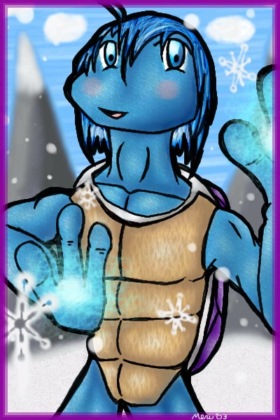
Merulotte
(Aug 25, 2003)
Umm... It's my first time posting on the Advanced Board, and I thought I'd take advantage of the many nice features of Shii Oekaki Painter... Um, I'm *really* unsure if this is up to standards, but I really hope it is, as I spent 95% of the time on the timer, on drawing this. But if it is not up to standards, then I am fine with deletion. I've already saved the picture.Anyhow, this is Kiri, and he appears to be using some form of Ice Spell... ^_^ It's my second time drawing him, and also the first time drawing a Turtle Anthro, so I have a few bugs to work out, but overall, I actually like it... That's unusual.
marcello (Aug 25, 2003)
I would call this intermediate towards the high-end. I won't delete it, but I suggest sticking to the intermediate boards for now.
Merulotte (edited Aug 29, 2003)
Alright... I'll keep working there, until I am quite ready for this area. Thank you very much for sparing me. ^_^|EDIT| Well, I had received several feedback comments about the left cheek being too thick in lineart and also too long, but when I go to edit it, the very top layer, Layer2, is completely erased... Is this a common error with Oekaki Shi Painter? If so, I'll consider making sure my image is what I want it to be before I submit. ._.
amuy (Aug 29, 2003)
I like the line art ! It makes the pic look really good!! Really nice shading, your snowflakes look edible lol... not that I eat snowflakes..like it ever even snows in texas...gawd anway AWESOME art and keep up tha good work! |
| ||||||||||||||||||||||
|
mazi
(Aug 25, 2003)
this is my reply to hakkai and her oldschool westside. b00-yeah.
mazi (Aug 26, 2003)
ahahah i win XD
amuy (Aug 29, 2003)
thats not ghetto, its blingbling baby! lol Nice pic! I have a fake silver dollar sign necklace that I got from the bowling alley 25c kiddie machine...its my blingin' I like the jeans and the way you shaded them, its tighttight (i/j)
Sixelab (Sep 30, 2003)
wow. i have never been so confused in my life...its like *blahblahblahgayblahblahblah* o.Owtf are you people saying?! love the drawing. you know i adore your chibis
mazi (Oct 1, 2003)
if your talking the gay comments, someone called me names and such and it got deleted.. otherwise.. er.. bling bling? i dunno. |

| ||||||||||||||||||||||
|
ChibiCandy01
(Aug 25, 2003)
just playing around....i fix it laterz ^_^ |
| ||||||||||||||||||||||
|
5 comments
– latest 4:
Marienkind (edited Aug 25, 2003)
yaoi! hurrah! their booties are so shiny.. (pokes them) i think the fingers on that hand directly on that guy's back should be bent a bit more. it looks kinda flat... :\
Hakkai (Aug 25, 2003)
>_<;; RAAAH! Lovely!! Just Truely, breathe takingly lovely.. -sighs- .....-quickly pokes the ass- *Wiggle Wiggle* XD
marcello (Aug 25, 2003)
girls... |
This is hidden because it is rated 18+. Edit your privacy settings to make it visible.
| ||||||||||||||||||||||
|
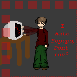
Minitsaru
(Aug 25, 2003)
*tries to punch evil computer* oops *notices he was standing to far away* heh. Not too sure if its that obvious but, I hate popups!oh yea, thanks mazy for that smooth lines thing =P (i feel bad i think i spelt ur name rong) D=
marcello (Aug 25, 2003)
If you use a decent browser like Mozilla or Firebird, not only does 2draw look better, but it blocks popups on all sites (not that 2draw has any).
Minitsaru (Aug 25, 2003)
lol, i have this virus that gives me about 10-20 popups per time something loads....... even if i'm not browsing the net >.<
bladefist (Aug 26, 2003)
That virus goes by the inconspicuous name of Kazaa :PI started using Avant Browser and Kazaa lite and haven't gotten popups in... well, since then.
Minitsaru (Aug 26, 2003)
thankz Marcello for telling me about Mozilla,and bladefist, I already use kazaa lite. |
| ||||||||||||||||||||||
|
Aunvi
(Aug 25, 2003)
A little violent now isn't he? |

| ||||||||||||||||||||||
|
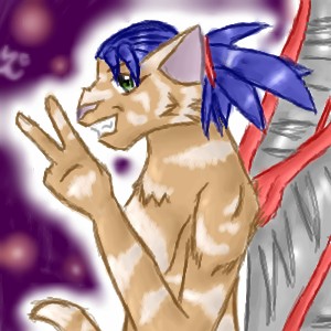
Jiah
(Aug 25, 2003)
I had fun doing this one, though I'm not satisfied how the wings came out. Also too lazy to go back and fix them :P
Mop-Fu (Aug 25, 2003)
That is so Effin awsome! Good Job Jiah! yay! *Pokes the wings* They looks fine. Better than fine in fact.And...Why Reka...erm I mean, Good Job! w00t!
Knockoff (Sep 20, 2003)
Heh, that is pretty awsome, Very nice.I reallly like the hair, really purdy blue, and the wings are spiffy Great job.! |
| ||||||||||||||||||||||
|
Texmo
(Aug 24, 2003)
whoops
Hakkai (Aug 25, 2003)
o_o; ... Lol!! Nasty.. Would've been better if it was colored and such, though. |

| ||||||||||||||||||||||
| |||||||||||||||||||||||
| 2draw.net © 2002-2025 2draw.net team/Cellosoft - copyright details - 3.86sec (sql: 33q/3.82sec) |
lookin pretty kick, my only complaint (heh i always have to complain ><) is that the nose ring is a tad low. nose rings usually are on the kinda.. dent part? of the nose.. like right above the bump. (jeez im descriptive today)
drawn in 11 min