| |||||||||||||||||||||||
|
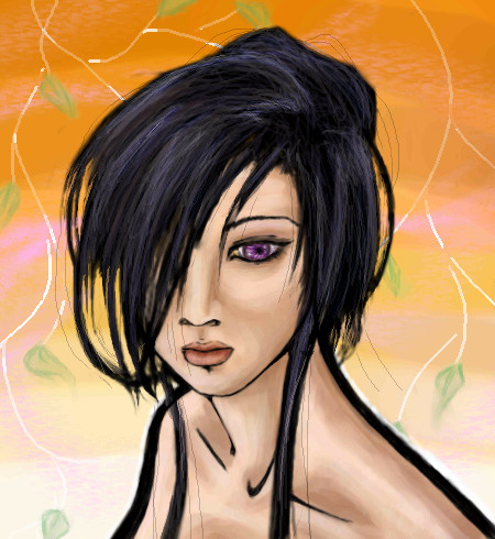
Natsuna
(Mar 11, 2006)
There's blood......o_o I dono i'm not good with putting ratings......So you tell me......And I felt like coloring the apple :D PLEASE DON'T DELETE :( Just cause it took 10 min....I shall color it and everthing for a long time so.....yeah......o_o |

| ||||||||||||||||||||||
|
13 comments
– latest 4:
JoeNobody (Mar 11, 2006)
I like the style you used to color this. Who's the little guy in the window?
DoOp (Mar 11, 2006)
xD the little guy in the window, people actually notice it? but it's zack ;D or whom ever you want it to be :0 i just drew him cause i got sie tracted'ed'ed'ed'ed'ed'ed'ed'ed'ed.... :D
laurael (Mar 11, 2006)
That's really, really pretty! Great style, this is. Little guy in window...zack's happy!
HunterKiller_ (Mar 12, 2006)
I love this! The gradients are orgasmic. |

| ||||||||||||||||||||||
|
Juni_gatsu
(Mar 10, 2006)
just trying out a hairstyle...maybe i'll just leave it like this...muahahahahahathair
Harurie (Mar 11, 2006)
Beautiful =D.
DoOp (Mar 11, 2006)
ahh!!! so prettyyyy ^_^
davincipoppalag (Mar 11, 2006)
This is very beautiful.
Menyway (Mar 13, 2006)
Wow! She's beautiful!! I really like this picture!!She knida reminds me of Lulu from Final Fantasy X... Which is cool because she is one of my favorite characters!!! ^___^ |
| ||||||||||||||||||||||
|
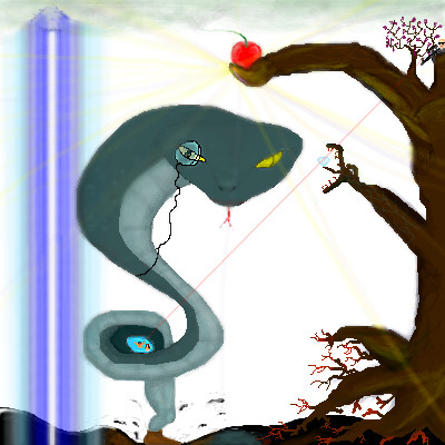
mikron
(Jan 13, 2006)
He is so sneaky the I don't even know what he's plotting about... There are alot of interpretations for this one.. |
| ||||||||||||||||||||||
|
IkariIreuL
(Jan 7, 2006)
__
davincipoppalag (Jan 9, 2006)
No...he's a happy clown lol
SYTHE (Jan 9, 2006)
He looks alittle too happy........down there, if you know what I mean.
DoOp (edited Mar 11, 2006)
*chokes on ritz crackers* i didn't notice the large prottruding thing til now XD *cough cough* i thought it was a leg XD...
Jodylicious (Mar 11, 2006)
I'm scared.. .__. now i'm gonna have nightmares about evil clowns raping me in the night... |
This is hidden because it is rated 18+. Edit your privacy settings to make it visible.
| ||||||||||||||||||||||
|
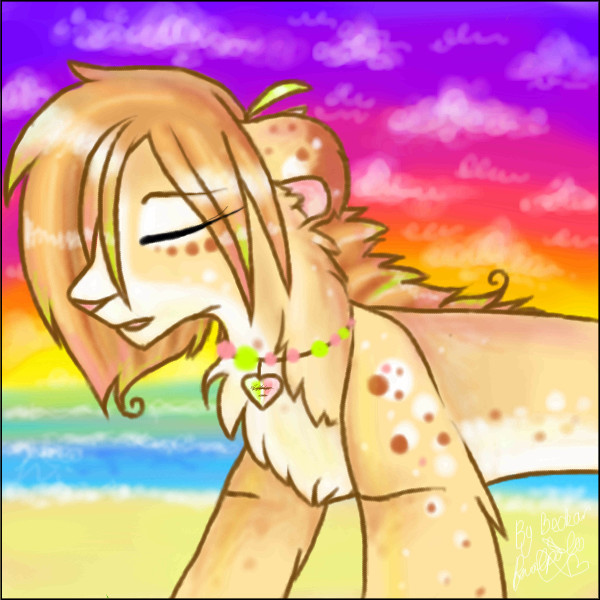
Becksie
(Mar 9, 2006)
Needs a Background.. little help plz? 8DI dont know if this works or not..any crits?
DoOp (Mar 9, 2006)
wahh!! It's so much cuter now! :D hehe
Becksie (Mar 9, 2006)
Thanks.. all it needs now is a caption on it.. something from a song.. I cant think D:
Skai (Mar 10, 2006)
So cute~ I love the colors. X3Lucky in the Sky with Diamonds popped into my head. What the hell? o_O |
| ||||||||||||||||||||||
|
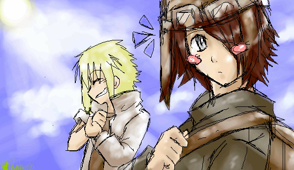
~unwritten_law_girl~
(Mar 7, 2006)
weeasdfgh
Protocom-iko (Mar 7, 2006)
woah! awsome picture can wait till its finished.^~^still not done.
Woo done.
|
| ||||||||||||||||||||||
|
~GSP~
(Mar 10, 2006)
north side boys
sephiroth54321 (Mar 10, 2006)
Dude, south side man ATL all the way...
~GSP~ (edited Mar 10, 2006)
naw northside boyz
sephiroth54321 (Mar 11, 2006)
haha it's all kool i guess... |

| ||||||||||||||||||||||
|
TheCrimsonKing
(Mar 10, 2006)
Went out and bought the "True Grit" soundtrack on vinyl. Referenced it's cover.
mikron (edited Mar 10, 2006)
Looks a bit like ex General/Minister Moshe Dayan RIP.http://www.brownsteins.net/Ulpan/Images/Moshe%20Dayan.jpg The face lines are great..
Punky (Mar 10, 2006)
All the lines in the face rule. Awesome as per usual. :)
SYTHE (Mar 10, 2006)
Have you ever heard that old song -A Boy Named Sue- ? I guess his parents had the same idea. :)
patienceisoverrated (Mar 10, 2006)
This is beautiful... in a manly pirate sort of way.I have an aunt named trudy. she actually looks a little like this. around the eyes, you know. |

| ||||||||||||||||||||||
|
23 comments
– latest 4:
Punky (Mar 10, 2006)
Lighting = YESAwesome job, I love it, although I'm not familiar with this character. :)
terracotta (Mar 10, 2006)
*hides in closet*
Zeal (edited Mar 11, 2006)
Dear god..Psycho Mantis.. God.. >_> Controller switchin' time~This boss has to be one of the hardest, most annoying bosses in the history of the world.. Heck.. @_@ Vamp was easier than this guy..God how I hated Vamp..
Sweetcell (Mar 11, 2006)
An amazing picture kejo, he reminds me of the character in Hellboy. Karl something... just amazing. |

| ||||||||||||||||||||||
| |||||||||||||||||||||||
| 2draw.net © 2002-2026 2draw.net team/Cellosoft - copyright details - 3.72sec (sql: 38q/3.66sec) |
:3
BLARRGG