| |||||||||||||||||||||||
|
another woman...
pokipsy
(Sep 20, 2008)
|
| ||||||||||||||||||||||
|
Kloxboy
(Sep 19, 2008)
TaCO (Sep 19, 2008)
O.O NICE!!!
davincipoppalag (Sep 20, 2008)
Peacefully sleeping demon |
| ||||||||||||||||||||||
|
Roytje
(May 14, 2008)
Pause.
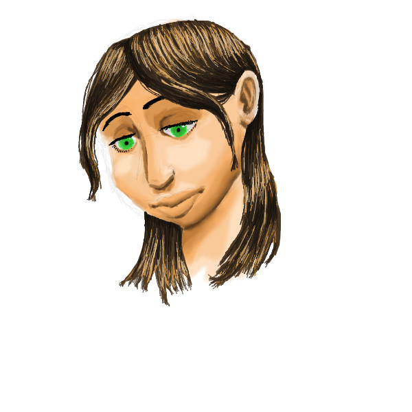
Roytje (May 15, 2008)
Thanks people! I've not much time, because I've a lot of schoolwork lately...Find the faces.
davincipoppalag (Sep 18, 2008)
Another cool looking creation Roy.. Come on.. schoolwork isnt as important as drawing here! :0)
Met (Sep 18, 2008)
i like your process of thought! SO spontaneous! |
| ||||||||||||||||||||||
|
Xodiak
(Jul 6, 2005)
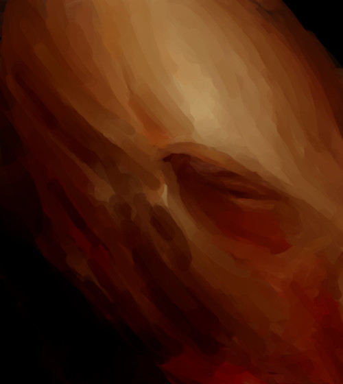
He has a nasty problem... <:(This is for Miss Renire. The first version is 18+ and not for little kids. <:) |XOD|
voodoobunny (Aug 11, 2005)
Oh my fu*king GOD! awesome work XD
plasma_ooganator (Aug 20, 2005)
THIS IS HYSTERICAL!!!!!!!!!!!!!!1
Mali (Apr 20, 2006)
LMFAO XD omg! thats so funny! gross, but funny!
shinigami-black (Sep 18, 2008)
Disturbing.... |

| ||||||||||||||||||||||
|
pandabarrie
(Sep 15, 2008)
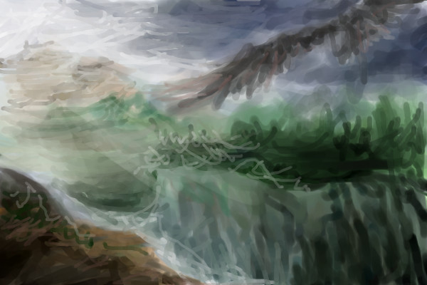
fiddling around again. this is actually something i drew in my concept book, and i just decided to see if i could put it on 2draw...it didnt turn out quite how i had originally intended, but i guess it works. w/e
vlad.the.hamster (Sep 17, 2008)
Those wings are gorgeous. <3
xiau (Sep 17, 2008)
Why doesn't this have more comments? ]:You did a really incredible job on this, especially the wings. They're so detailed and...and WONDERFUL.
torilyn (Sep 17, 2008)
I like the skin tones. :D
pandabarrie (Sep 17, 2008)
i appreciate it guys thanks :) |

| ||||||||||||||||||||||
|
DarthFar
(Aug 31, 2008)
My hometown in the 1950s.
Roytje (Aug 31, 2008)
Nice, nice! I like the atmosphere :) Welcome, btw.
vlad.the.hamster (Aug 31, 2008)
very interesting picture, like an old photograph.
DarthFar (Sep 15, 2008)
Wow, thank you all very much for the welcome, and for your feedback. ^_^
torilyn (Sep 17, 2008)
Awesome, I love all the activity. :D Yay! |

| ||||||||||||||||||||||
|
vlad.the.hamster
(Sep 14, 2008)
Not really sure where I'm going with this. :p
davincipoppalag (Sep 17, 2008)
It has a lot of potentialI give up. D:
|
| ||||||||||||||||||||||
|
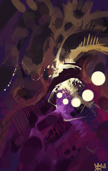
Kloxboy
(Sep 15, 2008)
enirroc (Sep 15, 2008)
I love the textures. All of your art is great. =)
QueenMelkorka (Sep 15, 2008)
love it! looks like a ball of yarn gone mad
davincipoppalag (Sep 16, 2008)
The eyes in this are majorly creepy. Damn
vlad.the.hamster (Sep 17, 2008)
This has so much depth in it... like there's always more to be discovered no matter how long I look. |

| ||||||||||||||||||||||
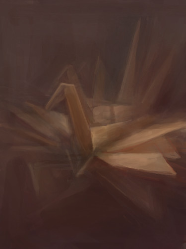
|
Kloxboy
(Sep 13, 2008)
mooki (Sep 14, 2008)
beautiful clox..
davincipoppalag (Sep 14, 2008)
Animated origami crane. Very cool indeed
tonyscott (Sep 14, 2008)
great one!the only origami thing that I can still remember how to make for me kids'
Lostification (Sep 17, 2008)
<3 |
| ||||||||||||||||||||||
|
QTgillie
(Apr 2, 2008)
Close but too tired to finish.
jpjp1052 (Apr 5, 2008)
Nicely done.
Aakyra (Apr 6, 2008)
This finished beautifully! Perfect colors ... beautiful textures, just the right fade to the reflection. Excellent work QT!
gloworm043 (Apr 6, 2008)
This is really neat...very pretty...:)
QTgillie (Sep 16, 2008)
tyvm gloworm |

| ||||||||||||||||||||||
| |||||||||||||||||||||||
| 2draw.net © 2002-2025 2draw.net team/Cellosoft - copyright details - 3.23sec (sql: 38q/3.18sec) |