| |||||||||||||||||||||||
|
Devil's Fingers
horsefeather
(Sep 17, 2008)
horsefeather (Oct 4, 2008)
thank you, i may try to redo this again in shi-painter, lascaux doesnt work as well for me and it seems that the quality got lost in the compression because it looks a lot different now than it did in the applet... ah well, c'est la vie.
Suntan (edited Oct 4, 2008)
Yes, i like the way you've worked the mountains, too. Come back to it and work some more , unless you really want to start over. This applet is a challenge for me, too. >< :)
horsefeather (Oct 5, 2008)
hehe thanks =)
bette_davis_eyes (Oct 6, 2008)
very nicely done! |

| ||||||||||||||||||||||
|
KenshinHimuraRK
(Oct 5, 2008)
Actually it took 1 hour and a half.I didn't like the sea, but well, who cares...
bette_davis_eyes (Oct 6, 2008)
very pretty scene .. love the tiny couple |

| ||||||||||||||||||||||
|
fer_sasaki
(Mar 30, 2008)
oh God, my titles are so creative 8Dso, I'm back to 2draw after.... ahm, 2 or 4 years, dunno? xD |

| ||||||||||||||||||||||
|
mokkaa62
(Oct 4, 2008)
HuHu
ichigokurosaki (Oct 5, 2008)
^o^ cooooooooooooooooool |
| ||||||||||||||||||||||
|
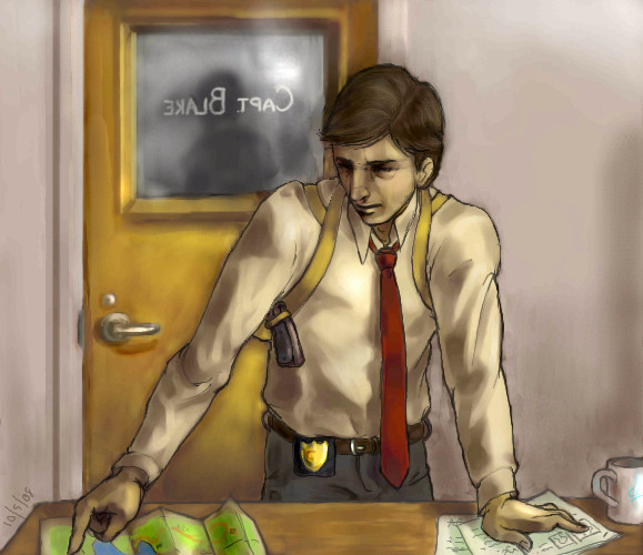
Caddris
(Oct 1, 2008)
The captain looked up as one of his detectives entered the office. The detective didn't wait to be acknowledged. He just went up to the desk and spread his papers and maps over top of the paper work Capt. Blake had been reviewing. "I've been thinking, captain. We need to expand our search to include the rest of the park." "Mackers . . . ," "I know we've been searching the east side but I think we'll have better luck finding him if we look near the lake and bike trails. Of course we could always-" "Mackers, stop." The detective looked up at the captain. "Sir?" "What are you doing here?" Mackers avoided the captain's eyes. "I thought I could help with the search." Capt. Blake sighed. "You know that isn't your place." "But, if I may, sir, I just thought-" "No, Mackers, you may not. You still have your job to do. You're still on call." "But sir, he's my partner!" "Which is all the more reason we need you to continue the case load. I know your worried. I am too, believe me. But the system can't just stop because you want it to. Right now we have every resource we can spare looking for Randles. They know what they're doing." Capt. Blake looked at Mackers. He looked small and tired, past the point of arguing. "When was the last time you went home?" Mackers didn't answer. "I'll put Vecchio and Benton on your shift. You go home and get some sleep. Your not doing anyone any good wearing yourself out." You can save if you want to.
Leave your friends behind, 'Cause your friends don't save and if they don't save Then they're no friends of mine! Let's Safety Save! Let's Safety Save! Done! I spent my last day of freedom working on this. Tomorrow I start my graduate courses in Palaeobiology. Hopefully I'll still find time to mess around on 2draw.
shults (Oct 5, 2008)
I love his face. There's something in your coloring style.The hair was bothering me.
|
| ||||||||||||||||||||||
|
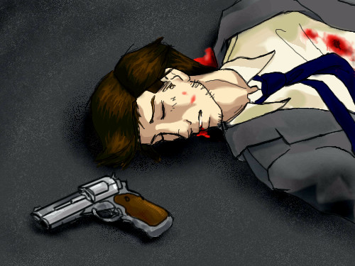
Caddris
(Nov 2, 2005)
Happy NaNoWriMo, everyone. November is National Novel Writing Month. 30 days, 50,000 words, countless cups of coffe, and one hell of a project. This is detecive John Mackers, the main charcter of my novel. The book opens with him being shot. He's in ICU in a coma for the remainder of the story as his partner, Brian Randels, tries to peice together how and why Mackers was shot. Keeping Mackers the main character while in a coma is going to be quite intersting. . . I'd explain more but that would be a lot to type and I'm needlessly long winded to begin with. God, this is old and sucky.
Isn't it nice to know that some one out there is having a worse day than you? =D
davincipoppalag (Oct 1, 2008)
good drawing in this one
Caddris (Oct 2, 2008)
Thank you, Davinci. You always find something nice to say. I appreciate that.
marie1996 (Oct 5, 2008)
Holy cow!! Thats amazing XD |
| ||||||||||||||||||||||
|
20 comments
– latest 4:
Moosh (Feb 4, 2007)
Damn. o.O That's awesome.
Qwerty_Wittle_Fawah (Feb 4, 2007)
This looks awesome...in my humanities class we were just learning about this piece :-)
Caddris (Feb 5, 2007)
Thank you, everybody. ^__^
Pandora (Oct 5, 2008)
Fantastic...the horse is amazing |

| ||||||||||||||||||||||
|
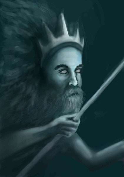
horsefeather
(Oct 5, 2008)
Yeah.. just something from my head...
Caddris (Oct 5, 2008)
Looks great so far!
davincipoppalag (Oct 5, 2008)
Neptune! Looks good Joannafrom the depths? no refs and umm.. i kinda give up, lost interest
|
| ||||||||||||||||||||||
|
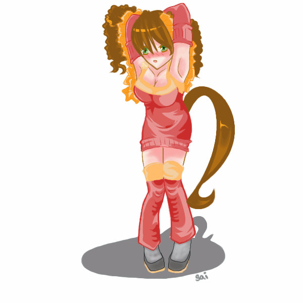
SaiWataki
(Oct 2, 2008)
Solid colors for now, will finish tomarrow
marie1996 (Oct 3, 2008)
Really cute i love it!!! XD
davincipoppalag (Oct 4, 2008)
VEry cute
camadeon (Oct 5, 2008)
awesome ^^ |
| ||||||||||||||||||||||
|
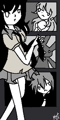
bette_davis_eyes
(Sep 28, 2008)
Cuz these rocks hurt like hellI hope her smile is better now cuz my neck hurts :P
davincipoppalag (Oct 2, 2008)
THis is beautiful Bette!
Pandora (Oct 2, 2008)
I love the perspective her hand comes out through the screen..very cool.
bette_davis_eyes (Oct 4, 2008)
thanks dave and pandora :) |

| ||||||||||||||||||||||
| |||||||||||||||||||||||
| 2draw.net © 2002-2025 2draw.net team/Cellosoft - copyright details - 3.69sec (sql: 42q/3.66sec) |