| |||||||||||||||||||||||
|
WerefoxLeBlanc
(Feb 26, 2003)
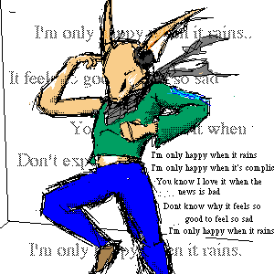
Music seems to be a prevalent element in my art. Hm.Well, you cought Marrow dancing. He likes to put on his headphones and dance like a fool when he's alone, but he's too shy and insecure to do so in front of anyone else. He goes to clubs with friends but never goes out onto the floor. I like the BG. Lyrics by Garbage, "I'm only happy when it rains" |
| ||||||||||||||||||||||
|
WerefoxLeBlanc
(Mar 27, 2003)
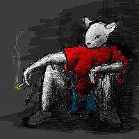
Sitting in a dark corner. Whee.She's actaully a white mouse in a dark environment. I like how the cig. smoke came out, but I'm less happy with this pic than with my previous one. Probably due to a lack of a defined light souce. Gah, I can't draw boobs... [EDIT]Cleaned up the shading a bit, and added feet. Well, shoes. I suck at feet as much as I suck at boobs. I think I'm cursed with putting Practice drawings in the Regular forum and putting Regular drawings in the Practice forum...
darkk_angel (edited Mar 27, 2003)
wow.... i thought it was an evil version of stuwart little until i realized that it wasnt (embarrased face goes here)
Shiek (edited Mar 27, 2003)
>_o 'Boobs.' How maturely put, Were. Perhaps a better phrasing would be 'breasts' or 'assets.' Though 'targets' would be a more accurate name, given how "society" is today. GOD I hate society.
WerefoxLeBlanc (edited Mar 28, 2003)
Well, "breasts" sounds uppity, and "snack trays""Hoochie mamas" and "bouncy bongos" sounds immature. Before you label me an immature hormonal sexist bastard, kindly remember that one word should define a person as much as one piece of anatomy should.Whatever they're called, I can't draw em. |
| ||||||||||||||||||||||
|
theraven
(Mar 25, 2003)
It was going to be something else but then, it came to me, streaming through my mind like the white lines sauntering into the inky black. There, I saw it. I saw the DOG.
RazorClaw (edited Mar 26, 2003)
Thats cool. I see a duck friend looking up to the dog.
roguefrequency (edited Mar 26, 2003)
WOAH, I see it too Razor!
WerefoxLeBlanc (edited Mar 27, 2003)
Cool. Cartooning minimalism at it's best.
theraven (edited Mar 28, 2003)
Thankyou everyone 4 da comps. but i feel sad because i can't recreate it...=u`. u= *stares quietly* |

| ||||||||||||||||||||||
|
DuPo
(Mar 26, 2003)
bob hate fire p2 no color wet but comming soon----Bob N?1 Cover ----p1:Bob my friend ----To Be Continued
Turtlebuster (edited Mar 26, 2003)
Bob should be helping out in my barbaque, NOT gallavanting around and having a merry old time with Mr. Fire!trees these days!
RabidMalikFanGirl (edited Mar 27, 2003)
STOP DROP ROLL! STOP DROP ROLL! |

| ||||||||||||||||||||||
|
rosalyn
(Feb 11, 2003)
I can't tell wether this is a boy or girl. Tell me what you people think it is and I'll Take a vote on what you guys think it should be... ^^
quintessence (edited Feb 11, 2003)
Methinks it should be a boy... just 'cause I like pretty boys. XP
darkk_angel (edited Mar 27, 2003)
i think its a girl because of the size of the eyes. |

| ||||||||||||||||||||||
|
concannon
(Feb 11, 2003)
Random elf. Not done, but must go attend homework. I'll finish it later.
squiggy (edited Feb 12, 2003)
O.o........*drools all ova keboard, shortcircuts and freezes brain*........sfdjhtfguvhrhzkihrfzhkjcsd tink!!
mauvemalady (edited Mar 5, 2003)
Mmm. Shows you just enough, not too much. And may I add that there is a strong urge to play with his hair; curl it around your finger...wee.
darkk_angel (edited Mar 27, 2003)
wow.... this looks like it'll be quite good!! you are so going to have to finish it!!! ;) |
| ||||||||||||||||||||||
|
Cienna
(Feb 12, 2003)
OOOhhhhh nooooooo! School mouses are sooo embarasssinggg they do absalooootly nothing for my art it would be soo much easier if the stupid school had tablets! :3 The only reason this took so long because at first i tried to do a sensible picture but i abandoned that when i remembered how badly equipped the scool are! But hey the spots are cool!
darkk_angel (edited Mar 27, 2003)
heheh i love the eyes!!! |
| ||||||||||||||||||||||
|
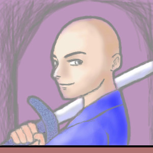
coffeejelly
(Feb 19, 2003)
i don't know what i was thinking. i don't know why he turned out bald.and the rectangle below is there because... i only found out about the excess space after i finished the main picture X'D anyways, this is a silly picture <edit> added the sword X'D i think it looks vaguely like a sword X'D
Knockoff (edited Feb 20, 2003)
This is cool. I love the sword!
Kazukie (edited Feb 21, 2003)
I think the sword deffinitly finishes it off well. =]
mauvemalady (edited Mar 5, 2003)
Why bald? Why hair? I like him bald. I like his attitude here. It's soft, too, which is nice--takes the edge off the sword and all it implies.
darkk_angel (edited Mar 27, 2003)
i like this!!! it doesnt look bad at all!! and i didnt notice the rectangle until you mentioned it.....and the baldness of it all actually suits the character.... and the facial structure!! |
| ||||||||||||||||||||||
|
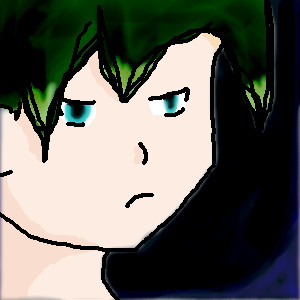
Minitsaru
(Feb 21, 2003)
Well i was angry but now........ i dunno im not that angry any more cuz... well this is my best drawing using my comp class' computers....what do you think?
Knockoff (edited Feb 21, 2003)
Its pretty good. The green highlights are cool.
Kazukie (edited Feb 21, 2003)
I like the hair too.. He does look angry! =]
darkk_angel (edited Mar 27, 2003)
reasonably good.... add multiple depths of shade to it!!! anyhow... i am a total critic... hehe really, it is good.... dont mind me *sits and hums in a corner while rocking back and forth* |
| ||||||||||||||||||||||
|
quintessence
(Mar 26, 2003)
I have commited the sin of drawing myself as an anime character. Someone shoot me.
quintessence (edited Mar 27, 2003)
Not that good. :p-blush- Thanks rogue. It's supposed to be me, yes. But of course I'm not an anime character. So it's stylized. I don't look a whole lot like that. I wanted to stick Fang in, but I ran out of room at the top... hehe.
roguefrequency (edited Mar 26, 2003)
what color is fang... I've only seen her in gray.
quintessence (edited Mar 26, 2003)
She's white, with grey markings.
darkk_angel (edited Mar 27, 2003)
tis not bad, but if you centered the mouth it would be better!! good job!!! i like it, man:)wait... move the eye over... scratch the comment on the mouth.... it rocks!! |

| ||||||||||||||||||||||
| |||||||||||||||||||||||
| 2draw.net © 2002-2026 2draw.net team/Cellosoft - copyright details - 4.00sec (sql: 33q/3.92sec) |
As for my style... How much more vague can you get? Might as well say "I like the cut of your jib."
The character design is weak, it is sloppy and unpolished. If you really want to define the character do a few detail sketches of body parts, such as the face. Your "style" needs to be defined more.. I mean is your character floating in space or standing? Space is very important in placing the whole scene.
What IS good about it though is that you have a form and an idea, and I'm sure in your mind it is alot clearer.
Just keep practicing man, practice makes perfect. Don't let the shit that I say get to you. Take it as constructive criticism
I don't mean to judge it too much, and art is art, if you mean it to be a sketch then forget what I say. Keep practicing on human form, like how a person stands and the movement of legs and arms. I know my stuff isnt perfect and need to work on it alot more.. ok, i'll stop now.
If I DIDNT want a crit, I wouldn't post. Thanks.