| |||||||||||||||||||||||
|
-_-
hideyourface
(Jul 14, 2005)
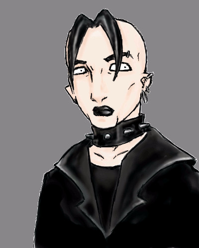
soo I watched this kendo video and saw this guy who looked really cool. Im trying to draw something like him without a ref.
nekodesu (Jul 15, 2005)
The shading looks really good. Great job on this pic ^^
darkshadow (Jul 15, 2005)
nice like the angle of the head hair is great
emmamommalag (Jul 15, 2005)
Reminds me of Ed Ames. Nice pic.
mazi (Jul 16, 2005)
nice, love his expression. :) |

| ||||||||||||||||||||||
|
kingo
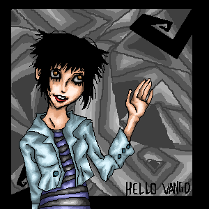
(Jul 15, 2005)
buahahahahaaaa! i wish i knew how to color leather... boink! and green apples are better than red apples!
mazi (Jul 16, 2005)
http://www.nivbed.com/images/crowfinalsmall.jpgleathers a little on the reflective side. so try putting in some tints of whats around him :) |
| ||||||||||||||||||||||
|
Aikara
(Jul 15, 2005)
I am new here. It took me about 5 minutes just to send it. <_<;;; Next drawing I am not using Lascaux sketchh x_o;;Anyway. This is a safety save in case my computer goes evil. I hope this is ok for Intermediate board so far. Doing a neutral thingy in the background. >_> So..hi. +waves+
Knockoff (Jul 15, 2005)
Welcome! I'm sure you'll find 2draw rather chaotic sometimes, but keep up the drawing and future ones. This one looks promising. Finish it.! :D
cold_graffiti (Jul 15, 2005)
this is nice i like your style!And it is done!. Thanks you guys for your comments. :D
Punky (Jul 15, 2005)
Hi Aikara! Do you remember me? Anyways, nice style as usual, I dig the swirls. |
| ||||||||||||||||||||||
|
mazi
(Jul 4, 2005)
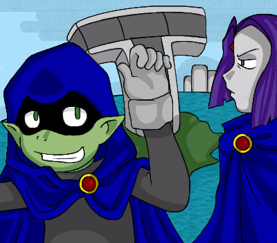
if you dont know where this is from you suck monkey nipples.just a quickie. lots of fun to do. that movie is the best.
zep (edited Jul 6, 2005)
nobody knows "The Wall"?....edit: if somebody like Pink Floyd, should watch this movie. :)
Nightmare (Jul 7, 2005)
@w@You. Kick. Ass. You accomplished ''The Wall'' Logo perfectly. ''Teachers...leave those kids alone!''
mazi (Jul 15, 2005)
if somebody like Pink Floyd, should watch this movie. :) they should watch the movie anyways! because its awesome.
Cianteed (Jul 15, 2005)
As soon as I saw this I screamed; "The Wall!" |

| ||||||||||||||||||||||
|
seaanemone
(Jul 14, 2005)
=Pkay all done
hideyourface (Jul 15, 2005)
I just think it's overrated for a lame anime reproduction :\STILL, the lineart and shading on this is very smooth and nice.
Xodiak (Jul 15, 2005)
I think the female characters are sexy! >:D|XOD|
Aikara (Jul 15, 2005)
People can like what they choose, whether obsessed or not, I find it sweet they can remain focused on something. Or inspiration source.++I like the simple shading on here. It looks especially good with the smooth texture. :) |
| ||||||||||||||||||||||
|
cold_graffiti
(Jul 15, 2005)
had to clear my throat!there we go and it says ern!
hideyourface (Jul 15, 2005)
haha. Im not sure about the shading on the face, but the lineart is cool, especially on the teeth. Neat idea.
Aikara (Jul 15, 2005)
How delightfully creative.
sephiroth54321 (Jul 15, 2005)
looks painful... |

| ||||||||||||||||||||||
|
Moosh
(Jul 13, 2005)
asdf |

| ||||||||||||||||||||||
|
oikitsumaru
(Jul 8, 2005)
XD I did a prismacolor picture just like this once for my good friend Lionne (http://lionne-de-matrix.deviantart.com) Tis her characters Lionne (the lion) and Dune (the panther) oh and the mouse.. who is mine. ^_^
darkshadow (Jul 8, 2005)
*one to the other* "look lunch " hehehebah. finish later.
wahooo!!! I'm done. cheezy yah, I know.
~unwritten_law_girl~ (Jul 15, 2005)
o.o woah, thats really cool! it sorta reminds me of lion king, in away.. |

| ||||||||||||||||||||||
|
nekodesu
(Jul 15, 2005)
Jue from Animatrix. Ref: http://www.yopi.de/images/prod_pics/689/e/689556.jpg (the left side of the cover) So not very accurate but I think this is the clostest drawing I ever did, using a ref. And I know the eye came out funky and sorta creepy. >_>
nekodesu (Jul 15, 2005)
Oh the nose.....how I despise it =_= I noticed that it was demented after I thought I was done. That always happens to me. I see an error once I'm finished. And Dave, I'm sure you could do better than me. :)
lycene (edited Jul 15, 2005)
Actually, I rather like the nose. They always give me trouble, but I like the shading on this. I think what's throwing this off more is the mouth. You've painted it as if you're looking at it straight on, while in reality the face is in more of a three-quarters view. If you tweaked the left side and moved the whole thing a bit down to the left, it might work a bit better. Overall, though, this is a really good picture, and I really like the whole effect.
davincipoppalag (Jul 15, 2005)
Lol...noooo I don't do faces at all.. I majorly suck at faces.. Fixed up the lips (hope it looks better >_>) and ....if you look really closely, there's a dot next to the right cheek...Well, when I was deleting layers, that thing suddenly came up. I've been trying to hide it since it wouldn't erase......Aha! It bugs me >_<
|

| ||||||||||||||||||||||
|
Linwe_lover_1990
(Jul 8, 2005)
This is gonna be my last car for a while. i hope ya'll like it!
Linwe_lover_1990 (edited Jul 15, 2005)
i already drew an RX-8 take a look http://cellosoft.com/2draw/view/48989/sorry, its not red
Renuar (Jul 15, 2005)
Porsche. i think you did the car justice. nice job
darkshadow (Jul 15, 2005)
dude may i say you are a bad ass like the cars the rx8 is still the shit even though i like mustangs more alsosome one did an 05 on here a long time a go *runs off to look for it*
davincipoppalag (Jul 15, 2005)
Nice shape..but I'm not sure I like the outline lines still being so bold. |

| ||||||||||||||||||||||
| |||||||||||||||||||||||
| 2draw.net © 2002-2025 2draw.net team/Cellosoft - copyright details - 4.75sec (sql: 42q/4.72sec) |