| |||||||||||||||||||||||
|
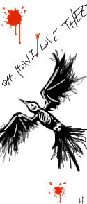
Help Me to the Light before--
GeeGee
(Jul 27, 2005)
Anyone recognize him?Naota/Takkun from FLCL. I never get enough torturing him :) XD This is one of the only times I've done it in the manga adaption style, and I think it came out well.
SanzoGirl (Jul 27, 2005)
Aww, I feel bad for him: D:
Rudeezy (Jul 27, 2005)
looks good. |

| ||||||||||||||||||||||
|
Shmoopy
(Apr 23, 2005)
Random doodleness. I didn't spend an hour on this, I was multi-tasking.EDIT: Ohmyfreakingawd. I didnt mean for this to be on intermediate, sorry!!!!! ;-; If it fits standards, though, it can stay. Whatever you mods feel like. o.o; Sorry. >.<
concannon (Apr 23, 2005)
Very neatly styled. I like it. XD
Punky (Apr 23, 2005)
i think it looks nice. good job. :)
Urei-sama (Jul 27, 2005)
this is really cool. All your pictures are so imaginative |
| ||||||||||||||||||||||
|
Cordelia_Pink
(Aug 24, 2004)
*sighs* Finally, I finished it. This took me more than 3 hours (probably almost 4 hours). I accidentally exited the window (stupid mouse) but then I loaded up this page again, and I was able to finish it up. I tried to make it look exactly like him, it was very difficult. Anyhow, hope you like it. I really like the glow in him. (oh and I had a little card with a photograph of him as a reference-- and of course, it's a painted picture of him, duh, like you could take a picture of the Lord) =)
DeadlyBlondeArcher (Nov 19, 2004)
This is the most beautiful drawing I have seen done here as of yet (altogether in meaning and execution). Yes, bump, he's your saviour, too. Considering that he was a carpenter by trade and walked bazillions of miles through the desert, I like the way you have him looking masculine and with lots of color (not pale and effeminate like some artists portray him)
Split (Jul 24, 2005)
this is great im amazedi once drew a picture on a piece of paper exactly like this but used charcol color this is the messiah the one and only he is our lord and God he rules this earth and everything eeles he ownes it to be exact the Omega the first and the last there is no begining to him and their is no end he lives enternal in the kindom of God believe in him and have eternal life forever nad eve let me put it this way John 3:16 says that god so loved the world he gave his only begotten son that who ever belives in him shall never die buut have eternal life forever and ever.But theres more read the Revelations in the bible it tells about many things that are going to happen time from now.make sure to red it in the Christian bible.if you are a chritian god bless you if your not still god bless you if you make fun of what I just said thats ok because i have love for everyone even if i dont know them you know as a brother from another mother we cool i aint embarrest to say this It is said that hate is murder to god dont get me wrong but its true even god loves anybody whos anybody but you must read the bible it may seem confusing at first but as you gain knowledge to the bible youll know more tell you you more later.
davincipoppalag (Jul 24, 2005)
The message is good, but you need to practice spelling and punctuation, please. Thank you for commenting on this picture and making it show up on the boards again. This is one of Christy's best and I enjoyed seeing it again.
xiau (Jul 27, 2005)
I love it! It looks just like how I imagine him to be... I don't see many pictures that have to do with christianity, and I'd like to see more of that, but I can't draw realism at all... This picture has to be one of the most beautiful ones I've seen so far! |

| ||||||||||||||||||||||
|
fuziwara
(Oct 2, 2003)
Hello! It is a long time.Were you fine? I drew the picture here after a long time. It was pleasant.
IDontLookTooGoodInPink (Dec 2, 2003)
hehe it reminds me of ling-ling form ramna 1/2 :3 I'm such a dork. Wonderful drawing.
xiau (Jul 17, 2005)
It's very cute! Your art style is very pretty. I love her hair!
fuziwara (Jul 27, 2005)
xiau,Thank you for the comment. Let's enjoy together in the future and write the picture. |

| ||||||||||||||||||||||
|
fuziwara
(Jul 15, 2003)
Please see animation. can I be making well ... ? I am worries for a while.
Urei-sama (Jul 17, 2004)
oh wow, that was soo cool!!! your drawings are so sugoy!! (did i spell that right?) i know alittle japanese...ja ne!
Kenshin (edited Sep 24, 2005)
>_< Actually, it's spelled sugoi. ?????I am taking Japanese currently. On Saturdays. Sucks getting up early when you should be sleeping in >_O
xiau (edited Jul 17, 2005)
It looks like Sasuke! I love the 'Naruto' series. I love all of the characters ^_^This picture is amazing! I love it! I love looking through your gallery ^_^
fuziwara (Jul 27, 2005)
Urei-sama,Kenshin,xiauThank you.'sugoy','sugoi'.Both are understood though the spelling is 'sugoi'.:D Hahaha,There are as many as nine hour time difference in the United States and Japan! He's Szsuke. I love him,too.^^ |

| ||||||||||||||||||||||
|
18 comments
– latest 4:
DeadlyBlondeArcher (Jul 25, 2005)
I think it turned out perfectly.
davincipoppalag (Jul 25, 2005)
yea it woked good.. I got my Smithsonian mag ..and in the last few pages there's an ad for an anniversary ring..it looks just like this except they put your anniversary number in roman numerals in gold on the band part.. you are officially in the shiny club..(If Anna the Queen of shiny says so)
JK-Arts (Jul 25, 2005)
neato'
Gemmy619 (Jul 27, 2005)
ooo very nice :) |

| ||||||||||||||||||||||
|
Kraisa
(Jul 25, 2005)
I once had a kitty named asuka, cause she was a "red" headed b*$ch.I crapped up the background, I just didn't know what to do with it...so its as done as its gonna get.
Xodiak (Jul 26, 2005)
Wow, she looks very hot and sexy and naughty! And so adorable and cute at the same time... I love how she looks small sized. The patches of fur on her body make her even more deliciously sensual. Very pretty drawing! I do not know if Xod would caress her like a pet, or kiss her like a beautiful girl. I hope she does not scratch! Fantastic art! >;D|XOD|
Kraisa (Jul 26, 2005)
She did unfortuneately scratch lots...but that could be fun in this form no?
Xodiak (Jul 26, 2005)
Indeed, it would be worth all the pain and bleeding! >;D|XOD|
Gemmy619 (Jul 27, 2005)
i think the background is good and goes great with the rest of the drawing :) |
This is hidden because it is rated 18+. Edit your privacy settings to make it visible.
| ||||||||||||||||||||||
|
demon666child
(Jul 21, 2005)
angels are genderless, so yeah...i'll just say that...it was supposed to be a guy, but sum1 told me it looked like a girl, so *sigh* i'll just leave it at that. XD oh yeah and the timer is off...i left for...40 mins or so, to go eat, do chores, as well as sit in on a movie my dad was watchin...sorry that it might not be good enough for intermediate >__<;;
JK-Arts (Jul 22, 2005)
not my bum bum my picture of a bum. lol silly...
Xodiak (Jul 22, 2005)
Maybe angels are hermaphrodites! I think hermaphrodites are very sexy! Beautiful artowrk! <:)|XOD|
JK-Arts (Jul 22, 2005)
X your last comment made me puke a little in my mouth.
Truearashi (Jul 26, 2005)
that's so great... amazing hair ^_^ |

| ||||||||||||||||||||||
|
moon-pearl
(Jan 2, 2005)
Done!so, for those who don't know, Kogaru comes from "Child" (ko) and "Girl" pronunced in japanese: "young girls playing women". It's a sort of prositution, they are paid by "salary-men" to have a date that can finish (or not) in an hotel room! Most of kogarus have a very tanned skin, lots of make up and are fake blonds! Kogarus inspired this pic!
Xodiak (Apr 17, 2005)
Xod likes this girl, she has a sexy pose, haha! >:D|XOD|
DivineStar (Apr 19, 2005)
XD Reminds me of morios.....which are men in weird costumes....LOL! Nice!
phanix (Jul 26, 2005)
Girlie stuff with attitude!
Xodiak (Jul 26, 2005)
I wish Xod was a Japanese salary man. But I would not want to have a date with the young prostitute girls, I would have a date with their grandmas! <:)|XOD| |

| ||||||||||||||||||||||
|
mazi
(Jul 24, 2005)
just got back from camping all weekend. so so sunburned. i think i'll not move for a while.when i was finished this, it looked familiar but i cant put my finger on it. he seems like he should be a monk or a wiseman or something. |

| ||||||||||||||||||||||
| |||||||||||||||||||||||
| 2draw.net © 2002-2026 2draw.net team/Cellosoft - copyright details - 3.50sec (sql: 34q/3.45sec) |