| |||||||||||||||||||||||
|
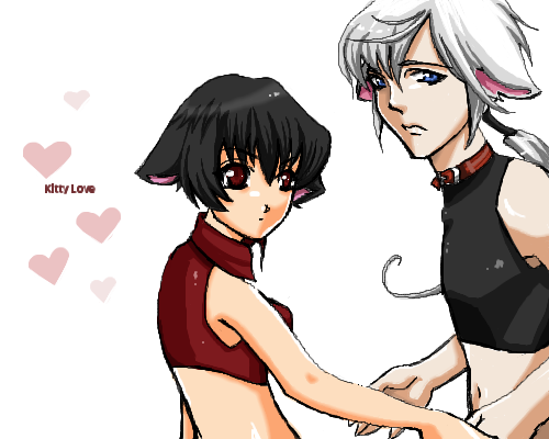
Smut Kitty Love
oikitsumaru
(Oct 15, 2004)
PWEE! more of my dark haired kitty.. and this time she has a friend! ^~^ XD It took so long though.. expecially for such a small picture.
TaCO (Oct 16, 2004)
O.O Great Pic!!!!!!!!!!
Pence (Oct 16, 2004)
I LOVE YOUR STYLE, MUST DRAW COOLNESS!
bethica2001 (Oct 17, 2004)
I love kitty people! They rock!
whitebunny1063 (Jan 17, 2006)
Kitty love. Whoo hoo!:) |
| ||||||||||||||||||||||
|
MellonCollie
(Jan 15, 2006)
Finally done :)This is my first intermediate post. I hope it meets the standards. Please tell me what you think! <3
MellonCollie (Jan 15, 2006)
Thanks Torchic! :D:O
SpazyPanda (Jan 17, 2006)
I like the star in the background. And her hair is awesomeness. :D
MellonCollie (Jan 17, 2006)
Thankyou! <3 |

| ||||||||||||||||||||||
|
Pakasutemanshikuka
(Aug 15, 2005)
the dartmoor pony for you. =D does it look like a dartmoor pony?
Pakasutemanshikuka (Aug 22, 2005)
XD oh, well, it's a perfect place !
Xodiak (Aug 22, 2005)
I have heard that in some places of the world, horse meat is eaten... <:O|XOD|
Pakasutemanshikuka (Aug 24, 2005)
oh yes ! you can buy horse meat in here.... i don't eat horse meat never :/ i love horses and it sure tastes bad. ._ _.
DrsFan (Jan 17, 2006)
awwwww,it looks like a dartmoor pony,I love it! |

| ||||||||||||||||||||||
|
Priszcilla
(Aug 26, 2005)
omigosh, it's chocobo Liz! weeeee
Animegirl250 (Sep 8, 2005)
Soooo strawberry cute!
LasRever (Sep 14, 2005)
This is just TOO cute. There should be a law against such cuteness!! (an I never even bother with the stupid things anymore, breeding them takes up valuable hours of my life!!)
Gigandas (edited Sep 24, 2005)
Hehe, I like this one a lot so I keep coming back to look at it from time to time :). I want a Chocobo Liz.... :-/-And when I get one, she'll fetch me the Japanese copy of FF7:AC cause it's still not out here yet :P.
DrsFan (Jan 17, 2006)
Oh its a chocobo I remember playing this vidio game a while ago |

| ||||||||||||||||||||||
|
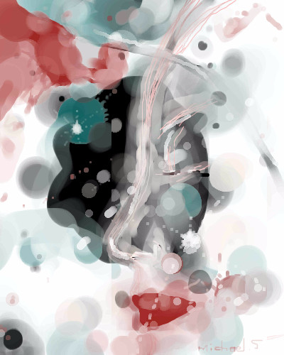
mx
(Jan 13, 2006)
watercolor series
HunterKiller_ (Jan 13, 2006)
Mesa likes it.
Urei-sama (Jan 16, 2006)
This is creative and a really nice abstract piece. Very pretty.
mx (Jan 16, 2006)
thank you...im considering going more loose like this piece, instead of my usual rigid approach... |
| ||||||||||||||||||||||
|
Axil62
(Jan 11, 2006)
OH HI EVERYBODY!!
HunterKiller_ (Jan 11, 2006)
I love his expression.
LisaAnne (Jan 11, 2006)
:)
featherstone (Jan 12, 2006)
this is a wonderful dog pic... people HAVE to love dogs... the pink/peach over his nose and forehead is what makes it for me... so well done, Dan
terracotta (edited Feb 19, 2006)
. |

| ||||||||||||||||||||||
|
somebody
(Dec 30, 2005)
.
somebody (Jan 7, 2006)
lmao....legs? You're funny. I'll get right on that
darkshadow (Jan 7, 2006)
when drinking wine before you drink you sniff then swirl the glass and the drips that fall back into the glass from the rim are called the wines legs not all wines have them but a red would
Ruggi (Jan 15, 2006)
Looks tasty! I'll have one!! And wow, the glassiness of the glass is so... glassy! Great job, ma'am!! :o)
somebody (Jan 16, 2006)
ohhhhh. Thank you Darkshadow. I never knew that. I learned something new. And ty Ruggi. Have a glass on me .:o) |

| ||||||||||||||||||||||
|
Kraisa
(Jan 14, 2006)
Where do they go when we grow up?
Jessor (Jan 14, 2006)
woa this looks familiar, i dont know why. i like it tho!
Kraisa (Jan 14, 2006)
all from my head...dunno maybe someone else had a similar thought...
davincipoppalag (Jan 14, 2006)
I think they become lawyers. This is a very cool idea..he's melting into your head.
Urei-sama (Jan 16, 2006)
Oh cool. Most people would like, blur him into the background but this is like, seamless integration. Very nice aaand, I like the concept. |
| ||||||||||||||||||||||
|
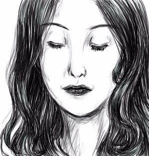
minikuineko
(Jan 14, 2006)
woooow, i haven't posted anything here in like... two months or so O.Oanywho, thought that i'd attempt a realism sketch...
mybettastorm (Jan 14, 2006)
I really like the way you draw, this looks really real.
Jessor (Jan 15, 2006)
i like how you did the hair in this, how the lines all flow together. quite wonderful indeed.
Urei-sama (Jan 16, 2006)
This is diffrent. It doesnt look like a sketch. Its more heavy and smooth. I really like it. |
| ||||||||||||||||||||||
|
Snoozy27
(Jan 15, 2006)
On an empty subway car with the spirits of cartoon past. They won't shut up EVER EVER EVER
SYTHE (Jan 15, 2006)
This week in *Behind the Stars* we takes a look at Wiley Cyote. "At first I started using the coke to give me an edge, then I had to use it just to keep up, it was that damn Road Runner fault." We will take a look at his rise to stardom and his fall from grace (and a cliff). -I like it alot.-
JK-Arts (Jan 15, 2006)
cool toon
marcello (Jan 15, 2006)
You were serious. O_Overy oldschool paintbbs feel.
Urei-sama (Jan 16, 2006)
Wow. I think my brain just 'sploded. Great picture. |

| ||||||||||||||||||||||
| |||||||||||||||||||||||
| 2draw.net © 2002-2026 2draw.net team/Cellosoft - copyright details - 5.07sec (sql: 35q/4.84sec) |