| |||||||||||||||||||||||
|
Sex & Violence
kejoco
(Aug 4, 2005)
Masuimi Max doing her best Lara Coft impressionStill needs a little work, especially on the right hand and gun
davincipoppalag (Aug 4, 2005)
It looks better to me kejo...
Anna (Aug 4, 2005)
woowoo! This is great! I love her collarbone area, it's nicely done! *high fives Kejo*
taori (Aug 5, 2005)
masuimi max is my hero. well, not really, but she does have sweet tattoos. nice picture. i like the way the shirt looks especially.
Cianteed (Aug 6, 2005)
Stoen Temple Pilots have a song called Sex and Violence. Mmm... Scott Weiland. |

| ||||||||||||||||||||||
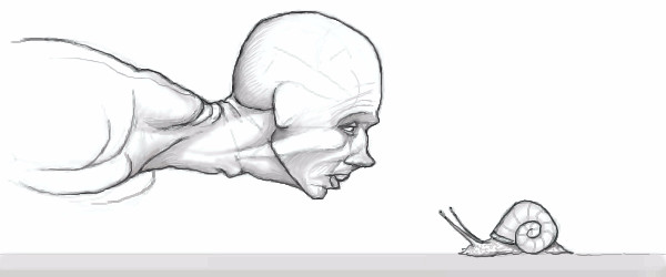
|
sagenev
(Jul 24, 2005)
a long trip with short glasses... a long trip without large drinks... a long movie without final. |

| ||||||||||||||||||||||
|
kejoco
(Jul 26, 2005)
I was going to move this to intermediate but it wouldn't give me the option while it was still hiddenWould a friendly neighborhood mod move this to intermediate thanks **edit** I think I'm done with it |

| ||||||||||||||||||||||
|
me007
(Jan 20, 2005)
Arg.. I need help finishing this up.. any tips?
davincipoppalag (Aug 5, 2005)
danny..that was epic..6 months! lol that has to be a record...for one picture..
Gigandas (Aug 5, 2005)
Haha, I think I've waited longer though davinci. I mean that one collab I started with FM way back when will probably never get finished. I dunno, I might just finish it and get it out of the way, but we'll see who the record holder is then lol.Nice work you did here, man. I bet the frets and guitar strings on the guitar were a pain in the ass :P. I think you did exceptionally well on hid left hand there too. Nice finish even after all this time :).
davincipoppalag (Aug 5, 2005)
Yea I forgot how long some of yours have been ...
Renuar (Aug 5, 2005)
This is really well done. Hope to see more like this in the future. good job. |

| ||||||||||||||||||||||
|
Renuar
(Jul 14, 2005)
...
Xodiak (Jul 15, 2005)
Haha, nice! I like how they look into each other's eyes... I like the man's muscles too. Great drawing! >:D|XOD|
davincipoppalag (Jul 15, 2005)
I was sure this was going to be a Crimson King.. nice work here..
HunterKiller_ (Jul 15, 2005)
Yeah i was sure this was Joes... Awesome.
kejoco (Aug 5, 2005)
There is so much depth in his face with minimal shadingnicely done |
| ||||||||||||||||||||||
|
PolythenePam
(Jul 11, 2005)
Not sure where this is going...it'll go somewhere...
Xodiak (Jul 12, 2005)
Very nice colours! It reminds me of Miss Shellie's drawing. http://cellosoft.com/2draw/view/26920/Great art! <:) |XOD|
PolythenePam (Jul 12, 2005)
Thank you everyone, your comments make me happy :)
Kabomb (Jul 13, 2005)
Awesome drawing! I love the crosshatch work...
Gigge (Aug 5, 2005)
Your pictures are always very bold and interesting. This is very nice work. |
| ||||||||||||||||||||||
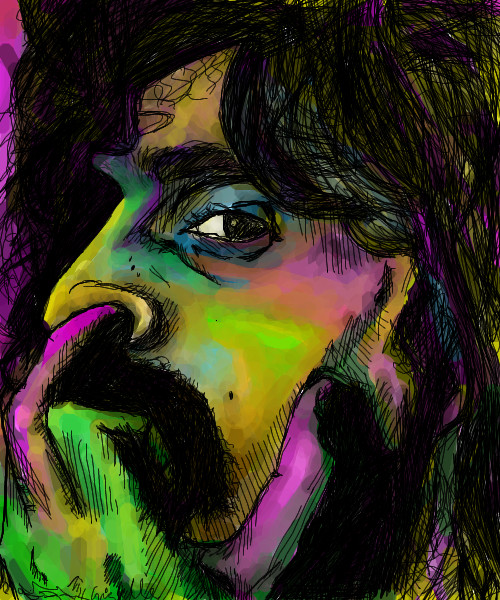
|
Knockoff
(Jul 23, 2005)
Well, first, I'm proud of this one. It combines several of my styles into one.Secondly, enough with the shitty comments. If you comment, comment on the picture, please.
Kenshin (edited Aug 1, 2005)
Great picture. I love the lips and her expression.The background is different from the rest of the picture and that makes it cool XD
DinoFlorist (Aug 1, 2005)
I would say nice things about this, because there are a lot of nice things that you've done. However, when you only focus on other people's negative work (with the exception of the few people you think are too cool to critique), it makes it harder to do that. This picture could be a lot better if you made the transition from the waxy girl a little more consistant. I think you quit on it, which is easy to do. Good job on the nostril and the lips, but the bridge of the nose is weird and the eyes look like the skin is peeling off of it. Of course, it was supposed to be that way @_@! With more practice, maybe you yourself can be in that small group of people that you won't harass. There are degrees of crappiness and your standards are too high. And, there are degrees of tactfulness, and your standards are too low.
starmarked (Aug 1, 2005)
Okay....I just read all of that ^ and I am halfway confused because I think some comments have been deleted/removed. So KO I just want to tell you that I only visit 2draw to look at everyone's contributions and I comment on those that amaze me or those that I feel I can help out with my comment. I ignore and skip over all of the other mess/gossip/in the end just words that have nothing to do with art. This way I "protect" myself from becoming so upset about the latest topics taking place here. That enables me to continue visiting this site.Now on to the more important thing, KO this is an amazing drawing! When I first saw it and that you drew it, I was soooo proud at how your skills have grown. Her nose, lips, chin, and cheeks are excellent! I like the extra bit of pink/purplish color you have added there. And the teeth add nice detail to her expression (which I also love). The outline of the eyes is not just right, and her eyebrows don�t quite fit the rest of the face. I also think that more emphasis would have been put on her expression and face if you made all of her hair black (or leave only a very few highlights) and remove the partial ear. Make the viewer wonder what is this girl looking at that is causing her to have this facial expression. I am glad you incorporated your different style in the background. This will be one of those drawings that I think about and have to go back to look at it again. Thanks Knockoff :D
Gigge (Aug 5, 2005)
Welcome back, knockoff. I like the mix of styles. |

| ||||||||||||||||||||||
|
zep
(Jul 28, 2005)
a kind of gray...
Renuar (Jul 31, 2005)
it's just like i imagined it. fantastic.
Asriel (Jul 31, 2005)
yeah i like the ones you do like this. they make you think.
sincity (Jul 31, 2005)
Awsome as usual ZEP! I really dig this one. :}
Gigge (Aug 5, 2005)
If truth is the desert, I'll stick to the fantasy. It looks so lush. :) |

| ||||||||||||||||||||||
|
dixielandcutie
(Jan 23, 2005)
i cant believe they made it a movie...referenced from several movie photoshair is not cooperating...
sing once again with me, our strange duet...my power over you grows stronger yet...
sincity (Feb 7, 2005)
I hate bloody musicals. do love the original phantom of the opera though. :}>
Aubrey (Feb 14, 2005)
Very nice. It'll be super when yer done :)
fleeting_memory (Jul 31, 2005)
EEP! How did I miss this? Oh well better late than never. I have to say I prefer Michael Crawford myself but this is a very nice rendition of the movie guy. His nose on the mask side seems a little uneven and the rose is a little flat but you're not done and I'm sure you know that. Very awesome dixie! |

| ||||||||||||||||||||||
|
zep
(Jul 19, 2005)
i defeat my demons today...well, a couple of them :)hope it is 120
sketcher2005 (Jul 27, 2005)
very nice add of ligthning, i love the draw itself, its a very beatiful idea u had, strong and sad but nice
renire (Jul 29, 2005)
Zep your drawings scare me....
zep (Jul 29, 2005)
mmm...i hope not ALL of them Amber :) |

| ||||||||||||||||||||||
| |||||||||||||||||||||||
| 2draw.net © 2002-2026 2draw.net team/Cellosoft - copyright details - 1.55sec (sql: 36q/1.50sec) |