| |||||||||||||||||||||||
| Specialty Boards/Elite Bastards | |||||||||||||||||||||||
|
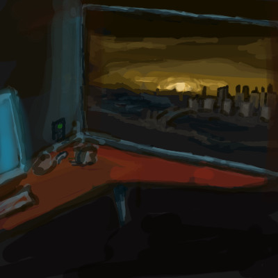
A Perch Above Jagged Teeth
23 comments
– latest 4:
hideyourface (Dec 15, 2005)
those lights are awesome. I wonder what that big knife-shaped silhouette in the back is..
Shortiebop (Dec 8, 2006)
OMG this is great i love city lights :)
Flubbles (Nov 12, 2010)
Hopefully now you've got some room to make some new ones.
Suntan (Nov 13, 2010)
beautiful :) |

| ||||||||||||||||||||||
| Public Boards/Intermediate | |||||||||||||||||||||||
|
Miss_DJ
(Oct 2, 2010)
I don't like the tusks, but it's late.
Felistorm (Oct 6, 2010)
I agree I really like this one!!!!!!
Miss_DJ (Oct 6, 2010)
Thanks, Felistorm!!
DeadlyBlondeArcher (Mar 11, 2011)
It's not necessary to try to change the tusks to make them "this or that", "correct" anything, or whatever.... it's obviously not meant to be realism. It's surreal and dreamy, then the tusks give it a sharp edginess I like. Kind of like the personality of elephants, so sweet and loyal, family oriented, but when threatened can be extremely vicious, enacting intelligently planned revenges, even. I love ephalumps, love the picture.
Miss_DJ (Mar 12, 2011)
Thanks!! Man I miss you around here!! ♥♥♥♥ |

| ||||||||||||||||||||||
| Public Boards/Advanced | |||||||||||||||||||||||
|
itchymonkey
(Sep 5, 2010)
ref from__http://en.wikipedia.org/wiki/Bob_Rossfor the stereotype comp....but it appears that i am unable to move it :p might have to have another fro
elly (Dec 20, 2020)
Well, that was the fasted upload for a drawing I've seen in years!! Of course there weren't near as many brush strokes in this draw so maybe that's why but at least it uploads!!!!!
davincipoppalag (Mar 20, 2021)
We need some happy little trees
WolverineAlpha (Apr 21, 2021)
Whoever made this is a Bob Ross
blueberry07 (Jun 26, 2021)
I love the scenery he's painting and you did a great job with his resemblance. Very nice art. |

| ||||||||||||||||||||||
| Public Boards/Intermediate | |||||||||||||||||||||||
|
padmooks
(Jul 26, 2010)
i just painted my nails pink.
padmooks (Jul 27, 2010)
i dont agree with the zeppish. zep is amazing.
davincipoppalag (Jul 27, 2010)
so are you
padmooks (Jul 27, 2010)
thanks dave. D:the perfect marriage.
|

| ||||||||||||||||||||||
| Public Boards/Advanced | |||||||||||||||||||||||
|
zep
(Apr 27, 2007)
cheating on hopper
DeadlyBlondeArcher (May 29, 2007)
boy if i had a nickel everytime my husband said that 'i'll fix it tomorrow' thing... hmmmm some of the things i can think of were 19 years and 362 days ago, and they still aren't fixed. =Di like this painting because it depicts that they are comfortable being 'together', while they aren't actually interacting and they are each in separate planes of thought, they remain as 'companions', and still comforted by the other's presence. I hope that makes sense... it does to me. =]
StrawberryPaintbrush (May 31, 2007)
A lot of people interpret Hopper's paintings differently and I read an interesting article about the various interpretations of just one piece. I usually get a depressing and very lonely feeling when I look at his work, as if the subjects are deliberately ignoring eachother as if to make a point. But I can also see what you mean DBA, that they look content with eachother without acknowledging one another.loosing hopper
Aakyra (edited Jul 31, 2010)
I totally agree with Strawberry Paintbrush ... I see a lost connection in this. Actually, it's the woman's left arm and hand that makes me feel as though she has given up on trying to reestablish a connection... feeling like it is just no use any longer. So, I feel the art evokes emotion and thought but not necessarily the emotion and thought that would draw me to a work of art. However, this is a beautiful rendition! |

| ||||||||||||||||||||||
| Public Boards/Beginner | |||||||||||||||||||||||
|
Axil62
(Jul 26, 2010)
DeadlyBlondeArcher (Jul 26, 2010)
I like that. I wonder what it would look like if it were bubble gum pink? Would it have the same effect? Probably not, unless it had camo behind it, then, maybe. :)
padmooks (Jul 26, 2010)
yes. pink, that would have been better.
DeadlyBlondeArcher (Jul 26, 2010)
Well, no, not necessarily better just because I wonder about it... I mean, what would the neighbors say if he went around painting the word BRUTE in pink...? Imagine the talk at the water cooler at the office, on the green at the country club, out by the stacks of mulch and lumber at the hardware store, ...he'd not be able to show his face in the auto parts store for, probably...months. Just imagine. It's definitely BETTER in red, just not something to wonder about, see?
padmooks (Jul 26, 2010)
no no, i feel like in pink hes making a statement. in red its just cliche. yes he will be talked about, but isnt that what he wants? infamy? or fa...famy?either way. |

| ||||||||||||||||||||||
| Public Boards/Advanced | |||||||||||||||||||||||
|
Flubbles
(Jan 10, 2010)
I need the room.
firecracker (Jun 14, 2010)
This makes me think of a subway station...:)
Teapot (Jun 15, 2010)
I love your subtle use of pinks, blues and greens in the marble. My favourite part of the drawing is that upper lefthand corner where the light reflects a dull sheen on the stone. Excellent shadows, too.Have you been watching the series called 'Luther'? I'm so pissed they killed off Indira's character! buggers.
Flubbles (edited Jun 16, 2010)
I wanted to watch it but it clashed with two other shows I watch at the same time. I thought his accent in the american show the wire was great, you would never think he was english. There was a drama you might like here recently called father & son, but it was on ITV so I'm not sure you'll get it over there.
Suntan (Jun 17, 2010)
This is really good, you know. I still keep trying to make it a floor, but I see it's a wall. I looked for a while though. |

| ||||||||||||||||||||||
| Public Boards/Intermediate | |||||||||||||||||||||||
|
Miss_DJ
(Feb 4, 2010)
this was fun...
madscientist (Feb 14, 2010)
Your use of textures is quite amazing! Beautifully done!
Miss_DJ (Feb 14, 2010)
thank you, madscientist. Any textures you see are created...it was magic! ;o) ♥
mursku (Feb 15, 2010)
cool textures... now only if you didn't do abstract art, i would give you thumbs up.. i hate abstract art, like, grrrr! :P
Miss_DJ (Feb 15, 2010)
Thanks, mursku..I'll have to try something new! You gave me an idea!....♥ |

| ||||||||||||||||||||||
| Public Boards/Beginner | |||||||||||||||||||||||
|
Jimbob
(Jan 31, 2010)
Sketch for a game... you might see a few more before the week is out.
davincipoppalag (Feb 4, 2010)
kinda cool
Miss_DJ (Feb 4, 2010)
nice!
DeadlyBlondeArcher (Feb 4, 2010)
although simplistic it has this really weird, interesting feeling of depth and space |
| ||||||||||||||||||||||
| Public Boards/Intermediate | |||||||||||||||||||||||
|
Roytje
(Nov 11, 2009)
http://www.youtube.com/watch?v=H8AbBaOKlRI
shults (Dec 28, 2009)
Oh, this seemed angelic indeed, until I spotted some unsatisfied, inquiring look in his eye. It destroys the angelic image. very interesting.Also, I think I liked his chin on 2nd version better.
LifeGotColour (Jan 2, 2010)
amazing composition!
DeadlyBlondeArcher (Feb 4, 2010)
This is captivating... the facial expression is amazing, and the execution of light and shadow here is more than masterfully done. If this were actually an oil painting I would hang it on my wall in a heartbeat... I haven't liked anything this much in a long time.
Roytje (Feb 10, 2010)
That's a sweet compliment. Thanks a lot. |

| ||||||||||||||||||||||
| |||||||||||||||||||||||
| 2draw.net © 2002-2024 2draw.net team/Cellosoft - copyright details - 2.37sec (sql: 40q/2.15sec) |