boardsbeginnerUhmmmm......??? Landscape?
100% - zoom in - zoom out
drawn in 59 min with Lascaux Sketch Classic
Artist
iconWraith
Addict
Wraith (May 18, 2007)
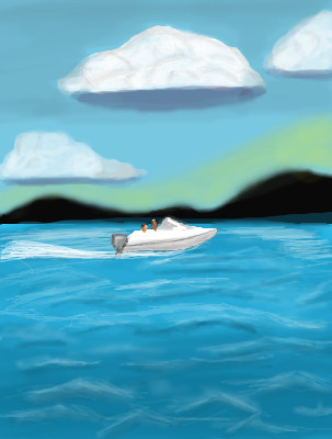
Well, DeadlyBlondeArcher inspired me to do some scenery.....But as you can see, it's not soo good. I tried. Any tips on making water stand out?
Wraith (May 18, 2007)
drawn in 27 min
Wraith (Jun 28, 2007)
drawn in 31 min
Sigh! My landscaping sucks! Oh well, I wanted to hurry up and finish this one to make more room for better drawings. I was trying to delete this entry, But I guess I am too drunk to know how.
davincipoppalag (Jun 28, 2007)
Hey you tried...the perspective on the boat looks good
penpen (Jun 29, 2007)
I think it looks good! i tried to draw water once... didn't work out so well.
Sweetcell (Jun 29, 2007)
The trick with water is making it not too opaque. With water (I've found) is capturing the depth, as well as the surface waves (very difficult) It's fairly good but you drew the waves too much like (forgive me Wraith) chidlike scribbles. You have the look of depth with the different shades of blue and green, but the waves ruin it. Look at the water, see how it moves, picture the surface waves in the movement and begin to slowly add color to highlight that wave. Contrary to what people think they aren't all upside down V shapes, the way you did them here. They curve, they bend, some are sharp, some are rolling, some have a reflective shade under them, some have full shade and some have highlights from the sun peaking through. Some are small curls, and some are a continuous line, somtimes starting small and turning into a full crashing wave or vise versa. I can see where the waves would be by looking at the flow of colors, if you look you'll see them and be able to follow the natural curls. Try it, let the picture tell you where to put them. Look up some ref's (because it will always be an asset to you) And keep trying. You can only get better.

As for the clouds, they look like cotton balls. Go back with the erasure on low opacity/flow, med/large brush, and slowly erase some of the solid color. Clouds, even full fluffy ones, should be loose. Come back with off white on low opacity/flow with the airbrush (when I mean low I mean barely any color) and build up the cloud slowly, adding more color and highlights on some, fading some out. Looks more natural, goes with shading too. Oh, and you can belnd the lower color of the sky with the upper better using blend. And maybe just make the hills less blurry.

The boat looks great, but it seems rather small for those two people. Then again I don't know much about boats so I bow to Poppa's wisdom. I hope that helps and you take it as suggestions. This is a good attempt, like everyone I had to work hard to get landscapes right (and I'm still trying)
Wraith (Jun 30, 2007)
LOL! Thanks alot for that Sweetcell! I think the only time I ever attempted landscape was when I was 10 yrs old. I'm 30 now, But I think I could have done a better job at age 10. I tried to make the water look like it was getting really wavy as if a storm was approaching. I have never done clouds, or sky so I guess this was a very good start. I forgive you for calling it childlike, because even I thought this was horrible, way off from what was in my imagination. I even wanted to delete it.. But then I added a boat, and said "Well the boat looks alright considering I never have drawn one." :D Boat kind of looks like a Shoe made of wood, from Holland.
post comment
You need to be logged in to post a comment. If you don't have an account, sign up now!