boards2draw inkTshirt Design (back)
25% - zoom in - zoom out
drawn in 7 hours 7 min with Lascaux Sketch Classic
Collaborators
iconmethod3
teh f00z4h
5 versions
5 hours 11 min
iconFin_beast
Addict
2 versions
1 hour 55 min
Edit
» edit/delete entry
» modify users
» revise image
method3 (Apr 27, 2004) — edit
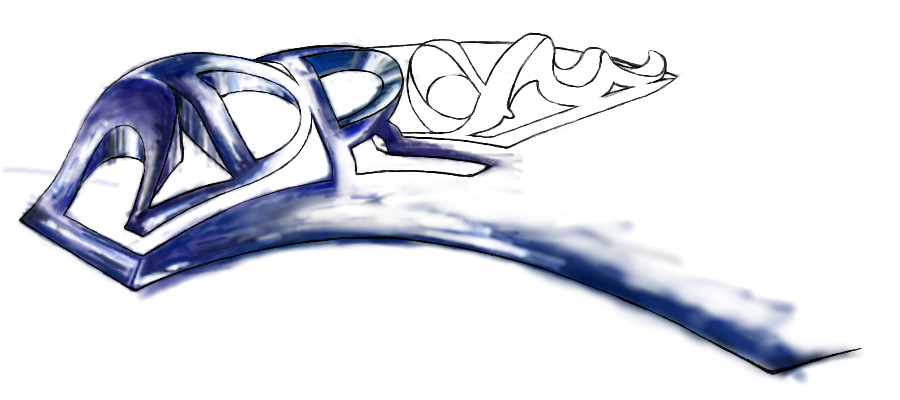
A 2draw logo designed for the back of a tshirt. Originally pretty faithful to the original sketch on paper with a few changes to make it more readable and hopefully less complicated. Now this monstrosity is pretty much a brainstorm of ideas. It will probably not be reproducible on a tshirt except by photographical reproductive process (not like a silkscreen).
method3 (Apr 27, 2004)
drawn in 1 hour 48 min
Basically spent all the time working on getting cleaner lineart.
Fin_beast (Apr 27, 2004)
Cool. Looks like a skatepark. ^_^
Fin_beast (Apr 28, 2004)
drawn in 43 min
Don't want you to see it until it's finished.
Fin_beast (Apr 28, 2004)
drawn in 1 hour 12 min
Well, first off, I have no idea what to do with that end bit. It really is quite awkward. :s
Turned them into skate ramps as you can see. Well... skate ramps?
I really like this line art design.
Method your line art rox0rz.
Vista (Apr 28, 2004)
Looks kinda like gold. ^_^
method3 (Apr 28, 2004)
I like the way you colored this, good job. The problem with the way it's colored now though is of course that end bit doesn't fit at all. The way I was thinking of coloring this (and I won't be able to get around to it I don't think) is by really increasing the thickness in all the lines and maybe adding color there instead of filling in the negative space. For instance, if you thicken the end bit line into a solid positive shape instead of that thin line it might work out better.
davincipoppalag (Apr 29, 2004)
I would cut that off altogether.. just end it and the narrowest point and lose that tail.. it looks kinda cool that way... skatepark eh,, how about the little icon guy (design one) on a skateboard somewhere on one of the ramps!
method3 (Oct 14, 2004)
drawn in 1 hour 43 min
Crappy mouse, had some spare time to mess around.
Fin_beast (Oct 17, 2004)
Looking good so far. :)
method3 (Apr 7, 2005)
drawn in 29 min
This thing is just a monster to work on. Messing with some other colors I think will help so... that's next. Also all the old layers are there in case you want to mess with them so don't worry.
Fin_beast (edited Apr 8, 2005)
Looks much better with that black surrounding. Should be insane when it's finished.
method3 (Apr 17, 2005)
drawn in 1 hour 3 min
Just added stuff behind (under?) the letters. What else does it need...
method3 (Apr 17, 2005)
drawn in 7 min
Some fixes to what I didn't like. But whether it's done or not... I think it still probably could use some work. Suggestions definetly welcome at this point.
post comment
You need to be logged in to post a comment. If you don't have an account, sign up now!