boardsadvancedZodiac - Gemini
100% - zoom in - zoom out
drawn in 2 hours with Lascaux Sketch Classic
Artist
iconLook
artist with no brain
Look (Feb 1, 2004)
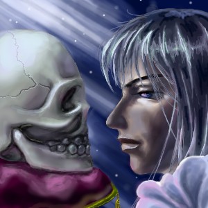
Plan to do a series of drawing on zodiacs. this is gemini
"There can be only one that's truely special. Brother, that is why you had to die and I stay alive. There should be nothing that is idenitical, for they will not be unique anymore. You shall rest in the moonlight, the cold moonlight."
Look (Feb 1, 2004)
drawn in 14 min
Look (Feb 2, 2004)
drawn in 1 hour 14 min
This took me probably 2 hours... had to refresh browser in midway. Leave it unfinished for now in case I see some flaw after I submit it. Kinda disappointed that the face and skull don't seem to fit in with each other. :(
Knockoff (Feb 2, 2004)
Woaw, thats some nice stuff, look.
It doesn't bother me the least that the skull doesn't exactly matvh the structure of the guys(?)
face.
I love the hair, and the skull. The teeth also give it some nice skelital features.
I dont see anything bad about this.
marcello (Feb 2, 2004)
Try adjusting the color balance of the skull, maybe adding more reds and yellows, to give it a similar lighting to the person's face. Perhaps more contrast (right now the face seems closer and the skull further in the background... The pillow seems to be reflected more in the skull/shirt than it should be.
Everything else looks really nice.
staci (edited Feb 2, 2004)
i think its a great concept, but now that marcello mentions it..maybe similar colors to the persons skin in the skull would give it a more gemini/twins feel. i still think its fine as is though. good stuff.

And! yes the skull does look further away..I noticed that before I realized Marcello mentioned it. Nose to nose would be good me thinks.
Look (Feb 2, 2004)
Hum... must be the lighting. I'll makek the color more matching for the skull when I revise it. (woot, it's under size!!! I dont have to beg Marcello for extra now. whee!) I wonder if the picture looks too dark on you guys' monitor. 'cuz it looks really dark on my small CRT monitor, but looks fine on my laptop.
marcello (Feb 2, 2004)
They are nose-to-nose, but most of the nose you think of isn't bone and thus doesn't show up on the skull.
Looks fine on my laptop.
staci (Feb 2, 2004)
okey dokey smarty pants.
ToraNeko (Feb 2, 2004)
But if you did draw out the rest of the nose, they would be overlapping. Hmm, when I first looked at it, I thought the skull looked closer >.< Maybe I need glasses or something... But because of the amount of lighting on the guy's fae, it doesn't look like they are on the same plane.

But I think this pic is cool! This is gonna sound wierd, but I like the guy's nose specifically. >.< And the ruffles, The shading on those are awsome, and well, yeah, the overall shading too. lol. And the skull is neat how its all shiny on top. Just like my Art teacher. His head reflects the ceiling, I swear!
Look (Feb 3, 2004)
drawn in 17 min
added some shading to the guy's face. sharpen the shading and lighting on the skull a little. Should I keep the shading on the guy's face? it does make those two more on the same plane, but i kinda liked the lighting on the face before... lemme know before i turn it into final
ToraNeko (Feb 3, 2004)
I think its still just a shade to bright on the nose. But I love it! It really does look like thy are the same now. But you're right, it looks good both ways, I'm sorry, I can't make a decission >.< And can I be the first to say how incredible the crack on the skull is?
Look (edited Feb 3, 2004)
Thanks ToraNeko. That crack was pretty easy to draw with a shaky hand. (and i thought it'd be harder). :D THe shade is still too bright on the nose? is it? hum... *sink into deep thinking*
btw, a friend told me it's disproportion... can anyone give me a pointer where it's disproportioned? (think about nose and chin)
staci (Feb 3, 2004)
the lighting was nice on the original...not an expert but to me this one is visually more pleasing.
Sotalean (Feb 3, 2004)
Do you use a tablet? 'cause this is really well done. The lines and coloring are amazing. *thumbs up* I kind of wish that this site had a favorites use. This would definitely be added to it. ^^
Look (Feb 4, 2004)
drawn in 13 min
Done!!! No more revise for this one. In case you are wondering what's changed. well.. nose smaller, slightly change on the eye, tried to add more texture to the skull (not successfull)... that's about it... ack, just realize the lighting on the hair isnt so good. oh well. :P
DeadlyBlondeArcher (Feb 4, 2004)
Did a great job on this one. What kind of galactic shampoo does she use? I want my hair that shiny! :) Her hair is my fav thing, btw.
Look (Feb 4, 2004)
It's a he... well, for the shampoo, same brand as InuYasha uses (inuyasha: a character from an anime called inu Yasha). reason: quote from cartoon network: "a full head of hair and not a single split end? that's his true strength if you gotta ask me!" heh
post comment
You need to be logged in to post a comment. If you don't have an account, sign up now!