|
yellow.nutella (Feb 7, 2023)
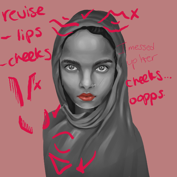
ReferenceTips and critiques are forever welcome, please comment on where and how I can improve, I sincerely appreciate it.
|
|||||
| 2draw.net © 2002-2025 2draw.net team/Cellosoft - copyright details - 0.17sec (sql: 45q/0.15sec) |
drawn in 9 min
drawn in 32 min
drawn in 28 min
drawn in 43 min
drawn in 37 min
drawn in 26 min
drawn in 1 hour 6 min
drawn in 16 min
drawn in 49 min
drawn in 45 min
drawn in 39 min
Nice shading and draping with clothing, and good job on face. Could have a bit more texture to hair, and some softening with some harsh outlines of person.
The position of shoulder looks flat like maybe if she was positioned to the left and not centered it wouldn't be so obvious. Not sure if I like the comic book style dots on face. Again, I think you did well on this draw!
Smart choice to start BW (you could take it further by using less values) and to use a "simple" reference. realism is a huge area of study so you don't want to overwhelm yourself. My go-to advice is zoom out often / look at the thumbnail. It is good at exposing "flaws". E.g. the chest is more uniformly lit in the ref.
while you capture a lot of lighting and the anatomy, the expression is different. i think that is striking in the ref, and worth capturing. goes to show that a minimal composition carries a lot of complexities. shading, expression, textures, glow/reflectivity, posture, facial proportions, dimensionality (cloth wrapping around the sphere that is her head). do you think you captured what you wanted to capture?
studies focusing on capturing drapery/clothing folds would help you. Most energy went into the face i think.
The shapes in the top half are satisfying. Imo you don't just go through the motions, you aim to reach a certain feel that brings you joy. Overall great job.
@luv2 I am keeping the dots jaja. I like them and was recently watching Puss in Boots and their amazing, scratchy animation. I fell in love. Not to mention I also adore Spider-man into the Spider-verse and their equally, if not, more scratchy smear-frame, animation and not to mention those juicy lines they add on top of the 3-D models. Just, ah, chef's kiss. I like the dither. And I'm a sucker for animation. I lean more towards that than realism, so adding the half-tones is a little of my touch.
@bitbof I have watched a few videos and they encourage references with good, contrasting lighting for drawing portraits (and many things, for that matter), I thought this was a great time to put that info into use.
I did zoom out quite often, but I agree, the tone for her chest area was not a perfect match. The expression, oof. It wasn't until my family member pointed out that her face was tilted and open-mouthed. But I was too tired and too lazy to alter it. Jejeje. Since I didn't get the tilt and positioning of her face in my initial sketch, I feel like it did affect the draping and expression in the end. I do acknowledge that the end product doesn't carry what the referenced did. I did spend more time in the face, I was just too excited!
Nonetheless, I had a good time drawing this, I learned a lot. To be honest, I just wanted to see if I could draw a face that make people say, "Yep, that's a person."
I set it to 100% for opacity because I do own an apple pencil, which supports pressure sensitivity, but if you don't, I suggest 60% or lower so the blending doesn't overboard. Then I see how it looks like compared to my reference and add or remove the highlight/shadow with my mid-tone with the first brush set to low opacity and the square nib. I repeat the process until I am satisfied or rage-quit. I hope this helps!