| |||||
| Public Boards/Beginner | |||||
|
~TaKeRu-San~
(Aug 17, 2004)
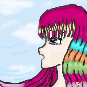
I drew this oekaki by using (for the first time) Lascaux Sketch, and after experimenting the applet, this is my opinion... *drum roll*... I. Don't. Like. It. Though it is okay, it truly isn't what it looks like. Either that or I just haven't gotten used to the program. *viewers agree with the last statement* Oh, be quiet. But seriously: the blur tool really isn't as good as the one in Oekaki Shi-Painter. Does anybody agree with me? *silence* I'll stop complaining now.The shading in this work isn't so good (no matter how HARD I tried), and the color of the eyes could be improved (curse you, poor blur tool!). Yet I really like the girl's defiant expression, and the last-minute idea of tears of blood flowing did add a nice touch to the overall picture, didn't it? Hehe. I wish I could've shaded the hair much better, but I tried and tried and tried... and no luck. *breaks down* But don't you just love the pink, shining lips? I'm quite good, aren't I? I hope the text isn't too hard to read either ^_^. |

| ||||
|
~TaKeRu-San~
(Aug 14, 2004)
As I like to state the obvious, this is my second oekaki. It is named "Breezing Colors," because I wanted to experiment with colors, tones, and shadings in this pic: I also tried to make my lines thicker, and I succeeded overall, right? ^_- Like I stated an infinite number of times, I'm truly no good at the last skill mentioned above, and although the shadings in this work probably is more intense than my first one, it's still much in the beginner level. I constantly changed the colors of the hair and the visage, and I admit that the hair's multiple hues is somewhat messed up... if not utterly. *sweatdrops* And there is more shading to the face than you think: the colors are just blended too well. An interesting change, if I do say so myself. And before I used to think that it was a great talent being able to portray a realistic sky, but now that I have done it myself (always wanted to do it ^_^), it's not hard at all. Either that or I'm blinded by my egotism... hehe ^ ^;;. Please, if you can, give me some advice/pointers on how to improve my shading (or anything else actually), and I'll be eternally grateful. And this is a rather good pic, isn't it?Last Note: I love the lips!! You don't know how long it took me to make it that beautiful!! >_<;; This looks... not-so-terrible, I say? Um... but there is a lot that I can do to make it better. *ponders* Plus, I hate that yellowish color on the face, and because I ran out of space, I can't correct it! *cries* At least not now... *wonders off to plead to a moderator*
This is now... FINI! Ladies, gentlemen, and germs... this is my creation! Doesn't the sky look realistic, huh? ^_^
Mipunai (Aug 17, 2004)
I like the eye, and the colors are pretty X3
Koneko-sama (Aug 17, 2004)
I think the head is a bit too short... and the chin pokes out too far... But I, too, love the lips! T'was a very good pic, Yang! |
| ||||
|
~TaKeRu-San~
(Aug 12, 2004)
Ah... my first oekaki~ Not bad, ne? I already see many things I could improve in this picture, but I have this tendency to love almost every work I create ^_^. And I DO love this one, hehe.The two lighted symbols are chinese characters: the above symbol represents my chinese astrological sign (the ram) and the one near the lower left corner means the light. And I know that my sign and light have almost NOTHING in common, but those were the first two characters I could think of -_-;;. I love my bg: the design was a last-minute decision, so it was difficult to make sure that the original figure (the girl) and the 'stars' would come out unscathed... but I did it! ... I hope ^ ^;;. The transaction from gray to blue wasn't as smooth as I wanted to be, but overall, the effects are great, if I do say so myself. The lines of the girl could be thicker, but I don't really know how to do it... except the hard way >_<;;. And the shading... ah, the shading. Beginner standards, of course... but it came out better than I thought. I also did a few last -minute changes that are barely noticeable, but I think it improved the overall picture ^_^. Plus, that moon in the pic is probably the best moon I have ever done in my life. So proud... hehe. *sweatdrops* Oh yes, one more thing: "Yue Nu" means "Moon Lady"... just to clarify things up.
flamefirefox (Aug 15, 2004)
haha wow ^_^ thats really good for a first oekaki =3 !! XD *does oekaki for its randomness* lol! >< hehe =P my real pics are on Deviantart.. XD!! cuz I'm such a loser >_>;;
Mipunai (Aug 17, 2004)
Wow, I really like the backround X3
Pence (Aug 19, 2004)
I like the idea of the picture, good jorb on it and thanks for the constructive comments.
Urei-sama (Aug 30, 2004)
<.< >.> Sorry for not commenting on this till now, been alittle overwhelmed with all the new stuff since i got back. Aywhoo~ Its ironic how your first picture is better than any of the others. The shadeing on her kimono is really nice and the moons glow is also exicuted prettly. Try useing Airbrush or pen on your lineart next time, makes it smoother and enhances the feel of it ^_-. The only thing that bothers me about this is the Cloud/Mist stuff. You do know how to use layers right? The fact that it cuts off on her edges and leaves a gapeing blue hole is distracting. Her pose is nice and you could even have gone darker on the background blue for more effect. All in all this is definatly one of the better "first Oekaki" pictures ive seen. |

| ||||
| 2draw.net © 2002-2024 2draw.net team/Cellosoft - copyright details - 0.20sec (sql: 15q/0.04sec) |
drawn in 1 hour 47 min
Anyway, great pic, great lips... I can't remember which picture I'm commenting on though. -_-;; This is an edit.