| |||||||||||||||||||
| Public Boards/Beginner | |||||||||||||||||||
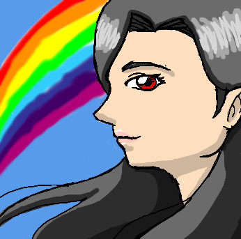
|
Kisshu
(Jul 8, 2006)
Another profile.. i can never seem to draw profiles... oh well... |

| ||||||||||||||||||
| Specialty Boards/Contest! | |||||||||||||||||||
|
Moosh
(Jul 6, 2006)
heh. v.2 is the most accurate. D:
davincipoppalag (Jul 8, 2006)
You look great in grayish blue...nice
patienceisoverrated (Jul 8, 2006)
I like this a lot... very stylish.
wboyer (Jul 8, 2006)
Very funky indeed :D Could this be classified as a charicature? In any case, I like the details of the profile, as well as your mad hatching skillz. Nice work :D And if I may say so, you are definately very pretty. Except in Version two. LAWL.
Kloxboy (Jul 10, 2006)
This is one of the more skilled entires in that contest. Excellent line work. |

| ||||||||||||||||||
| Public Boards/Beginner | |||||||||||||||||||
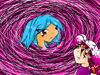
|
KaykuyoAkabane
(Jun 20, 2006)
Haven't posted in a while, so here's something.Er...My rainbow. XD
wboyer (Jul 8, 2006)
Neatoh, but there's a few problems with the jawline and side of the face... We see a profile of the girl, but the jawline and side of face appear to be that of a 3/4 view of her face. Lawl. I like her eye, though, in addition to the cell shading... :) |
| ||||||||||||||||||
|
Miss_DJ
(Jul 7, 2006)
a memory
Miss_DJ (Jul 7, 2006)
you have a great imagination! cool.
davincipoppalag (Jul 7, 2006)
it's ...those stairs......and it's coming......
wboyer (Jul 8, 2006)
Wieeerrrddd! My brain has just convulsed and died looking at this. I mean, wow. Especially for the 255 red/green/blue colors used.When I first looked at it, I thought tha tit was stairs down to a hole that dropped into a peripherally lit room with wooden floors. But then that doesn't make sense, because of the fact that it looks like they're going the opposite way. That they don't line up properly. And oh my god, the brain has spluttered again. Neat effect! :D
Sweetcell (Jul 10, 2006)
Piano keys is what I see. Hey girly. |

| ||||||||||||||||||
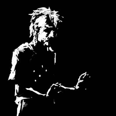
|
hideyourface
(Jul 7, 2006)
.
davincipoppalag (Jul 7, 2006)
18 minutes, yet very striking . Nice one
wboyer (Jul 8, 2006)
I absolutely love the hilighting here. As Davincipoppalag said, you've created a very striking and unique piece. The fingers totally make the picture, for me! Brilliant work :D |
| ||||||||||||||||||
|
PeAcHy
(Jul 8, 2006)
Practicing getting used to the applet by drawing some of my original characters. (Timer lies. I was off for quite awhile.) |
| ||||||||||||||||||
| Public Boards/Intermediate | |||||||||||||||||||
|
diablo_fan
(Jul 8, 2006)
!!!
wboyer (Jul 8, 2006)
Neatoh :D I like the coloring scheme and style of painting here :D I only have a few suggestions... First off, the white lines of the orbital bones are kind of off... The highlighting of the viewer's left one must be moved farther left, and should have an accompanying shadow to emphasize the muscle mass that's attached in that region. Another issue I have is with the length of the face relative to the nose. If you were to move the highlight that I assume is at the jawbone down father, this proportion would be fixed.Also, make sure you remember facial anatomy in your highlighting and shading, such as the muscles attached to the jaw, and the convex surface around the mouth created by the ring of muscles there. I don't know any of the proper names for these things, but... Bear with me :) This is a really cool picture, so I hope you keep it up :) |

| ||||||||||||||||||
| Public Boards/Advanced | |||||||||||||||||||
|
cianteed2
(Jun 27, 2006)
.
Alter.Native (Jul 23, 2009)
Sweet colors!
Broken_Heart_ (Sep 2, 2009)
WaW[not WoW] this is cute
druyamikyo (Jan 3, 2010)
sweet. Valo is pretty epic
dorothyblueeyes (Jan 4, 2010)
yes,some wonderful color effects,great. |

| ||||||||||||||||||
|
Luka
(Jul 6, 2006)
Look into my glass eye and you can see your own death! >.OC&C would be very helpfull. I already see a few mistakes :(
fleeting_memory (Jul 7, 2006)
how fitting, a pirate piece! yaarr
Deino (Jul 8, 2006)
What? I'm going to die because of Gello? Not fair. This drawing is looking awesome thought.
wboyer (Jul 8, 2006)
OMFG. PENISNAKE.*coughcough* Very cool start... I love the design of this character! The evil, lopsided grin totally makes the picture.
HunterKiller_ (Jul 11, 2006)
Perfect pirate expression. |

| ||||||||||||||||||
| Public Boards/Intermediate | |||||||||||||||||||
|
Pseudonymous
(Apr 24, 2006)
*sigh*
frootcake (May 22, 2006)
this is really good. it's a good use of blurry and sharp areas. it actually reminds me of a wooden doll - pinocchio perhaps
Pseudonymous (May 22, 2006)
I know what you mean, Lisa and thank you. Thank you so much, Dave. :)Awwww, thanks Cindy! :D I know what you mean...even PICTUREs of children bring out that maternal nature in us. Thanks froot - that wooden look actually came because I was on the phone and not really paying attention to what I was drawing. I kind of just wanted to get rid of this from my studio, but I'm actually pretty happy with how it came out.
Miss_DJ (May 23, 2006)
this makes me so sad...it's perfectly conveyed sadness.
wboyer (Jul 8, 2006)
The focus on the eye and the teardrop is superb. Your style, as always, is ftw. |

| ||||||||||||||||||
| |||||||||||||||||||
| 2draw.net © 2002-2026 2draw.net team/Cellosoft - copyright details - 0.72sec (sql: 40q/0.20sec) |
also, the forehead stops at one of her bangs there should be more of it on the other side.
Stop puting yerself down when you draw something, their good, seriosly.