| |||||||||||||||||||||||
| Public Boards/Beginner | |||||||||||||||||||||||
|
cravenlass
(Apr 8, 2004)
I really had fun with this one. I finally found my board! -PaintBBS- So now I can go right to it and begin my work. UPDATE: 4/18/04 I re-touched my drawing a bit. Making the background pink where before it was white. I felt it was very empty before and seemed to "float". I also did some shading around the ears, tail and body a bit, then lightened it up with the half-tone tool to give it a sort of "plushie" feel. I don't know, I just experimented with it a bit and seen if it could come out of its "ghost like" appearance and it has. I will try experimenting further with future works to see if I can get it to work better. Overall I hope its an improvement, not just in my eyes but in others as well. :-) |

| ||||||||||||||||||||||
| Public Boards/Intermediate | |||||||||||||||||||||||
|
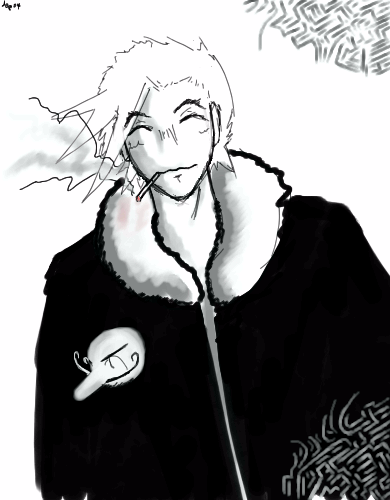
TheCrimsonKing
(Apr 8, 2004)
This in a way is my representation of me walking through Osaka drunk after hitting a bar...very fun time in japan.
tappie_chan (edited Apr 8, 2004)
i really love the style of this. the expression on his/your face is really good, the designs are cool, and the hand looks like a dudes head (which i love ^___^). i also like that its in B&W. cool yo!edit: AHAHAHAHAAAAA!!!! so i'm not seein' things! ^^;
TheCrimsonKing (Apr 8, 2004)
Oh....thanks..but uh...that hand, is actually a "dudes" head..hmmm yeah, my/his hands are in his pockets right now...this guy is just floating around him...because....I'm drunk. I guess.
marcello (Apr 8, 2004)
it's a knockoff nose :)
lp_phaery (Apr 8, 2004)
hmmm interesting. i like the guy and the little head thingy is soo funny |
| ||||||||||||||||||||||
| Public Boards/Beginner | |||||||||||||||||||||||
|
cursive
(Apr 7, 2004)
I was trying to go for realism but its hard and frustrating !! I might delete this because I keep messing up the face =/
tappie_chan (Apr 7, 2004)
the hair is really good. ^_____^ |
| ||||||||||||||||||||||
| Public Boards/Intermediate | |||||||||||||||||||||||
|
shudson
(Apr 5, 2004)
Midvalley the Hornfreak from Trigun
tappie_chan (Apr 5, 2004)
beautiful! looks like a scene straight out of the anime! excellent!
davincipoppalag (Apr 6, 2004)
I am not a fan of Anime, but this is very nicely done. Good work.
Noremac (Apr 6, 2004)
this looks identical... yeah to him. too bad he killed himself
DieChan (Apr 7, 2004)
*stares in absolute awe* It looks freakin' professional! I see nothing wrong. Good, no, GREAT job! *80,000,000 thumbs up!* |

| ||||||||||||||||||||||
|
Shiek
(Apr 5, 2004)
A question for the more skilled oekaki-ers:- How can I make my colors smoother and my objects less two-dimensional? Some help would be greatly appreciated.
tappie_chan (Apr 5, 2004)
to smooth out colors, try erasing the edges of your blocks of colors w/the eraser on a pretty low opacity, then blurring it. for more 3-dimensionality, you have to develop your skill with light and shadow; namely the use of 'core shadows', which are very important in creating that 3d look. i don't think i can explain it adequately, so look it up. i'm sure there are lots of drawing sites that can explain it pretty well. anyways, this is looking really good so far! i especially like the lion. ^___^
Shiek (Apr 7, 2004)
Thank you! _(._.)_I'm not terribly sure what these two broke into conflict about, but I hear it had something to do with one of them calling the other mean names, like 'Sir I'm-Too-Good-To-Make-My-Own-Damn-Body-Heat.'
|

| ||||||||||||||||||||||
| Misc. Boards/Sprites | |||||||||||||||||||||||
|
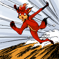
Doodlibop
(Apr 7, 2004)
Ahhh this was so fun to do. And I really don't know why!The red fox runneth! :)
tappie_chan (Apr 7, 2004)
this is really cute! you put so much character into the way she runs; she looks simply ecstatic to be doing just what shes doing right now. great lob! oh, and the title sounds like a childrens book. you should make a story for her (unless this is already a book)! ^_____^ |
| ||||||||||||||||||||||
| Public Boards/Beginner | |||||||||||||||||||||||
|
DMV
(Apr 5, 2004)
I think the BG is cool :)
tappie_chan (Apr 5, 2004)
i think the BG is cool too! real trippy man. how did you do it?
davincipoppalag (Apr 6, 2004)
Everyone on DMV's planet is born with an instictive ability to make cool backgrounds. You did it again DMV
DMV (Apr 6, 2004)
layers, different brush size and brush spacing :)
Knockoff (Apr 6, 2004)
Woaw, those balls are soo cool. THe shading on them is great. I love the colors you used here.! |
| ||||||||||||||||||||||
| Public Boards/Intermediate | |||||||||||||||||||||||
|
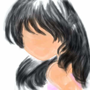
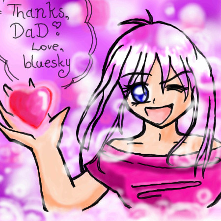
bluesky
(Apr 5, 2004)
many, many, MANY thanks to good ol' dad and lotsa luv ^^ luv ya pop(ignore the little black dots at the top left corner i didn't realize they were still there and ran outta space ^^;;) nearly done i just realized i missed a spot arggggh
tappie_chan (Apr 6, 2004)
the lineart looks good. lotsa pink, but it works^___^
laurael (Apr 6, 2004)
Hey...she's cute! You did a lot of other cute pics too...keep it up! |
| ||||||||||||||||||||||
| Public Boards/Beginner | |||||||||||||||||||||||
|
ChibiNay
(Apr 5, 2004)
This is my first um real life type picture. I think it reminds me iof a beach in hawaii!
davincipoppalag (Apr 5, 2004)
Its pretty. See if you can give it more definition and sharpness. The colors are very nice and the water actually looks more like the water in Bermuda, it really IS that color there. Very nice
tappie_chan (Apr 5, 2004)
pretty! a little too blurry, but pretty nonetheless. it looks especially good in the thumbnail.
fieryfever (Apr 6, 2004)
This is remids me of a beautiful little beach (Kapu) in Kau on the big island. Its a four mile hike over lava rock, but its worth it. |

| ||||||||||||||||||||||
| Public Boards/Intermediate | |||||||||||||||||||||||
|
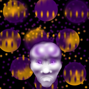
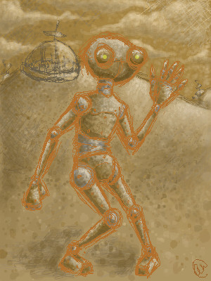
mooseflower
(Apr 3, 2004)
Eets a robot!!!! Wooyay! Robots are so much fun to draw. Anywho, it escaped from one of those little city things back there, the poor thing was enslaved. But it got away! Go it! (yay camoflauge!)dots... are... evil...
concannon (Apr 3, 2004)
Shnazzy. Great texture.
davincipoppalag (Apr 5, 2004)
This is actually kinda cool.. looks like alien cave art sort of.. I like it
Kasha (Apr 5, 2004)
texture is great. The colors are even better. Neat concept. Keep up the good work. |
| ||||||||||||||||||||||
| |||||||||||||||||||||||
| 2draw.net © 2002-2026 2draw.net team/Cellosoft - copyright details - 1.12sec (sql: 41q/0.34sec) |
drawn in 5 min