| |||||||||||||||||||||||
| Public Boards/Advanced | |||||||||||||||||||||||
|
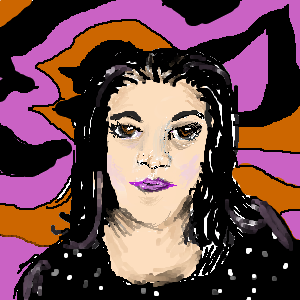
Silk Kimono
terracotta
(Feb 17, 2006)
It's not deep, it's phthalo.
Imperfect (Oct 3, 2011)
So amazing. One of the most beautiful photorealistic pieces I've ever seen.
dorothyblueeyes (Oct 7, 2011)
Very beautiful. I think I know the difference between me and many of the other painters here, now.For example, this is very smooth,finished,and slick.It' very professional. Good job. I do not tend to like going all the way to smooth,finished,and photo-like. I like the paint(figuratively) to look and feel like paint.I even like it similar to paint, messy and gooey. And there seems to be a tendency here, to like everything very smooth,slick,and finished. Guess I am out of the groove. I just like allowing for different styles,and different veiwpoints of what painting and drawing is.
Teapot (Apr 5, 2016)
Actually, Dot, this is quite impressionistic compared to the photograph, not an attempt at photo-realism at all.
davincipoppalag (Mar 9, 2017)
I wish more were drawing |

| ||||||||||||||||||||||
| Public Boards/Beginner | |||||||||||||||||||||||
|
Pakasutemanshikuka
(Feb 23, 2006)
Had a need to draw..... and I was suppose to go sleep early because I need to go to dentist tomorrow morning......... why did I pick morning and not the afternoon?! Noo DXMust...... go......... to...... sleeeep....... *o* (I think I'll delete this :/)
suzie (Feb 23, 2006)
No..don't delete her, she has such a gently pretty blush and its a really nice draw. :D
woah_pockster (Feb 24, 2006)
she's precious <:D DON"T DELETE THIS >:0 delete it and I shall eat you. >:0:] <33 |

| ||||||||||||||||||||||
|
mote
(Feb 23, 2006)
Just testing out 2draw for the first time!
davincipoppalag (Feb 23, 2006)
Not a bad first picture. Welcome. This might help some..http://cellosoft.com/2draw/wiki/index.php/Lascaux_Sketch
suzie (Feb 23, 2006)
mote!!!! Welcome, she is good for a first try..lol you should see mine *cough*..rubbish lol |
| ||||||||||||||||||||||
|
Moppeh
(Feb 22, 2006)
My second drawing here, I know it's pretty bad, but this is the beginner board, so I think it's okay. ^^Hi! This is my second drawing here, and I thought I'd make a little person drawing. The backround is bad, so is the hands, pencil, paper, pretty much everything, but I hope you don't mind me posting it.
suzie (Feb 23, 2006)
I think its more than good enough for this board. I keep thinking that pencil will roll down the table :S nice :D |

| ||||||||||||||||||||||
|
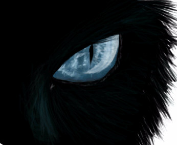
nekodesu
(Feb 22, 2006)
Ref used
davincipoppalag (Feb 22, 2006)
I like this one, it looks like our cat.
suzie (Feb 23, 2006)
Eye detail is very nice. |
| ||||||||||||||||||||||
| Public Boards/Intermediate | |||||||||||||||||||||||
|
Mal
(Feb 21, 2006)
carrots
Zeal (Feb 21, 2006)
Ehh I'd have to say about 4..
DeadlyBlondeArcher (Feb 21, 2006)
oooohhhh carats. I love carats.That was challenging! I think it looks vaugely Sapphireish so i'm happy :o)
& thanks for the comments everyone
Opium (Feb 22, 2006)
ooooh! I really like this one! I'll have to show this to my roomie...she's a jewelry freak....we'll see jewelry ads on tv, and she can tell how many carats it is, along with the cut, even on those little stones on the side. I like the depth you gave this, btw :) |

| ||||||||||||||||||||||
| Public Boards/Beginner | |||||||||||||||||||||||
|
Harurie
(Feb 22, 2006)
bleh.
Childlike_Vampire (Feb 22, 2006)
I love the colors, especially of her hair. My favorite bits are her collar bone and the nose and lips. Great pic!
Harurie (Feb 22, 2006)
thanks ^^!! Your one of my favourite artists on 2draw, I'm happy you commented ^^
suzie (Feb 23, 2006)
The shine on her hair is good and her pink nose is really sweet. Very nice colours too :D |

| ||||||||||||||||||||||
|
Deformed
(Feb 21, 2006)
... |

| ||||||||||||||||||||||
|
marini135
(Feb 21, 2006)
this is my idea of how Emily looked before she was killed. |

| ||||||||||||||||||||||
|
PsychoTeddy
(Feb 21, 2006)
No matter how loud I shout, you'll never know how much I love you...
Juni_gatsu (Feb 21, 2006)
I'm going to go out on a limb here and guess that that is hide >.>very nice picture, the solids look really good, i like how soft the background is in contrast though, you should definately draw more, you're very talented.
suzie (Feb 21, 2006)
The idea an title are so lovely. Great clours and the lines look good to me! (me no expert tho lol)
woah_pockster (Feb 21, 2006)
:0 looks like hide :] <33
PsychoTeddy (Feb 22, 2006)
Thanks everyone. o(^u^)ohdfgdh Yes, it is supposed to be hide. Of course. XD But the eyes make him look too childlike and... I need to change him A LOT. In fact, I think I'll re-do him all together. With softer lines. They're bugging me. The title is a reference to 'Pink Cloud Assembly' and the clothes.. well. Rocket Dive PV, obviously. |

| ||||||||||||||||||||||
| |||||||||||||||||||||||
| 2draw.net © 2002-2026 2draw.net team/Cellosoft - copyright details - 1.09sec (sql: 42q/0.27sec) |