| |||||||||||||||||||||||
| Public Boards/Intermediate | |||||||||||||||||||||||
|
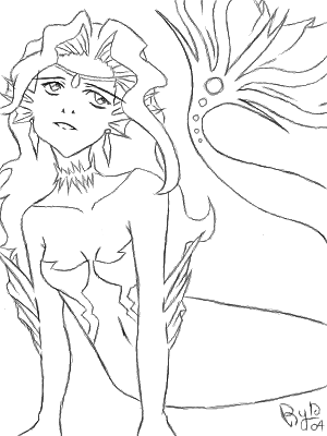
Mermaid Eryn
ryn-chan
(Jun 21, 2004)
This is my first post, im new. I didn't want to post in the advance board bcuz well i don't know if im good enough, im still not finished obviously but God it'll take me ages with the sliders, i suck with sliders. But oh well...c+c is deeply appreciated. Thanks!~Ryn~
staci (Jun 21, 2004)
just lovely so far...get to colorin!
Urei-sama (Jun 21, 2004)
the pose and lineart look great so far! it's be nice to see it finished. nice first post ;) |
| ||||||||||||||||||||||
|
squee
(Jun 19, 2004)
how do you spell that word anyways? blah, This is wat happens when you listen to Slipknot and 3DD right after the other..
squee (Jun 19, 2004)
^___^;; .....
jord (edited Jun 19, 2004)
oohh.. now i got to know... what whas your previous name?great draw btw.. he's got some weird fingers though ;) -edit- please? -edit- thanks!
squee (Jun 19, 2004)
IF you all may know my previous name (crappy one) was SaheraNightsand i cant draw hands....-_-;
Erewin (Jun 19, 2004)
He looks sort of inquisitive and clueless. I like the style of it, like anime with heaps of personality. He'd be the shy quiet type, I guess. Maybe he's poor. |

| ||||||||||||||||||||||
|
staci
(Jun 19, 2004)
from a photo i took of a wasp, hornet, something.
laurael (Jun 19, 2004)
Great job with this...wow, looks real.
MaLynne (Jun 20, 2004)
this is cool.. how the heck did you get so close? i'd be scared. would like to see the photo too
davincipoppalag (Jun 20, 2004)
I hate these things only marginally less than spiders...(shudder) I think it's that "twitchy wing " business they do when they land... they just look like they are out to sting you whenever they are around... Ya done did good.. I hate this picture so you know you did it right!(did those wings just twitch????)s
staci (Jun 20, 2004)
he was too concered with the flowers to bother me..i got about 2 or 3 feet away and zoomed in, besides they fly pretty slowthanks! |

| ||||||||||||||||||||||
| Specialty Boards/Elite Bastards | |||||||||||||||||||||||
|
staci
(Jun 3, 2004)
i wanted to do a pic of him where he's got his smeagol eyes..this is as close as i found.i think this is when faromir makes frodo call gollum up from the forbidden pool of whatever : )
Pakasutemanshikuka (Aug 9, 2005)
omg ... looks just like him ! 8'DD wow. amazing, gorgeous. wow. fantastic pic, i think...
beth92093 (Oct 17, 2006)
wow r u the person who drew him 4 the movie? cause this looks just like em ya no!!!!!!!! wonderful job!!!!!!!!!!!!!!
Split (Nov 17, 2007)
reminds me of my sister.lol!im playing,this is really gd!^_^i like the color
Zad (Dec 6, 2007)
This is awesome!!!!! But i have to ask, what are the pink smilies for? |

| ||||||||||||||||||||||
| Public Boards/Advanced | |||||||||||||||||||||||
|
davincipoppalag
(Jun 16, 2004)
The Mitsubishi A6M "Zero"
IkariIreuL (Nov 21, 2004)
Gorgeous :)
Xodiak (Nov 21, 2004)
And I thought the Japanese made only tablets and anime. Awesome drawing Dave! >:D|XOD|
davincipoppalag (Nov 22, 2004)
Wow..this was done way back in June..
DeadlyBlondeArcher (Nov 22, 2004)
I'm glad someone commented on it... I must have made a bad shot... Damn! It's still there... *locking in again* ;) |

| ||||||||||||||||||||||
| Public Boards/Beginner | |||||||||||||||||||||||
|
Gigge
(Jun 15, 2004)
Thanks for the comments/advice on the last draw. I put in a few harder lines on this draw, but I didn't use the anti-alies to do thin highlights. I found that it blurs the line too much and makes the line 2 or three pixels wide. What worked better for me was turning off the anti-alias and blend and using a low opacity and high flow to draw thin highlights. But, thanks for the suggestion!Ok...i sharpened the bowl slightly, added a touch more definitiion to the glass outline and 'clarified' the base of the glass. Thanks for the hints.
deannak24 (Jun 15, 2004)
fab gigge .....is beautiful nice to see you drawing here as well as in the game
davincipoppalag (Jun 16, 2004)
I think what it is about this is the bg kind of camouflages the glass.. I think with a different bit of color back there the glass would stand out more... its much better as I stare at it.. but that bg hides it...
JackSprat (Jul 26, 2004)
Just browsing yer board....this one is beautiful! I love the blending and colors, especially the contrast between the grey and the wine. LOL....sorry, but I think of things in terms of where I'd like to see them....this would make an absolutely beautiful cover for a wine menu. |

| ||||||||||||||||||||||
| Public Boards/Intermediate | |||||||||||||||||||||||
|
staci
(Jun 10, 2004)
yea...do her lips look funky?
DeadlyBlondeArcher (Jun 15, 2004)
Keket is a rude little creep, I think. Must be new around here.
Blueeyedartist (Jun 16, 2004)
This pic is excellent....................I love everything about it.........she looks so real!
Gigge (Jul 14, 2004)
I just wanted to thank you for doing this picture. I've gone through the versions several times trying to learn your technique for doing hair and it's helped so much. The way you saved the versions makes this like a mini tutorial. Thank you!!
staci (Jul 14, 2004)
:Dim glad i could help..and i know what you mean. i learned alot about the possibilities of digital art from watching animations in shi painter. its fun! |

| ||||||||||||||||||||||
| Misc. Boards/Sprites | |||||||||||||||||||||||
|
Zack
(Jun 13, 2004)
Yeah, this one turned out a lot more realistic.
mooseflower (Jun 14, 2004)
Omegosh! Zack's devolving! Hurry, break into the geneticists lab and steal their evolutional accelorator! Don't worry Zack, just stay calm, we can fix this.just the hat
method3 (Jun 15, 2004)
Heh, awesome, glad I decided to glance at the Sprite board. Say... do you live in an animal test lab where they do weird things like make you draw on 2draw?
Zack (edited Jun 18, 2004)
Yes. They're trying to find out how long someone can use a computer with only 128 megs of RAM and a crappy OEM optical mouse before their head explodes. I've had a few close calls, but nothing permanent yet. |
| ||||||||||||||||||||||
| Specialty Boards/Collaborations | |||||||||||||||||||||||
|
The Cloxboy Church! heh
26 comments
– latest 4:I kept it basic Zack. You can make the game interface much more bright and detailed or whatever you wish.
ironoxide_red (Aug 6, 2004)
You know, I just love this one! :)
Gigge (Oct 6, 2004)
What happened to the tournie?
Xodiak (Oct 21, 2004)
Awesome video game! One must build it! For real! >:D|XOD|
Kenshin (Oct 21, 2004)
That is awesome.. The coloring and everything is great! |

| ||||||||||||||||||||||
| Public Boards/Intermediate | |||||||||||||||||||||||
|
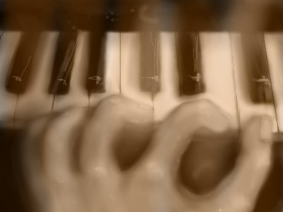
audie
(Jun 11, 2004)
Its ok...
DMV (Jun 11, 2004)
Wow! the piano keys look real and I like that sepia look to it:)
davincipoppalag (Jun 12, 2004)
I like this too, even though the hand is off. The angle of the hand playing is kinda too low for what the hand position would be to actually play and that index finger is too long and off angle.. but in spite of all that.. I still like this alot.
audie (Jun 12, 2004)
:)
Erewin (Jun 16, 2004)
The keyboard is quite photorealistic, and the hand has a good sense of movement in it. The blurring over the keyboard adds to the sense of fast-paced movement! |
| ||||||||||||||||||||||
| |||||||||||||||||||||||
| 2draw.net © 2002-2025 2draw.net team/Cellosoft - copyright details - 1.89sec (sql: 40q/1.53sec) |